Search packages, repositories and app categories

spoiler_widget cover
Package detailsv1.0.25

spoiler_widget

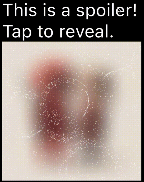
A Flutter package to create spoiler animations similar to the one used in Telegram, allowing you to hide sensitive or spoiler-filled content until it's tapped or clicked.

AndroidiOSWebmacOSWindowsLinux
30-day downloads
1.1K
Likes
97
Pub points
160

Install package

flutter pub add spoiler_widget

Package Overview

Package selection guidance compiled from public package information, community data, and project usage.

The spoiler_widget package enables developers to create interactive spoiler animations in Flutter, mimicking the popular Telegram-style reveal effect. It allows sensitive or surprising content to be hidden initially and revealed upon user interaction, such as tapping or clicking. Ideal for hiding spoilers in messages, images, or text, it enhances user experience with smooth transitions across multiple platforms. The package is lightweight and integrates seamlessly into existing Flutter apps.

Use cases

  • Hiding spoilers in chat apps
  • Revealing image content on tap
  • Creating interactive story elements
  • Protecting sensitive information in UIs
  • Adding playful reveals in games

Key features

  • Telegram-style animation
  • Tap-to-reveal interaction
  • Smooth transition effects
  • Cross-platform support
  • Easy integration with existing widgets
  • Customizable reveal duration

Suitable for

  • Chat and messaging apps
  • Interactive storytelling
  • Gamified interfaces
  • Content that requires controlled visibility
  • Developers seeking simple yet effective animations

Considerations

  • May impact performance with many instances
  • Limited customization beyond basic animation
  • Requires user interaction for reveal
  • Not suitable for static content
  • Best used sparingly to maintain surprise effect

Original README

Original README snapshot from the linked source repository. Visit the repository for the latest content.

Spoiler Animation for Flutter

Spoiler Widget

Pub Likes Pub Points Pub Version License: MIT Flutter GitHub stars

A Flutter package to create spoiler animations similar to the one used in Telegram, allowing you to hide sensitive or spoiler-filled content until it's tapped or clicked.

Demo

Mask Operation Demo Mask Operation Demo
PathOperation.intersect PathOperation.difference
PathOperation.union PathOperation.xor

Features

  • Spoiler Animation: Blur effect to hide content until tapped or hidden

  • Wave Effects: Optional wave/ripple expansions with SpoilerSpotsController

  • Particle System: Configure particle density (0–1 coverage), size, speed, color, and shape paths/presets.

  • Fade Animation: Smooth circular reveal/cover transitions

  • Gesture Control: Enable or disable gestures to users can tap toggle the spoiler.

  • Masking Support: Use custom Path + PathOperation via maskConfig.

  • Platform Agnostic: Works on iOS, Android, Web, Tizen and more


Installation

In your pubspec.yaml:

dependencies:
  spoiler_widget: ^1.0.25

Then run:

flutter pub get

Usage

1. Basic Spoiler Usage

Import the package:

import 'package:spoiler_widget/spoiler_widget.dart';

Wrap any widget you want to hide in a spoiler:

SpoilerOverlay(
  config: WidgetSpoilerConfig(
    isEnabled: true,
    fadeConfig: const FadeConfig(padding: 3.0, edgeThickness: 20.0),
    enableGestureReveal: true,
    imageFilter: ImageFilter.blur(sigmaX: 30, sigmaY: 30),
    onSpoilerVisibilityChanged: (isVisible) {
      debugPrint('Spoiler is now: ${isVisible ? 'Visible' : 'Hidden'}');
    },
  ),
  child: const Text('Hidden content'),
);

For text-only content, use SpoilerTextWrapper (preferred over deprecated SpoilerText):

SpoilerTextWrapper(
  config: TextSpoilerConfig(
    isEnabled: true,
    fadeConfig: const FadeConfig(padding: 3.0, edgeThickness: 20.0),
    enableGestureReveal: true,
    onSpoilerVisibilityChanged: (isVisible) {
      debugPrint('Spoiler is now: ${isVisible ? 'Visible' : 'Hidden'}');
    },
  ),
  child: const Text(
    'Tap me to reveal secret text!',
    style: TextStyle(fontSize: 16, color: Colors.black),
  ),
);

1.1 Wrap existing text widgets

If you already have a text subtree and just need to hide it with particles, use SpoilerTextWrapper:

SpoilerTextWrapper(
  config: TextSpoilerConfig(
    isEnabled: true,
    fadeConfig: const FadeConfig(padding: 10.0, edgeThickness: 20.0),
    enableGestureReveal: true,
  ),
  child: Column(
    crossAxisAlignment: CrossAxisAlignment.start,
    children: const [
      Text('Sensitive line 1'),
      Text('Sensitive line 2'),
    ],
  ),
);
1.2 Form field integration

Use SpoilerTextFieldWrapper to keep the native context menu/cursor while hiding parts of the input:

final controller = TextEditingController(text: 'Type here...');

SpoilerTextFieldWrapper(
  controller: controller,
  focusNode: FocusNode(),
  config: const TextSpoilerConfig(
    isEnabled: true,
    fadeConfig: FadeConfig(padding: 10.0, edgeThickness: 20.0),
    enableGestureReveal: true,
    textSelection: TextSelection(baseOffset: 0, extentOffset: 5),
    textStyle: TextStyle(fontSize: 18, color: Colors.white),
  ),
  cursorColor: Colors.deepPurple,
  maxLines: 3,
);
2. Wave Animations (SpoilerSpotsController)

For dynamic "wave" effects:

class WaveDemo extends StatelessWidget {
  @override
  Widget build(BuildContext context) {
    return SpoilerOverlay(
      config: WidgetSpoilerConfig( 
        isEnabled: true,
        maxActiveWaves: 3,
        fadeConfig: const FadeConfig(padding: 10.0, edgeThickness: 20.0),
        enableGestureReveal: true,
        imageFilter: ImageFilter.blur(sigmaX: 30, sigmaY: 20),
        onSpoilerVisibilityChanged: (isVisible) {
          debugPrint('Spoiler is now: ${isVisible ? 'Visible' : 'Hidden'}');
        },
      ),
      child: Image.network('https://your-image-url'),
    );
  }
}

3. Custom Path Masking

You can apply a custom-shaped mask using maskConfig in both TextSpoilerConfig and WidgetSpoilerConfig. This allows the spoiler effect to only appear inside specific areas defined by a Path.

SpoilerTextWrapper(
  config: TextSpoilerConfig(
    isEnabled: true,
    enableGestureReveal: true,
    particleConfig: const ParticleConfig(
      density: 0.1,
      speed: 0.2,
      color: Colors.white,
      maxParticleSize: 1.0,
    ),
    maskConfig: SpoilerMask(
      maskPath: myCustomPath,
      maskOperation: PathOperation.intersect,
      offset: Offset(50, 30),
    ),
    onSpoilerVisibilityChanged: (isVisible) {
      debugPrint('Spoiler is now: ${isVisible ? 'Visible' : 'Hidden'}');
    },
  ),
  child: const Text(
    'Masked spoiler!',
    style: TextStyle(fontSize: 24, color: Colors.white),
  ),
);

3. Full Example

You can find a complete, runnable example in the example/lib/main.dart file. It demonstrates various configuration options and both text and widget-based spoilers.

Configuration
Common Fields

Table showing common config parameters for both TextSpoilerConfig and WidgetSpoilerConfig.

Field Type Description
isEnabled bool Whether the spoiler starts enabled (hidden).
enableGestureReveal bool Whether tap should toggle visibility.
particleConfig ParticleConfig Particle system parameters (density, speed, color, size, shape).
fadeConfig FadeConfig? Fade parameters (padding, edgeThickness).
shaderConfig ShaderConfig? Custom fragment shader configuration for particles.
maskConfig SpoilerMask? Optional mask to apply using a Path.
onSpoilerVisibilityChanged ValueChanged? Callback fired when spoiler becomes visible/hidden.
Legacy fields (deprecated)

These fields are kept for backward compatibility; prefer particleConfig and fadeConfig.

  • enableFadeAnimation
  • fadeRadius (maps to FadeConfig.padding)
  • fadeEdgeThickness
  • particleDensity
  • particleSpeed
  • particleColor
  • maxParticleSize
ParticleConfig
Field Type Description
density double Area coverage percentage in the range 0..1 (0 = 0%, 1 = 100%). Values are clamped.
speed double Particle speed (px/frame).
color Color Base particle color.
maxParticleSize double Particle diameter in pixels.
shapePreset ParticlePathPreset? Built-in shapes or ParticlePathPreset.custom(...) for your own path.
enableWaves bool Enables ripple waves that push particles.
maxWaveRadius double Wave radius limit in pixels.
maxWaveCount int Maximum number of simultaneous waves.
TextSpoilerConfig
Field Type Description
textStyle TextStyle? The text style applied to the spoiler text.
textSelection TextSelection? Range of text to apply the spoiler.
textAlign TextAlign? Text alignment inside the widget.
maxLines int? An optional maximum number of lines for the text to span, wrapping if necessary.
isEllipsis bool? Determines whether overflowing text should display an ellipsis ("…") at the end.
WidgetSpoilerConfig
Field Type Description
imageFilter ImageFilter? Blur filter used to hide the child.
maxActiveWaves int Max concurrent waves for wave-based effects.
FAQ
  1. How can I animate the blur or wave concurrency? Adjust the properties in your configuration object at runtime. For instance, set a new imageFilter or call methods on the wave controller to dynamically tune the effect.

  2. Can I skip the wave logic? Yes—by default, you get a basic spoiler with fade. Use SpoilerSpotsController only if you want wave animations.

  3. Does this work on the web? Yes! It’s entirely in Flutter/Dart. Just ensure you handle any platform quirks with gesture input.

Dual Rendering Modes

spoiler_widget now supports two modes of rendering particles:

  1. Atlas Rendering (Default): Uses Flutter's drawRawAtlas. This is a CPU-driven approach that is highly efficient for most standard spoiler effects.
  2. Shader Rendering (GPU): Uses custom fragment shaders to render particles. This is ideal for complex visual effects and leverages GPU power for smoother performance on high-end devices.

To enable Shader Rendering, simply provide a ShaderConfig to your spoiler configuration.

Particle Shapes

Pick a shape once in ParticleConfig, and it works for both atlas and shader modes. Leave shapePreset null for the default circle (fastest path).

particleConfig: ParticleConfig(
  density: 0.1,
  shapePreset: ParticlePathPreset.snowflake,
),

If you need full control, provide a custom Path for particles:

final starPath = Path()
  ..moveTo(0.0, -1.0)
  ..lineTo(0.2, -0.2)
  ..lineTo(1.0, -0.2)
  ..lineTo(0.35, 0.15)
  ..lineTo(0.6, 0.9)
  ..lineTo(0.0, 0.4)
  ..lineTo(-0.6, 0.9)
  ..lineTo(-0.35, 0.15)
  ..lineTo(-1.0, -0.2)
  ..lineTo(-0.2, -0.2)
  ..close();

particleConfig: ParticleConfig(
  density: 0.1,
  shapePreset: ParticlePathPreset.custom(starPath),
),
4. Custom Fragment Shader (particles.frag)

You can use the default high-performance shader for particle rendering:

SpoilerTextWrapper(
  config: TextSpoilerConfig(
    isEnabled: true,
    enableGestureReveal: true,
    particleConfig: const ParticleConfig(
      density: 0.15,
      speed: 0.25,
      color: Colors.white,
      maxParticleSize: 1.0,
      shapePreset: ParticlePathPreset.star,
    ),
    shaderConfig: ShaderConfig.particles(),
  ),
  child: const Text('GPU-driven particles!'),
);
Contributing

Contributions are welcome! Whether it’s bug fixes, new features, or documentation improvements, open a Pull Request or Issue.


License

Licensed under the MIT License. Enjoy building your spoiler effects!

Categories

Source repository

Projects using this package

No data available yet.