Search packages, repositories and app categories

square_progress_bar cover
Package detailsv1.1.1

square_progress_bar

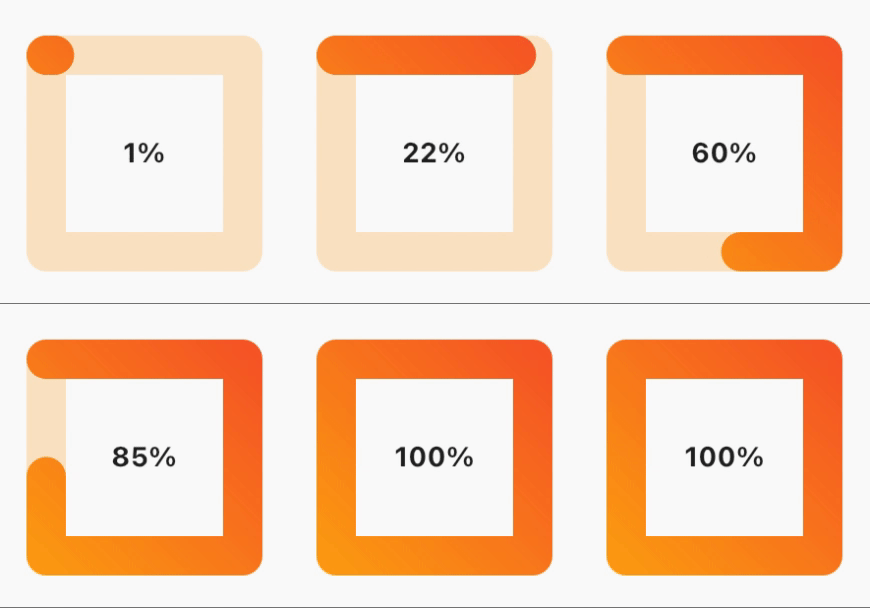
A square progress bar that you can use easily, Just provide the progress in a range from 0.0 to 1.0 and you are set to go.

AndroidiOSWebmacOSWindowsLinux
30-day downloads
83
Likes
29
Pub points
150

Install package

flutter pub add square_progress_bar

Package Overview

Package selection guidance compiled from public package information, community data, and project usage.

A simple and customizable square-shaped progress bar for Flutter applications. It accepts a progress value between 0.0 and 1.0, making it easy to integrate into any UI needing visual feedback for loading or completion states. The widget is lightweight and supports all major platforms including Android, iOS, Web, macOS, Windows, and Linux. Ideal for use in forms, file uploads, or any scenario requiring a clean, modern progress indicator.

Use cases

  • Loading indicators in forms
  • File upload progress tracking
  • Task completion visualization
  • Dashboard progress displays
  • Animated onboarding flows

Key features

  • Square-shaped design
  • Progress from 0.0 to 1.0
  • Cross-platform support
  • Minimal configuration
  • Customizable colors and size
  • Smooth animations

Suitable for

  • Simple progress UIs
  • Lightweight apps
  • Consistent design systems
  • Rapid prototyping
  • Mobile and web applications

Considerations

  • Limited customization beyond basic styling
  • No built-in label support
  • Not suitable for complex progress workflows
  • Requires manual handling of animation timing
  • Depends on external package updates

Original README

Original README snapshot from the linked source repository. Visit the repository for the latest content.

Square progress bar because why not 😎

Build Status

Features

  • Dynamic sizing
  • Animated progress bar
  • Gradient color progress bar
  • Progress bar cap shape customization
  • RTL support
  • ✨Magic✨

alt text

Installation

dependencies:
  square_progress_bar: ^1.1.1

Getting started

Just provide the progress in a range from 0.0 to 1.0 and you are set to go.

Usage

              SquareProgressBar(
                width: 100, // default: max available space
                height: 100, // default: max available space
                progress: _progress, // provide the progress in a range from 0.0 to 1.0
                isAnimation: false, // default: false, animate the progress of the bar
                solidBarColor: Colors.amber, // default: blue, main bar color
                emptyBarColor: Colors.orange.withOpacity(0.2), // default: gray, empty bar color
                strokeWidth: 20, // default: 15, bar width
                barStrokeCap: StrokeCap.round, // default: StrokeCap.round, bar cap shape
                isRtl: false, // default: false, bar start point
                gradientBarColor: const LinearGradient(
                  begin: Alignment.topRight,
                  end: Alignment.bottomLeft,
                  colors: <Color>[Colors.red, Colors.amber],
                  tileMode: TileMode.repeated,
                ), // default: null, if you pass gradient color it will be used instead of solid color for the main bar
                child: Center(
                  child: Text(
                    _percentageLabel,
                    style: const TextStyle(fontWeight: FontWeight.bold),
                  ),
                ),
              )

License

MIT Free Software, Hell Yeah!

Categories

Source repository

Projects using this package

No data available yet.