
Overview
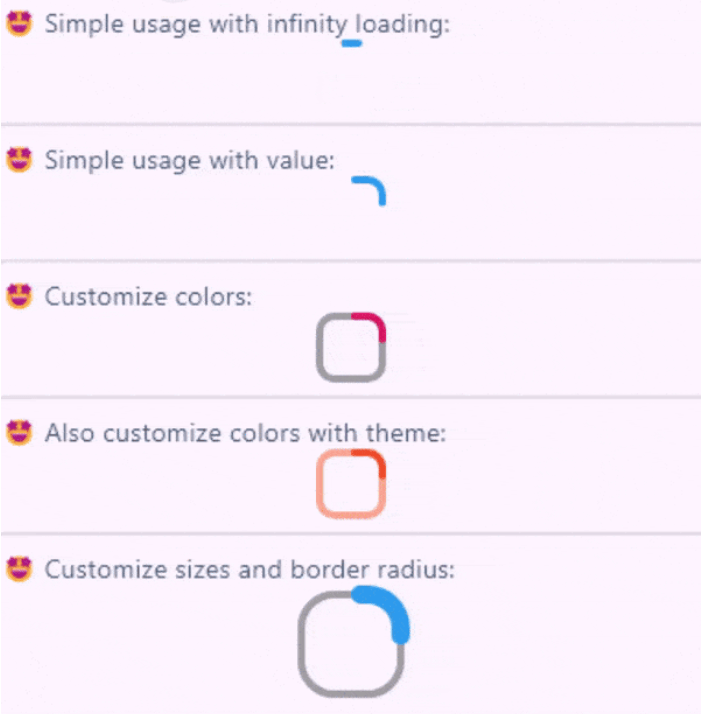
A customizable square-shaped progress indicator widget for Flutter, inspired by the native CircularProgressIndicator. It offers a modern, compact alternative to circular progress indicators with support for custom colors, stroke width, and animation. Ideal for loading states in apps where a square design fits better with the UI. The package is lightweight and compatible across all major platforms including Android, iOS, Web, macOS, Windows, and Linux.
Use cases
- Loading indicators in forms
- Displaying progress in dashboards
- Custom loading animations in mobile apps
- Replacing circular progress bars with square ones
- Enhancing UI consistency in material design apps
Key features
- Square-shaped design
- Customizable color and stroke width
- Smooth animation
- Cross-platform compatibility
- Simple integration with Flutter
- Extensible styling options
Suitable for
- Developers seeking alternative progress indicators
- UI designers focusing on square-themed interfaces
- Apps requiring consistent loading visuals
- Flutter projects targeting multiple platforms
- Projects using Material Design with modern aesthetics
Considerations
- Limited to square geometry
- May require additional styling for complex animations
- Not suitable for circular progress needs
- Depends on Flutter's rendering performance
- Best used in contexts where square shapes align with design language