Search packages, repositories and app categories

steps_indicator cover
Package detailsv1.3.0

steps_indicator

Flutter plugin to display a simple steps indicator line widget.

AndroidiOSWebmacOSWindowsLinux
30-day downloads
1.3K
Likes
59
Pub points
150

Install package

flutter pub add steps_indicator

Package Overview

Package selection guidance compiled from public package information, community data, and project usage.

A Flutter plugin that provides a simple, customizable steps indicator line widget to visually represent progress through a sequence of steps. It supports various styling options for indicators, lines, and labels, making it ideal for onboarding flows, checkout processes, or any multi-step user journey. The package is lightweight and compatible across all major platforms including Android, iOS, Web, macOS, Windows, and Linux.

Use cases

  • Onboarding wizards
  • Checkout process tracking
  • Multi-step form navigation
  • Progress visualization in apps
  • Tutorial walkthroughs

Key features

  • Customizable step indicators
  • Configurable line styles
  • Support for labels and icons
  • Cross-platform compatibility
  • Simple API integration

Suitable for

  • Developers building guided user flows
  • Apps requiring visual progress tracking
  • Projects with multi-step interfaces
  • Designers seeking minimalistic progress indicators
  • Cross-platform applications

Considerations

  • Limited to linear step progression
  • No built-in animation support
  • Requires manual handling of step state changes
  • Not suitable for complex branching workflows
  • Basic styling options compared to advanced UI libraries

Original README

Original README snapshot from the linked source repository. Visit the repository for the latest content.

steps_indicator

pub package

A simple steps indicator widget

Installation

Add steps_indicator: ^1.3.0 in your pubspec.yaml dependencies. And import it:

import 'package:steps_indicator/steps_indicator.dart';

How to use

Simply create a StepsIndicator widget and pass the required params:

StepsIndicator(
  selectedStep: 1,
  nbSteps: 4
)

Do not forget to check that the selectedStep is not lower than 0 and is not higher than the total number of steps (nbSteps).

Params

Animations are disabled by default if you want to enable them remember to pass properties to true.

StepsIndicator(
  selectedStep: 1,
  nbSteps: 4,
  selectedStepColorOut: Colors.blue,
  selectedStepColorIn: Colors.white,
  doneStepColor: Colors.blue,
  doneLineColor: Colors.blue,
  undoneLineColor: Colors.red,
  isHorizontal: true,
  lineLength: 40,
  doneStepSize: 10,
  unselectedStepSize: 10,
  selectedStepSize: 14,
  selectedStepBorderSize: 1,
  doneStepWidget: Container(), // Custom Widget 
  unselectedStepWidget: Container(), // Custom Widget 
  selectedStepWidget: Container(), // Custom Widget 
  lineLengthCustomStep: [
    StepsIndicatorCustomLine(nbStep: 3, length: 80)
  ],
  enableLineAnimation: true,
  enableStepAnimation: true,
)

For a more detail example please take a look at the example folder.

Example

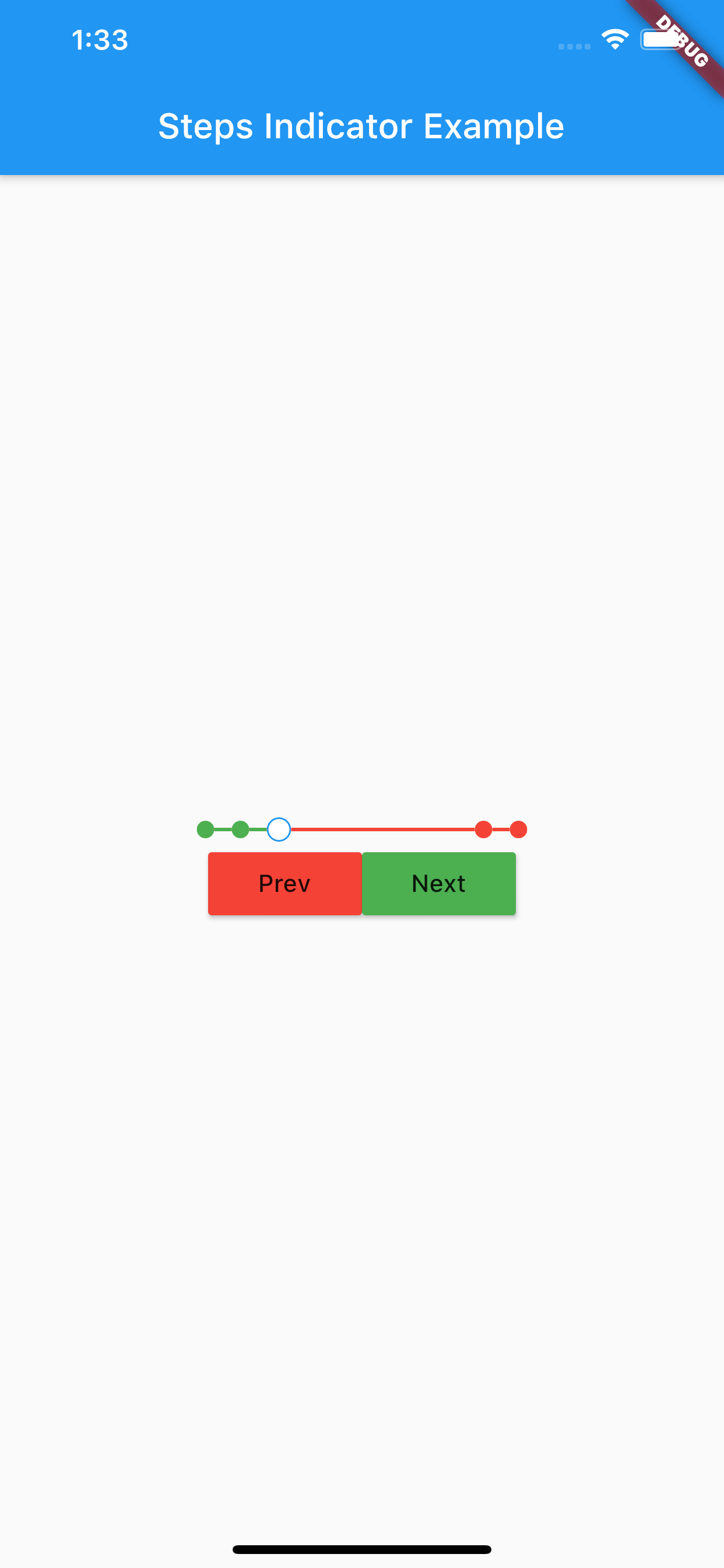
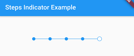
Steps indicator:

-

If something is missing, feel free to open a ticket or contribute!

Categories

Source repository

Projects using this package

No data available yet.