Search packages, repositories and app categories

stylish_bottom_bar cover
Package detailsv1.1.1

stylish_bottom_bar

A collection of stylish bottom navigation bars like animated bottom bar and bubble bottom bar for flutter.

AndroidiOSWebmacOSWindowsLinux
30-day downloads
8.2K
Likes
331
Pub points
150

Install package

flutter pub add stylish_bottom_bar

Package Overview

Package selection guidance compiled from public package information, community data, and project usage.

A Flutter package offering visually appealing bottom navigation bars, including animated and bubble-style designs. It enhances user interfaces with smooth transitions and modern aesthetics, ideal for apps seeking a distinctive navigation experience. The package supports multiple platforms and integrates seamlessly into existing Flutter projects. With customizable options, it allows developers to easily implement engaging bottom bars without extensive coding. Perfect for mobile and web applications aiming for a polished, contemporary look.

Use cases

  • Enhancing app navigation with animated effects
  • Creating unique UIs using bubble-style bottom bars
  • Improving user engagement through visual feedback
  • Designing modern interfaces for cross-platform apps
  • Adding dynamic transitions to bottom navigation
  • Customizing navigation appearance with minimal code

Key features

  • Animated bottom bar transitions
  • Bubble-style bottom navigation design
  • Cross-platform support (Android, iOS, Web, macOS, Windows, Linux)
  • Easy integration with Flutter projects
  • Customizable colors and animations
  • Lightweight and performant implementation

Suitable for

  • Flutter developers seeking modern UI components
  • Apps requiring eye-catching navigation
  • Design-focused mobile and web applications
  • Developers wanting quick UI enhancements
  • Projects emphasizing user experience and visual appeal
  • Teams looking for ready-to-use, styled navigation bars

Considerations

  • May require additional styling for complex themes
  • Limited customization beyond provided animation types
  • Depends on Flutter version compatibility
  • Potential performance impact with heavy animations
  • Not suitable for minimalist design preferences
  • Requires understanding of Flutter's widget system for advanced modifications

Original README

Original README snapshot from the linked source repository. Visit the repository for the latest content.

Hello stylish_bottom_bar Version

A collection of stylish bottom navigation bars like animated bottom bar and bubble bottom bar for flutter.

Table of contents

⭐ Installing

dependencies:
    stylish_bottom_bar: ^1.2.0-beta

⚡ Import

import 'package:stylish_bottom_bar/stylish_bottom_bar.dart';

📙 How To Use

items:
option:
backgroundColor:
elevation:
currentIndex:
iconSize:
padding:
inkEffect:
inkColor:
onTap:
opacity:
borderRadius:
fabLocation:
hasNotch:
barAnimation:
barStyle:
unselectedIconColor:
bubbleFillStyle:
iconStyle:
selectedIcon:
dotStyle:

Properties

items → List<BottomBarItem>
option → AnimatedBarOptions
option → BubbleBarOptions
option → DotBarOptions
option → BarBlurOptions
backgroundColor → Color
elevation → double
currentIndex → int
iconSize → double
padding → EdgeInsets
inkEffect → bool
inkColor → Color
onTap → Function(int)
opacity → double
borderRadius → BorderRadius
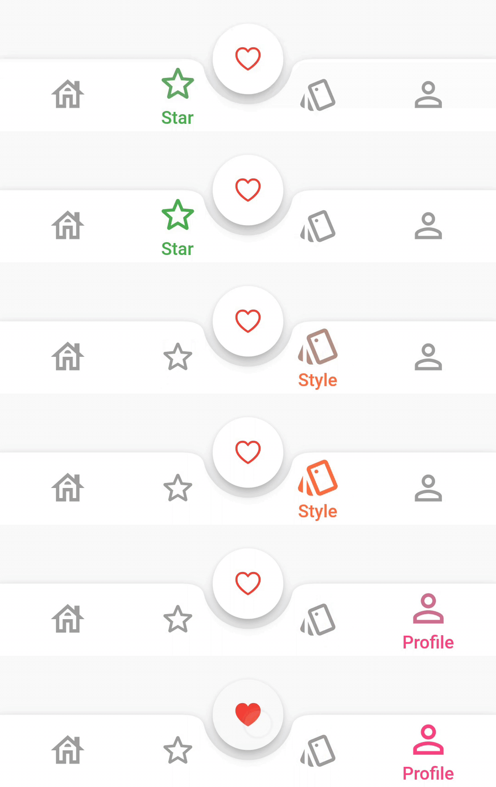
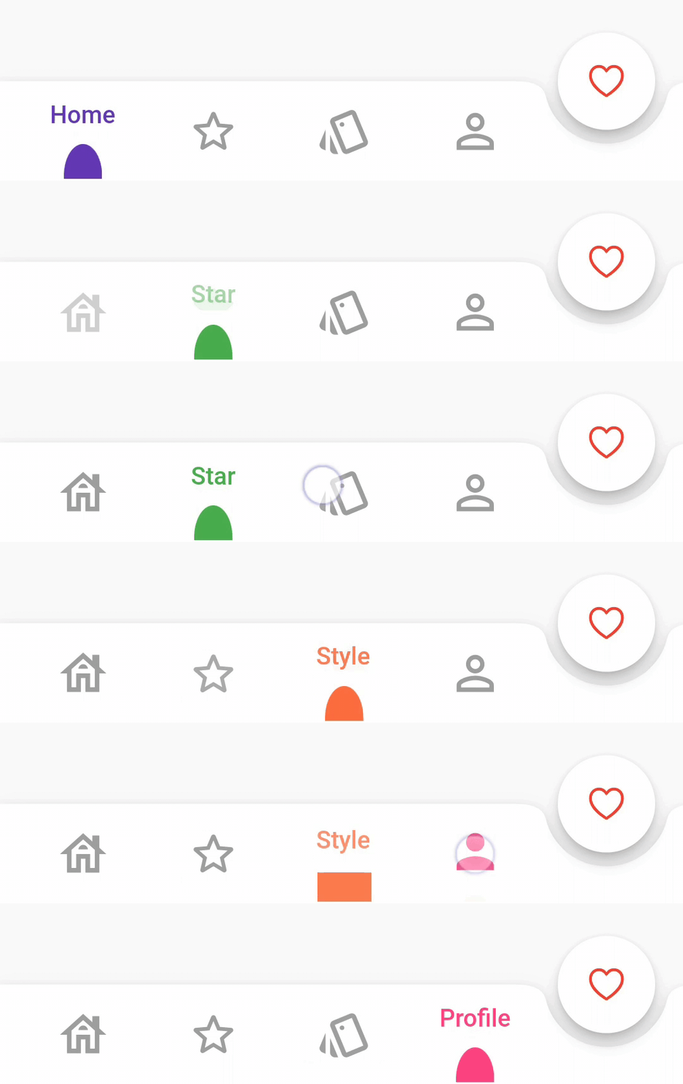
fabLocation → StylishBarFabLocation
hasNotch → bool
barAnimation → BarAnimation
barStyle → BubbleBarStyle
unselectedIconColor → Color
bubbleFillStyle → BubbleFillStyle
iconStyle → IconStyle
dotStyle → DotStyle
BarStyle
BubbleBarStyle.vertical
BubbleBarStyle.horizotnal
BubbleFillStyle
BubbleFillStyle.fill
BubbleFillStyle.outlined
FabLocation
StylishBarFabLocation.center
StylishBarFabLocation.end
BarAnimation
BarAnimation.fade
BarAnimation.blink
BarAnimation.transform3D
BarAnimation.liquid
BarAnimation.drop
IconStyle
IconStyle.Default
IconStyle.simple
IconStyle.animated
DotStyle
DotStyle.circle
DotStyle.tile
NotchStyle
NotchStyle.circle
NotchStyle.square
NotchStyle.themeDefault
Event
onTap: (index){
    
}

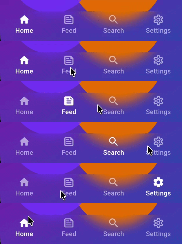
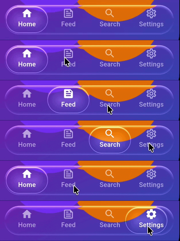
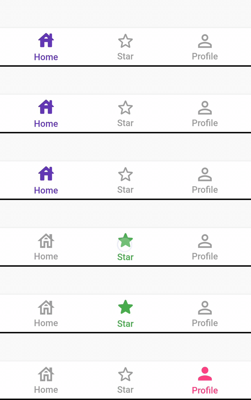
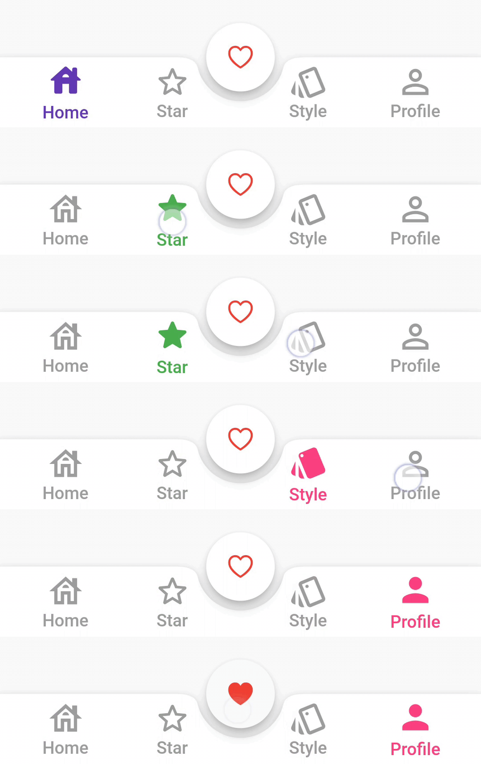
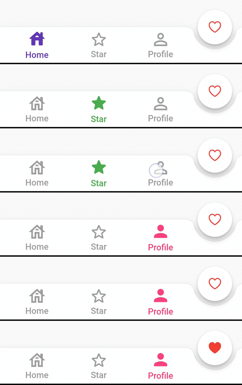
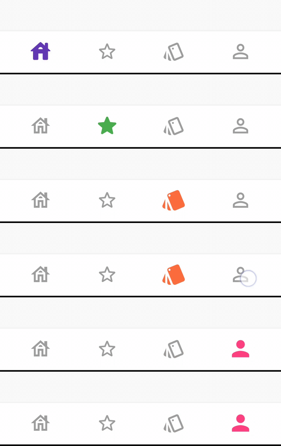
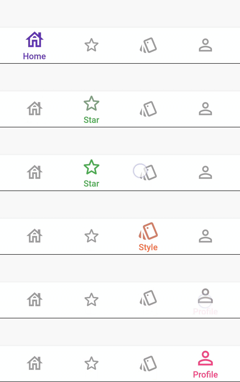
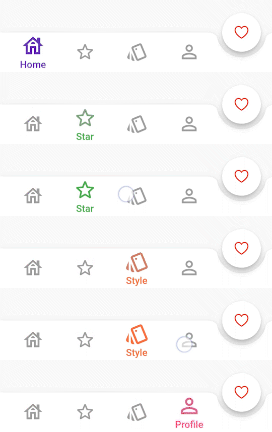
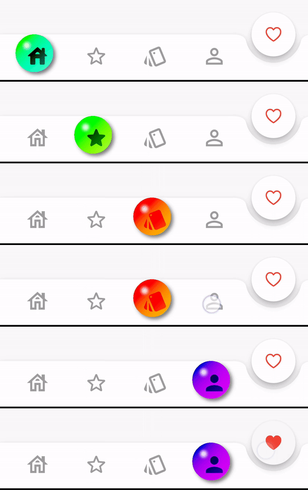
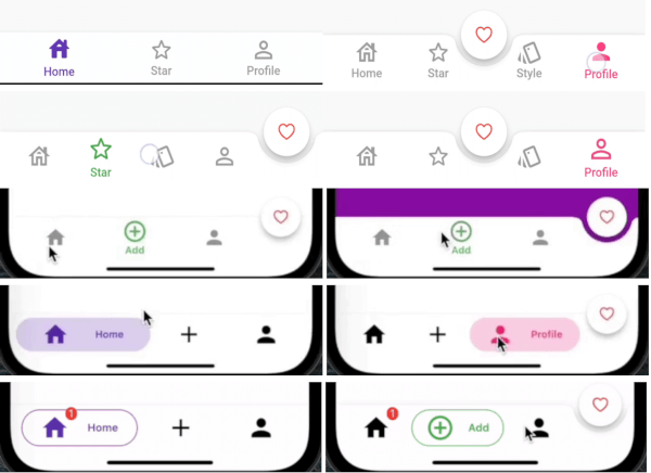
Showcase

BarBlurOptions

BarBlurOptions.frosted()


BarBlurOptions.liquidGlass()

AnimatedBarOptions

IconStyle.Default


IconStyle.simple


IconStyle.animated


BarAnimation.fade


BarAnimation.blink


BarAnimation.liquid


BarAnimation.drop


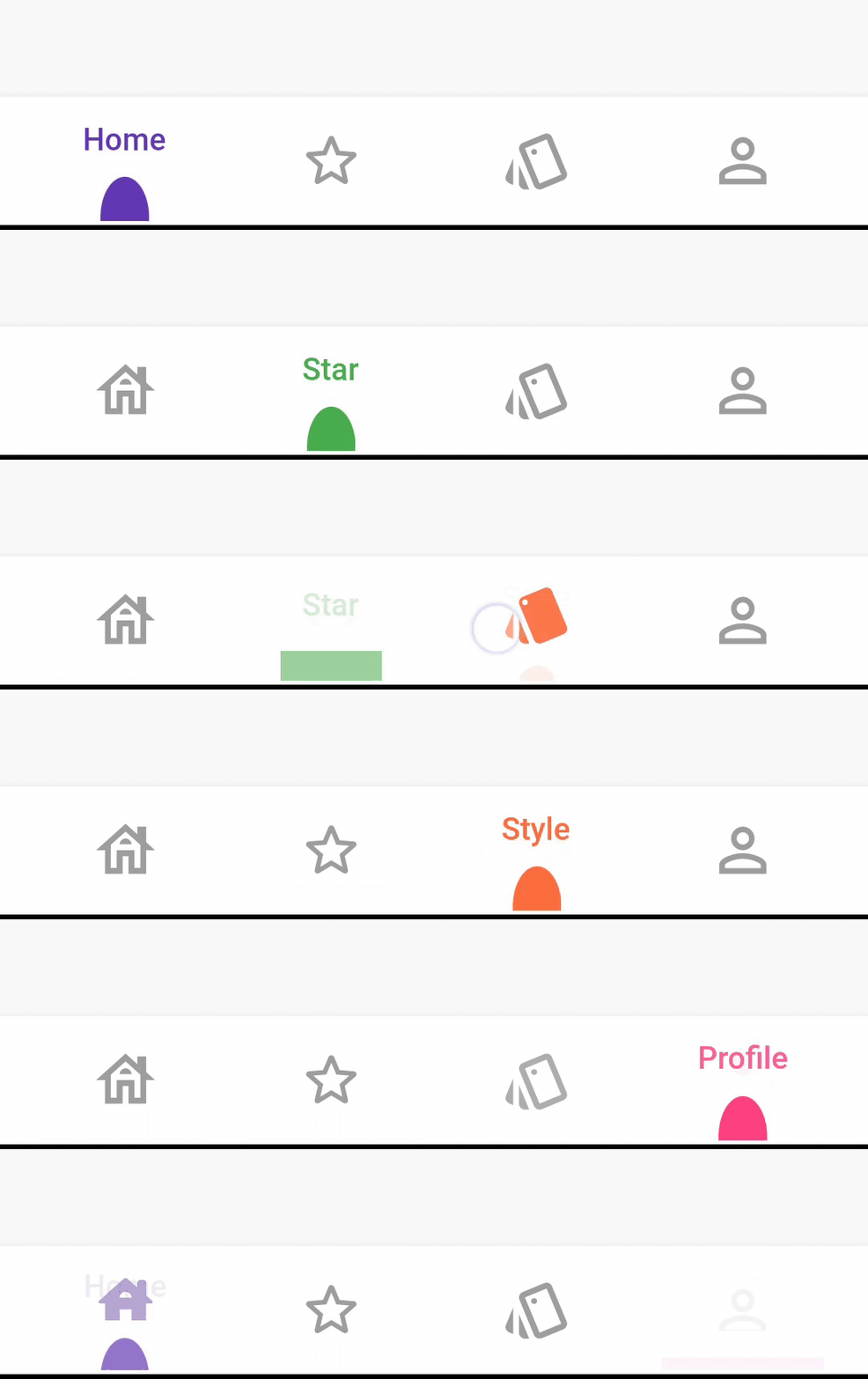
DotBarOptions

DotStyle.circle


DotStyle.tile

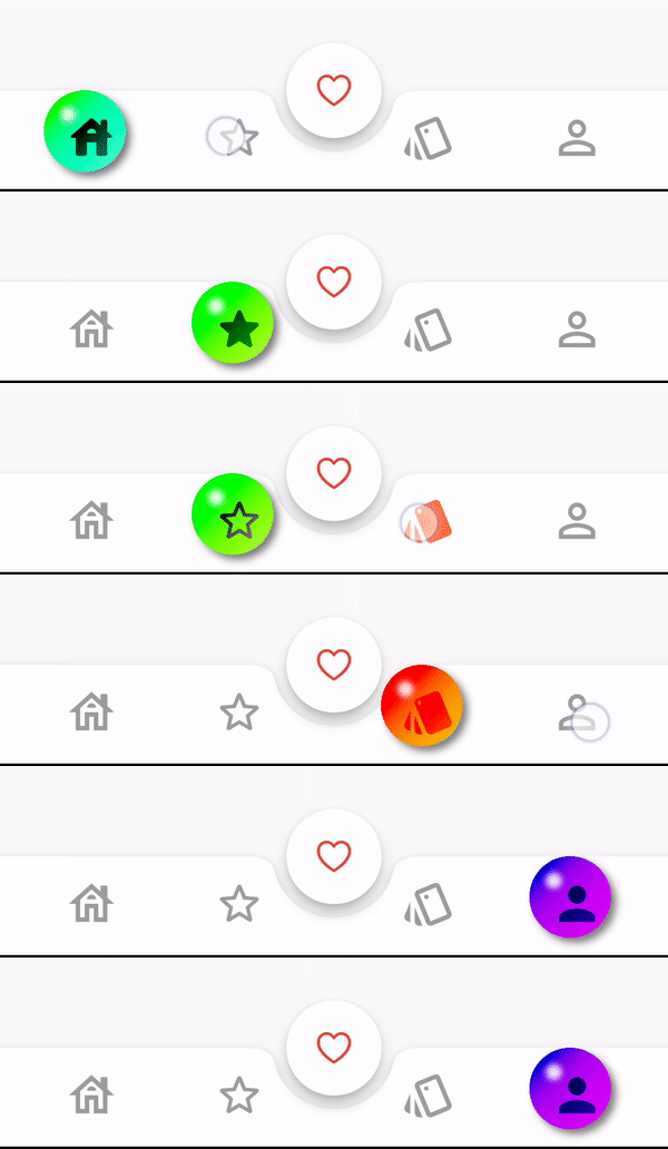
BubbleBarOptions

BubbleBarStyle.horizotnal

BubbleFillStyle.outlined

BubbleBarStyle.vertical

BubbleFillStyle.outlined

Migrate to 1.0.0

List<dynamic> items is changed to List<BottomBarItem> items

From version 1.0.0 option: AnimatedBarOptions and BubbleBarOptions will be used to change the bar items type and properties.

Example

StylishBottomBar(
//  option: const BarBlurOptions.liquidGlass(),
//
//  option: const BarBlurOptions.frosted(),
//
//  option: AnimatedBarOptions(
//    iconSize: 32,
//    barAnimation: BarAnimation.liquid,
//    iconStyle: IconStyle.animated,
//    opacity: 0.3,
//  ),
//
//  option: BubbleBarOptions(
//    barStyle: BubbleBarStyle.horizotnal,
//    // barStyle: BubbleBarStyle.vertical,
//    bubbleFillStyle: BubbleFillStyle.fill,
//    // bubbleFillStyle: BubbleFillStyle.outlined,
//    opacity: 0.3,
//  ),
//
  option: DotBarOptions(
    dotStyle: DotStyle.tile,
    gradient: const LinearGradient(
      colors: [
        Colors.deepPurple,
        Colors.pink,
      ],
      begin: Alignment.topLeft,
      end: Alignment.bottomRight,
    ),
  ),
  items: [
    BottomBarItem(
      icon: const Icon(Icons.abc),
      title: const Text('Abc'),
      backgroundColor: Colors.red,
      selectedIcon: const Icon(Icons.read_more),
    ),
    BottomBarItem(
      icon: const Icon(Icons.safety_divider),
      title: const Text('Safety'),
      backgroundColor: Colors.orange,
    ),
    BottomBarItem(
      icon: const Icon(Icons.cabin),
      title: const Text('Cabin'),
      backgroundColor: Colors.purple,
    ),
  ],
  fabLocation: StylishBarFabLocation.end,
  hasNotch: true,
  currentIndex: selected,
  onTap: (index) {
    setState(() {
      selected = index;
      controller.jumpToPage(index);
    });
  },
)

Contributions and pull requests are welcome! We value your input and appreciate any improvements or suggestions you can provide. Feel free to submit a pull request with your changes. Don't forget to star the repository if you find it useful. Thank you for your collaboration!

Categories

Source repository

Projects using this package