Search packages, repositories and app categories

sweetsheet cover
Package detailsv0.4.0

sweetsheet

Show beautiful bottom sheet as confirmation dialog quickly and easily.

AndroidiOSWebmacOSWindowsLinux
30-day downloads
50
Likes
231
Pub points
140

Install package

flutter pub add sweetsheet

Package Overview

Package selection guidance compiled from public package information, community data, and project usage.

Sweetsheet is a Flutter package that enables developers to quickly and easily display attractive bottom sheets as confirmation dialogs. It simplifies the process of creating modal bottom sheets with minimal code, offering a clean and modern UI out of the box. Designed for seamless integration across multiple platforms, it supports Android, iOS, Web, macOS, Windows, and Linux. The package enhances user experience by providing smooth animations and customizable layouts while maintaining simplicity and consistency in design.

Use cases

  • Quick confirmation dialogs
  • User action prompts
  • Form submission confirmations
  • Modal navigation
  • Simple pop-up interfaces

Key features

  • Easy-to-use API
  • Beautiful default styling
  • Cross-platform support
  • Customizable content
  • Smooth animations
  • Minimal boilerplate

Suitable for

  • Developers seeking fast bottom sheet implementation
  • Projects needing lightweight confirmation dialogs
  • Apps with consistent UI patterns
  • Teams prioritizing development speed
  • Flutter beginners exploring bottom sheets

Considerations

  • Limited customization beyond basic styling
  • Not ideal for complex interactive sheets
  • Depends on external dependencies for full functionality
  • Best suited for simple use cases rather than advanced modals

Original README

Original README snapshot from the linked source repository. Visit the repository for the latest content.

sweetsheet

Show beautiful bottom sheet as confirmation dialog quickly and easily.

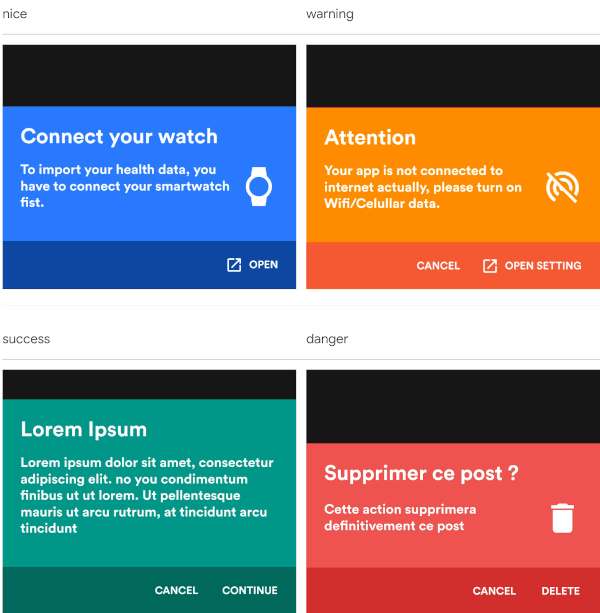
nice warning
nice warning
success danger
success danger

and since version 0.2.0 , it is fully customizable.

custom dark custom light
success danger

Getting Started

With increasingly large smartphones, it has become almost impossible to have good ergonomics in an application using confirmation dialogs. The SweetSheet package allows you to show beautiful bottoms sheets to replace your confirmation dialogs and maintain a good user experience.

How to use?

Add this to your package's pubspec.yaml file:

dependencies:
  sweetsheet: ^0.4.0

And import it:

import 'package:sweetsheet/sweetsheet.dart';

to start using the sheets, you have to create the instance of the SweetSheet class first.

final SweetSheet _sweetSheet = SweetSheet();

Now you can show the bottom sheet by calling the method show() on the instance. This is the signature of the show method

  show({
    required BuildContext context,
    Text? title,
    required Text description,
    required CustomSheetColor color,
    required SweetSheetAction positive,
    EdgeInsets? contentPadding = const EdgeInsets.symmetric(horizontal: 24.0, vertical: 24.0),
    EdgeInsets? actionPadding = const EdgeInsets.all(8.0),
    SweetSheetAction? negative,
    IconData? icon,
    bool useRootNavigator = false,
    bool isDismissible = true,
  }) {}

This is the signature of the SweetSheetAction widget.

class SweetSheetAction extends StatelessWidget {
  final String title;
  final VoidCallback onPressed;
  final IconData icon;
  final Color color;

  SweetSheetAction({
    @required this.title,
    @required this.onPressed,
    this.icon,
    this.color = Colors.white,
  });  
}

Attention : At least one action is required and the icons are IconData for uniformity purpose.

The SweetSheetColor is a class which have four static values and it determine the color of the sheet by creating a CustomSheetColor:

  • SweetSheetColor.SUCCESS (green)
  • SweetSheetColor.DANGER (red)
  • SweetSheetColor.WARNING (orange)
  • SweetSheetColor.NICE (blue)

Customisation

To customise, create a new instance of CustomSheetColor and pass it to the argument color when calling the method show. signature of CustomSheetColor:

class CustomSheetColor {
  Color main;
  Color accent;
  Color icon;

  CustomSheetColor({@required this.main, @required this.accent, this.icon});
}

To customise the action, pass a new color to color argument of SweetSheetAction.

Example:

Warning
_sweetSheet.show(
    context: context,
    title: Text("Attention"),
    description: Text(
        'Your app is not connected to internet actually, please turn on Wifi/Celullar data.'),
    color: SweetSheetColor.WARNING,
    icon: Icons.portable_wifi_off,
    positive: SweetSheetAction(
      onPressed: () {
        Navigator.of(context).pop();
      },
      title: 'OPEN SETTING',
      icon: Icons.open_in_new,
    ),
    negative: SweetSheetAction(
      onPressed: () {
        Navigator.of(context).pop();
      },
      title: 'CANCEL',
    ),
);
Custom Light
_sweetSheet.show(
    context: context,
    description: Text(
      'Place your order. Please confirm the placement of your order : Iphone X 128GB',
      style: TextStyle(color: Color(0xff2D3748)),
    ),
    color: CustomSheetColor(
      main: Colors.white,
      accent: Color(0xff5A67D8),
      icon: Color(0xff5A67D8),
    ),
    icon: Icons.local_shipping,
    positive: SweetSheetAction(
      onPressed: () {
        Navigator.of(context).pop();
      },
      title: 'CONTINUE',
    ),
    negative: SweetSheetAction(
      onPressed: () {
        Navigator.of(context).pop();
      },
      title: 'CANCEL',
  ),
);
That is all. Have fun!

Categories

Source repository

Projects using this package

No data available yet.