Search packages, repositories and app categories

swipable_stack cover
Package detailsv2.0.0

swipable_stack

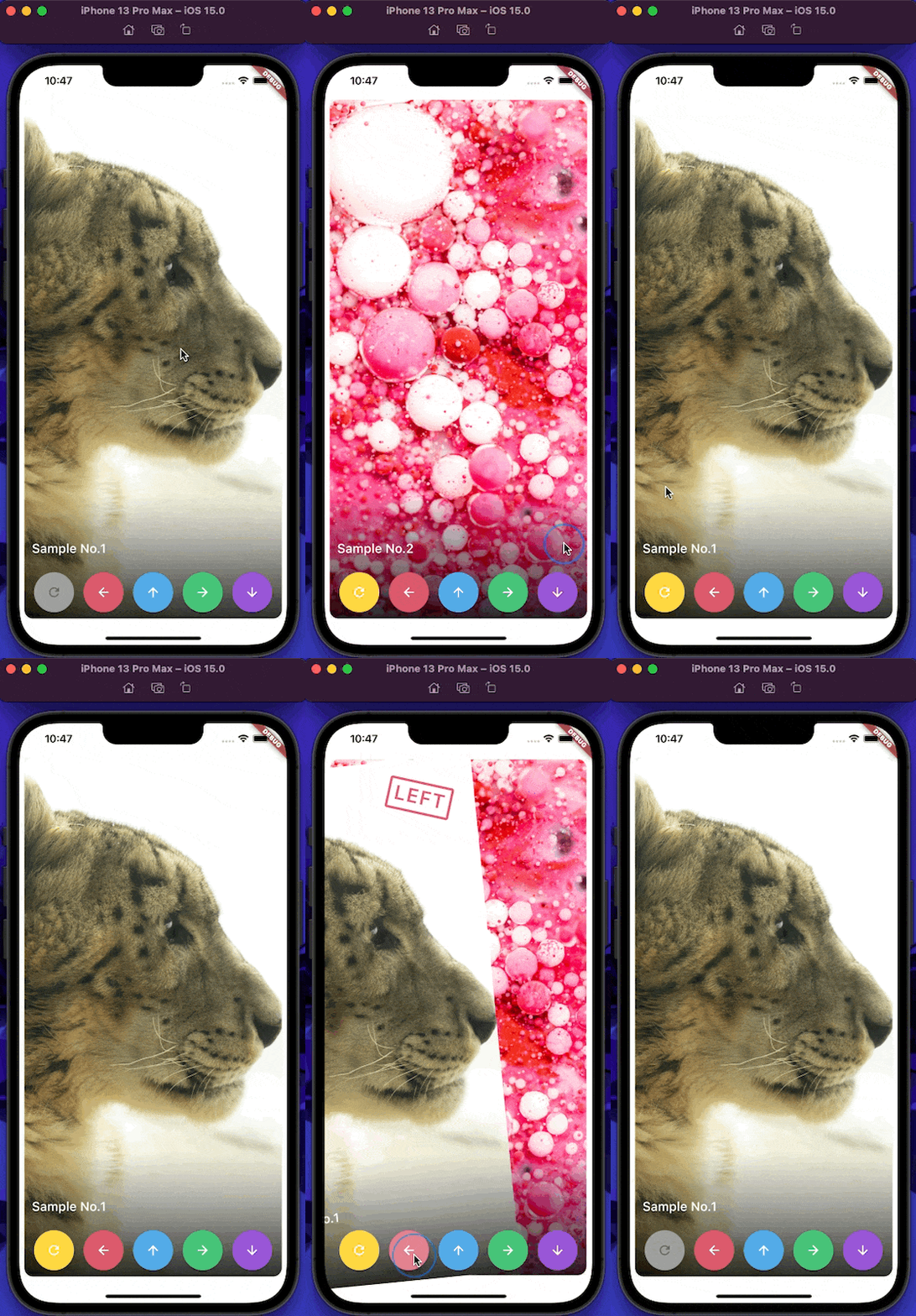
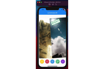
A widget for stacking cards, which users can swipe horizontally and vertically with beautiful animations like Tinder.

AndroidiOSWebmacOSWindowsLinux
30-day downloads
8.3K
Likes
325
Pub points
150

Install package

flutter pub add swipable_stack

Package Overview

Package selection guidance compiled from public package information, community data, and project usage.

A Flutter widget that creates an interactive card stack with smooth horizontal and vertical swiping animations, inspired by Tinder. It enables users to swipe cards left or right (or up/down) with intuitive gestures and elegant transitions. Ideal for apps requiring a swipe-based interface, such as dating apps, product showcases, or content discovery features. The package supports multiple platforms including Android, iOS, Web, macOS, Windows, and Linux, ensuring consistent behavior across devices.

Use cases

  • Dating app interfaces
  • Product or item discovery
  • Content browsing with swipe gestures
  • Interactive onboarding flows
  • Gamified user engagement
  • Swipe-based quizzes

Key features

  • Smooth horizontal and vertical swiping
  • Customizable animation curves
  • Gesture recognition with feedback
  • Support for multiple platforms
  • Easy integration with existing UI
  • Configurable card alignment and spacing

Suitable for

  • Developers building swipe-based UIs
  • Designers seeking interactive card experiences
  • Apps requiring gesture-driven navigation
  • Cross-platform mobile and web applications
  • Prototyping interactive layouts

Considerations

  • May require performance tuning for large card stacks
  • Limited built-in customization for complex animations
  • Requires careful handling of state during rapid swipes
  • Not optimized for extremely high-frequency swipe interactions
  • Best suited for moderate card counts to maintain responsiveness

Original README

Original README snapshot from the linked source repository. Visit the repository for the latest content.

swipable_stack

pub.dev github likes popularity pub points license

A widget for stacking cards, which users can swipe horizontally and vertically with beautiful animations like Tinder UI.

demo

(Sorry, the package name swipable_stack is typo of swipeable stack)

Usage

builder

A SwipableStack uses a builder to display widgets.

SwipableStack(
  builder: (context, properties) {
    return Image.asset(imagePath);
  },
),

onSwipeCompleted

You can get completion event with onSwipeCompleted.

SwipableStack(
  onSwipeCompleted: (index, direction) {
    print('$index, $direction');
  },
)

overlayBuilder

You can show overlay on the front card with overlayBuilder.

SwipableStack(
  overlayBuilder: (context, properties) {
    final opacity = min(properties.swipeProgress, 1.0);
    final isRight = properties.direction == SwipeDirection.right;
    return Opacity(
      opacity: isRight ? opacity : 0,
      child: CardLabel.right(),
    );
  },
)

controller

SwipableStackController allows you to control swipe action & also rewind recent action.

final controller = SwipableStackController();

SwipableStack(
  controller:controller,
  builder: (context, properties) {
    return Image.asset(imagePath);
  },
);
controller.next(
  swipeDirection: SwipeDirection.right,
);
controller.rewind();

SwipableStackController provides to access currentIndex of SwipableStack.

final controller = SwipableStackController();
controller.addListener(() {
  print('${_controller.currentIndex}');
});

onWillMoveNext

You can also restrict user actions according to index or action with onWillMoveNext.

SwipableStack(
  onWillMoveNext: (index, direction) {
    final allowedActions = [
      SwipeDirection.right,
      SwipeDirection.left,
    ];
    return allowedActions.contains(direction);
  },
);

swipeAssistDuration

You can set the speed the user is able to swipe through Widgets with the swipeAssistDuration.

SwipableStack(
  swipeAssistDuration: Duration(milliseconds: 100),
)

The default is 650ms.

stackClipBehaviour

You can set the clipBehaviour of the stack with the stackClipBehaviour.
Change it to Clip.none to exceed the boundaries of parent widget size.

SwipableStack(
  stackClipBehaviour: Clip.none,
)

The default is Clip.hardEdge.

allowVerticalSwipe

Disable vertical swipe with allowVerticalSwipe.
Changing to false disable vertical swipe capabilities

SwipableStack(
  allowVerticalSwipe: false,
)

The default is true.

swipeTopAnchor

Set the swipe anchor with swipeAnchor with the following enum SwipeAnchor.top : card rotation on bottom and anchored on top SwipeAnchor.bottom : card rotation on top and anchored on bottom

SwipableStack(
  swipeAnchor: SwipeAnchor.top,
)

The default is SwipeAnchor.top.

Categories

Dependencies

Dependency list 1 items

Source repository

Projects using this package

No data available yet.