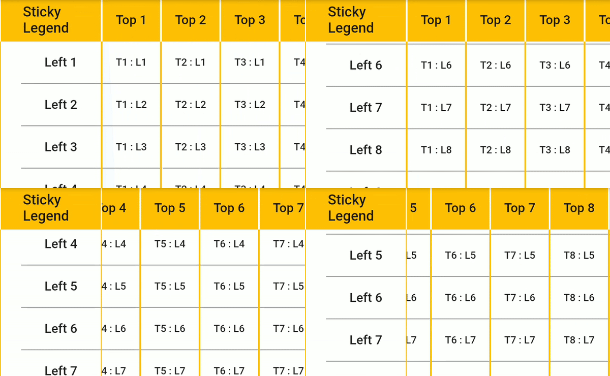
Original README snapshot from the linked source repository. Visit the repository for the latest content.
Table Sticky Headers
This package for Flutter allows you to display two-dimension table with both sticky headers.
Key of this package is sticky headers. You can scroll table any direction and headers (top and left) will always stay.
Cells themselves are fully customizable as you can fill them with Widgets.
To work with table you need to fill it with data. It has three builders for generating title column (List), title row (List) and content itself (List.
Simplest UseCase. You have two-dimensional array of Strings. Builder takes value from array and generates Text widget:
contentCellBuilder: (i, j) => Text(data[i][j]),
For more advanced usage - decorate Text with other widgets like borders, cell colors, etc. Check decorated_example.dart to see it in action.
You can also wrap cell with tap listeners and add custom behavior on tap. Check tap_handler_example.dart.
The cell dimensions can be customized using the cellDimensions property of StickyHeadersTable. Use:
- CellDimensions.base: Default fixed values.
- CellDimensions.uniform: Same dimensions for each cell.
- CellDimensions.fixed: Custom fixed width and height for each content cell.
- CellDimensions.variableColumnWidth: Different width for each column.
- CellDimensions.variableRowHeight: Different height for each row.
- CellDimensions.variableColumnWidthAndRowHeight: Different width for each column and different height for each row.
The alignment of the cell contents can be customized using the cellAlignments property of StickyHeadersTable. Use:
- CellAlignments.base: Default alignment value (Alignment.center).
- CellAlignments.uniform: Same alignment for each cell.
- CellAlignments.fixed: Same alignment for each content cell, but different alignment for the sticky column, row and legend.
- CellAlignments.variableColumnAlignment: Different alignment for each column.
- CellAlignments.variableRowAlignment: Different alignment for each row.
- CellAlignments.variable: Different alignment for every cell.
You can provide functions that execute when tapping a cell by setting the properties:
- onStickyLegendPressed: () => print('Sticky legend pressed.'),
- onColumnTitlePressed: (i) => print('Column $i title pressed.'),
- onRowTitlePressed: (j) => print('Row $j title pressed.'),
- onContentCellPressed: (i, j) => print('Cell at column $i, row $j pressed.'),
You can provide offset to the table for X and Y, by using either double offset or cell index offset:
- initialScrollOffsetX
- initialScrollOffsetY
or
- scrollOffsetIndexX
- scrollOffsetIndexY
You can also set a callback for when the scrolling ends by setting the onEndScrolling property.
By combining the two above features, you can return to the previous scroll position after a rebuild. See example below:
double _scrollOffsetX = 0.0;
double _scrollOffsetY = 0.0;
StickyHeadersTable(
initialScrollOffsetX: _scrollOffsetX,
initialScrollOffsetY: _scrollOffsetY,
onEndScrolling: (scrollOffsetX, scrollOffsetY) {
_scrollOffsetX = scrollOffsetX;
_scrollOffsetY = scrollOffsetY;
},
)
You can also define a custom set of scroll controllers for both title and body with the scrollControllers property.
IMPORTANT: don't forget to dispose your scroll controllers if you are using this field. Otherwise table will take care of disposal.
Feature requests and PRs are welcome.
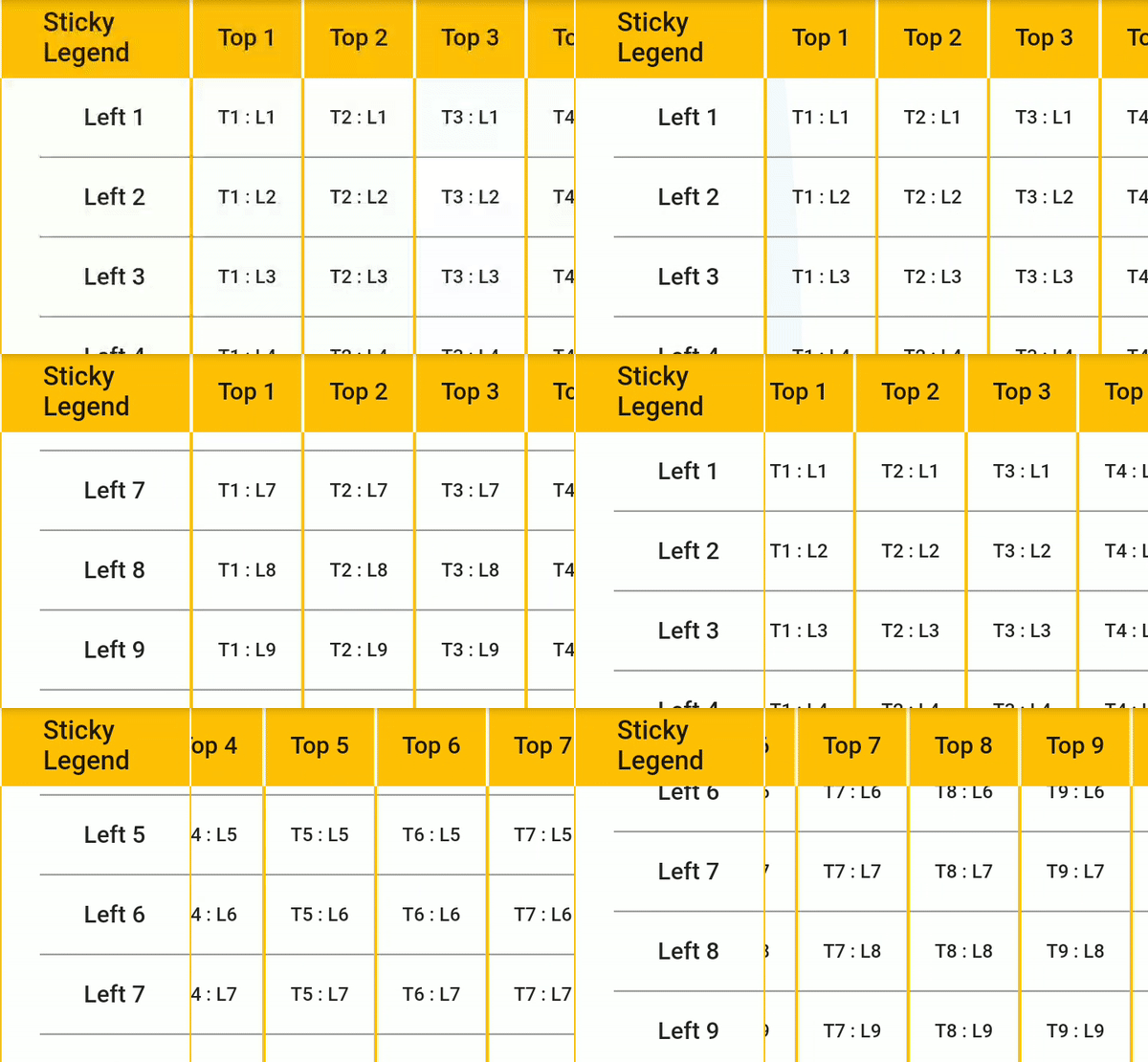
Widget usage example:
StickyHeadersTable(
columnsLength: titleColumn.length,
rowsLength: titleRow.length,
columnsTitleBuilder: (i) => Text(titleColumn[i]),
rowsTitleBuilder: (i) => Text(titleRow[i]),
contentCellBuilder: (i, j) => Text(data[i][j]),
legendCell: Text('Sticky Legend'),
),
Visit examples to see it in details
Support
Please file issues and feature requests.
Project is on support-only mode. Feel free to contact me so I can share access rights to publish
updates and maintain.
Getting Started
This project is a starting point for a Dart
package,
a library module containing code that can be shared easily across
multiple Flutter or Dart projects.
For help getting started with Flutter, view our
online documentation, which offers tutorials,
samples, guidance on mobile development, and a full API reference.