Package selection guidance compiled from public package information, community data, and project usage.
TDesign Flutter is a comprehensive UI component library developed by Tencent, designed for building consistent and visually appealing mobile applications across Android, iOS, macOS, Windows, and Linux. It offers a rich set of customizable widgets, following TDesign's design system to ensure cohesive user experiences. The library integrates seamlessly with Flutter projects via pub package manager and provides extensive documentation and source code on GitHub. Ideal for teams prioritizing design consistency and rapid development.
Use cases
Building cross-platform mobile apps
Creating consistent UIs in enterprise applications
Rapid prototyping with pre-built components
Developing design-system-driven interfaces
Enhancing UI consistency across platforms
Key features
Pre-designed, reusable widgets
Cross-platform compatibility
Alignment with TDesign design system
Extensive documentation
Open-source on GitHub
Suitable for
Flutter developers at Tencent or similar enterprises
Teams using TDesign design guidelines
Projects requiring fast UI development
Mobile app teams focused on design consistency
Developers targeting multiple operating systems
Considerations
Requires familiarity with TDesign design principles
May introduce additional bundle size
Limited customization options in early versions
Dependent on external maintenance
Best suited for large-scale or enterprise apps
Original README
Original README snapshot from the linked source repository. Visit the repository for the latest content.
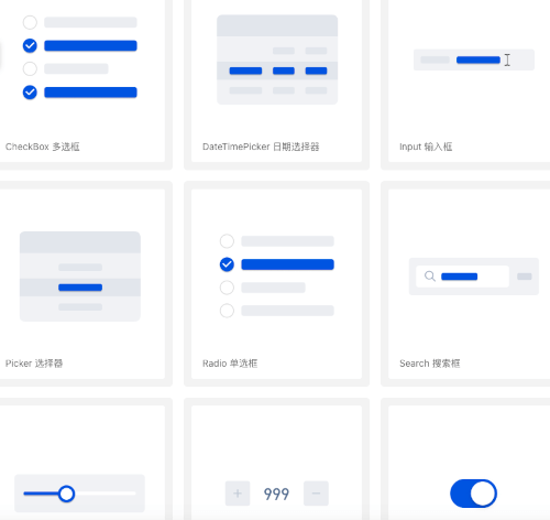
TDesign Flutter is a cross-platform UI component library based on Tencent's design system. Built with the Flutter framework, it enables rapid development of beautiful, consistent mobile/web applications with rich pre-built components and theme customization capabilities, supporting iOS, Android, and Web platforms.
🎉 Features
Provides Flutter UI component library following TDesign design specifications
Supports theme customization to match your App's design style
Includes a comprehensive Icon library with custom replacement support
Defines color groups according to TDesign specifications (viewable in TColors)
Real-time preview of default color values through the color declaration class
📱 Preview
Android: Scan the QR code to download the preview app
Configure theme styles (colors, font sizes, font styles, corner radius, shadows) through JSON files. Retrieve theme data using TTheme.of(context) or TTheme.defaultData().
Recommendation: Use TTheme.of(context) for components that should follow the local theme. Only use TTheme.defaultData() for components that don't need to follow local themes.
If you don't want to customize too many colors but still want a beautiful custom theme, the "Theme Generator" is a great choice.
Note: Since v0.2.6, the Theme Generator supports "Dark Mode". See Dark Mode for details.
Generate: Visit TDesign Theme Generator, click the theme generator below, select your desired colors in the generator on the right, and click download.
Convert: You will get a theme.css file. Place it in tdesign-component/example/shell/theme/, modify css2JsonTheme.dart with your file name, theme name, and output path to generate a theme.json file.
Apply: Load the theme JSON into TTheme, and your beautiful custom theme is ready.
Theme configurations generated by the Theme Generator support dark mode colors by default.
// ...// Set three properties in MaterialApp as follows. If you have custom theme properties, you can modify them using the copyWith() method.// Note: Theme switching needs to be implemented by the business side, e.g., using Provider. See tdesign-flutter/tdesign-component/example/lib/component_test/dark_test.dart for reference.MaterialApp(
theme: _themeData.systemThemeDataLight,
darkTheme: _themeData.systemThemeDataDark,
themeMode: themeModeProvider.themeMode,
// ...
)
🌍 Internationalization
TDesign Flutter does not have built-in internationalization, but supports integration with Flutter's i18n capabilities. You can extend the TResourceDelegate class, which abstracts all text resources inside the components, override the methods to get text for internationalization, and inject it via TTheme.setResourceBuilder.
var delegate = IntlResourceDelegate(context);
returnMaterialApp(
home: Builder(
builder: (context) {
// Set the text delegate. Internationalization only takes effect after MaterialApp is initialized, and context needs to be updated each time.TTheme.setResourceBuilder((context) => delegate..updateContext(context), needAlwaysBuild: true);
returnMyHomePage(
title: AppLocalizations.of(context)?.components ?? '',
);
},
),
// Set internationalization
locale: locale,
supportedLocales: AppLocalizations.supportedLocales,
localizationsDelegates: AppLocalizations.localizationsDelegates,
);