Search packages, repositories and app categories

timeline_list cover
Package detailsv0.1.1

timeline_list

Flutter widget for creating highly customizable timelines. Perfect for onboarding flows, progress tracking, and interactive history displays.

AndroidiOSWebmacOSWindowsLinux
30-day downloads
4.1K
Likes
222
Pub points
160

Install package

flutter pub add timeline_list

Package Overview

Package selection guidance compiled from public package information, community data, and project usage.

A highly customizable Flutter widget for building interactive timelines, ideal for visualizing sequences such as onboarding processes, progress tracking, and historical event displays. It supports various layout options and styling, enabling developers to create engaging user experiences across multiple platforms. The package is designed for flexibility, allowing customization of timeline items, connectors, and markers. It integrates seamlessly into Flutter apps with minimal setup.

Use cases

  • Onboarding flows
  • Progress tracking
  • History displays
  • Event sequencing
  • User journey visualization
  • Interactive tutorials

Key features

  • Highly customizable design
  • Support for multiple platforms
  • Flexible item and connector styling
  • Smooth animations
  • Easy integration with Flutter
  • Responsive layout options

Suitable for

  • App onboarding screens
  • Task completion trackers
  • Chronological data presentation
  • Educational apps
  • User activity logs

Considerations

  • Requires manual configuration for complex layouts
  • Limited built-in themes
  • May need additional styling for accessibility
  • Performance impact with large datasets
  • Not optimized for vertical scrolling in dense timelines

Original README

Original README snapshot from the linked source repository. Visit the repository for the latest content.

Flutter Timeline Widget

pub package Flutter Timeline List Web Demo

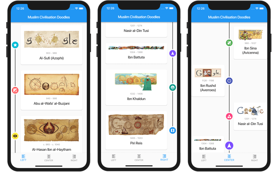
A highly customizable Flutter widget for displaying vertical timelines with custom markers, icons, and flexible positioning options.

Flutter Timeline List Screenshot

[!WARNING] 🦚 The documentation was created using LLMs. If you notice any errors or typos, please submit a Pull Request or create an issue.

Features

  • 🎯 Three timeline positions: start (left), center, or end (right)
  • 🎨 Fully customizable markers with any widget as content or icon
  • 📍 Flexible icon alignment: top, center, or bottom of markers
  • 🎯 Individual marker positioning for centered timelines
  • 🔄 Support for reversed timeline order
  • 📱 Custom scroll physics and controller support

Installation

Add this to your package's pubspec.yaml file:

dependencies:
  timeline_list: ^0.1.0

Usage

Simple Timeline

Flutter Simple Timeline List Screenshot

import 'package:timeline_list/timeline_list.dart';

Timeline(
  children: [
    Marker(child: Text("Step 1")),
    Marker(child: Text("Step 2")),
    Marker(child: Text("Step 3"))
  ],
)
Onboarding Example

Here's a more advanced example showing an onboarding timeline with custom icons:

Flutter Onboarding Timeline List Screenshot

var checkIcon = Container(
    width: 16,
    height: 16,
    decoration: BoxDecoration(shape: BoxShape.circle, color: Colors.green),
    child: Icon(Icons.check, color: Colors.white, size: 12));
var emptyIcon = Container(
    width: 16,
    height: 16,
    decoration: BoxDecoration(shape: BoxShape.circle, color: Colors.grey));
return Scaffold(
    appBar: AppBar(title: const Text("Onboarding example")),
    body: Column(children: [
      Timeline.builder(
        context: context,
        markerCount: 10,
        properties: TimelineProperties(
            iconAlignment: MarkerIconAlignment.center,
            iconSize: 16,
            timelinePosition: TimelinePosition.start),
        markerBuilder: (context, index) => Marker(
          child: Padding(
            padding: const EdgeInsets.all(8.0),
            child: Text("Step ${index + 1}"),
          ),
          icon: index >= 8 ? emptyIcon : checkIcon,
          position: MarkerPosition.left,
        ),
      ),
    ]));

Customization

Timeline Properties
  • timelinePosition: Controls the overall timeline position (start, center, end)
  • iconAlignment: Sets icon alignment relative to marker content
  • iconSize: Defines the size of marker icons
  • lineWidth: Sets the width of connecting lines
  • lineColor: Customizes the color of connecting lines
  • itemGap: Controls spacing between markers
  • iconGap: Sets gap between icon and marker content
Marker Properties
  • child: The main content widget of the marker
  • icon: Optional custom icon widget
  • position: Marker position for centered timelines (left, right)
  • onTap: Optional callback for marker tap events
  • maxWidth: Maximum width constraint for marker content

Examples

Check out the example/ folder for complete sample applications, including:

  • Fully featured timeline with custom icons and widgets
  • Simple onboarding flow

Contributing

This repo is looking for maintainers. Contributions are welcome! Please feel free to submit a Pull Request.

Thank you for all the contributors!


Sponsored by:

Categories

Source repository

Projects using this package