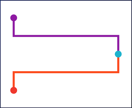
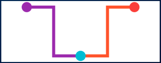
Package selection guidance compiled from public package information, community data, and project usage.
timeline_tile is a Flutter package designed to create highly customizable timelines with ease. It provides flexible widgets for building vertical or horizontal timelines, supporting various styles, colors, and content layouts. Developers can customize the appearance of timeline indicators, connectors, and tiles to match their app's design. The package is lightweight and integrates seamlessly into existing Flutter projects, making it ideal for displaying event histories, project progress, or chronological data in an engaging way.
Use cases
Displaying event histories
Showing project milestones
Visualizing step-by-step processes
Creating interactive timelines
Presenting historical data
Enhancing onboarding flows
Key features
Highly customizable timeline design
Support for vertical and horizontal layouts
Configurable indicators and connectors
Flexible tile content placement
Lightweight and easy integration
Extensible widget structure
Suitable for
Developers building chronological UIs
Apps requiring visual progress tracking
Educational or onboarding interfaces
Project management tools
Content-rich applications
Considerations
Requires manual layout configuration for complex designs
Limited built-in animations
Best suited for static or simple dynamic timelines
May need additional styling for responsive behavior
Not optimized for very long timelines without performance tuning
Original README
Original README snapshot from the linked source repository. Visit the repository for the latest content.
TimelineTile
A package to help build customisable timelines in Flutter.
Example
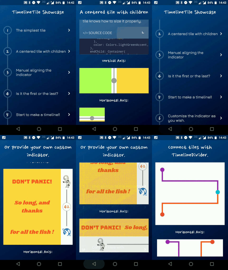
You can access the example project for a Timeline Showcase.
A Timeline consists in a group of TimelineTiles. To build a tile you can simply use:
TimelineTile()
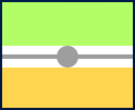
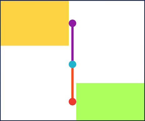
Which will build a default tile with a vertical axis, that aligns to the start, with a height of 100:
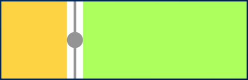
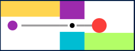
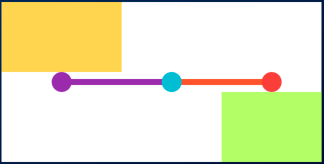
The axis can be switched to render an horizontal tile, aligned to the start, with a default width of 100:
TimelineTile(axis: TimelineAxis.horizontal)
There are 4 types of alignment.
TimelineAlign.start
TimelineAlign.end
TimelineAlign.center
TimelineAlign.manual
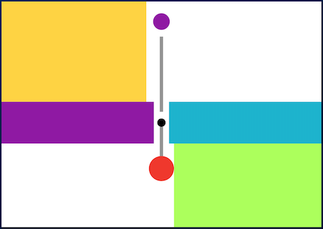
The start and end alignment allows a child in their opposite sides. On the other hand, both center and manual allows children on both sides. For example, one tile with alignment to the center:
When providing children to the vertical tile, the height will be as minimum as possible, so you can control it with a height constraint (at least minHeight). This way the tile knows how to size it properly.
If the axis is horizontal, the things are the opposite. The width will be as minimum as possible, so you can control it with a width constraint (at least minWidth). This way the tile knows how to size it properly.
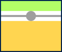
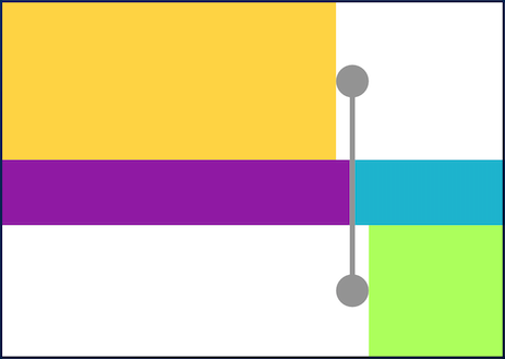
With TimelineAlign.manual you can provide the lineXY, which allows you to specify a value from 0.0 to 1.0, that represents a size percentage. For example, aligning at 30% of the width or height:
You can finally start to combine some tiles to make a Timeline. The flag hasIndicator can control whether an indicator should or shouldn't be rendered.
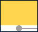
The default indicator is a circle, and you can customize it as you wish. With IndicatorStyle you can change the color, the X/Y position based on values from 0.0 to 1.0 or give it a padding. You must explicitly provide its width (vertical) or height (horizontal) though.
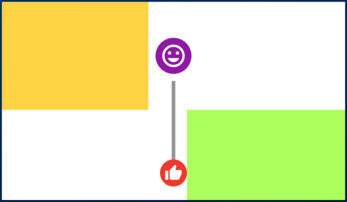
With the indicator parameter you can customize the tile with your own indicator. However, you must control its size through both width and height parameters.