Search packages, repositories and app categories

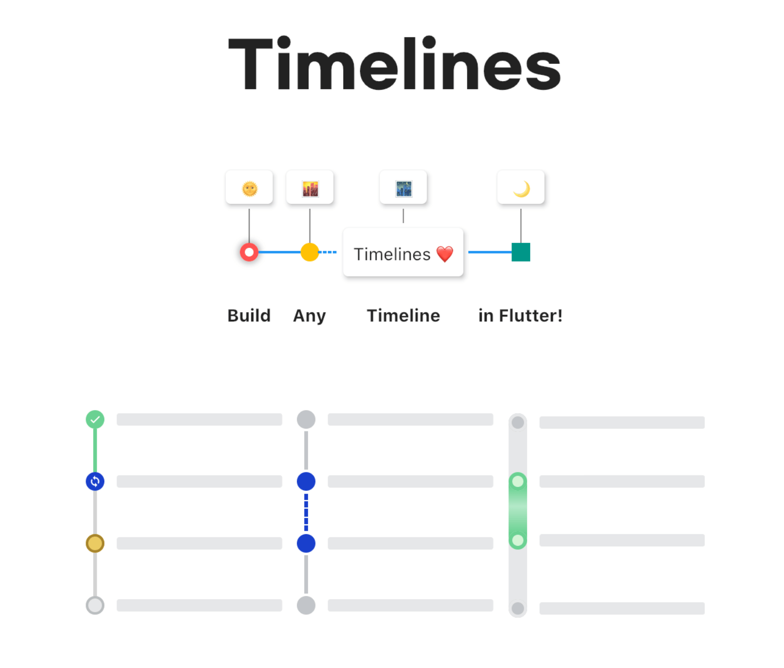
timelines cover
Package detailsv0.1.0

timelines

A powerful & easy to use timeline package for Flutter. All UI components in this package are separate widgets.

30-day downloads
8.3K
Likes
1.8K
Pub points
70

Install package

flutter pub add timelines

Package Overview

Package selection guidance compiled from public package information, community data, and project usage.

The timelines package is a flexible and user-friendly Flutter library designed to create customizable timeline UIs. It provides modular, standalone widgets that allow developers to build complex timelines with ease. Each component—such as timeline items, connectors, and indicators—is implemented as a separate widget, enabling fine-grained control over layout and styling. Ideal for displaying chronological data like project progress, event histories, or process flows, it supports both vertical and horizontal orientations. The package emphasizes simplicity and extensibility, making it suitable for apps requiring clean, interactive timelines.

Use cases

  • Displaying project milestones
  • Showing event history in apps
  • Visualizing step-by-step processes
  • Creating onboarding sequences
  • Presenting historical data
  • Building task tracking interfaces

Key features

  • Modular widget components
  • Support for vertical and horizontal layouts
  • Customizable connectors and indicators
  • Easy integration with existing Flutter apps
  • Extensible design for custom styling
  • Lightweight and focused functionality

Suitable for

  • Developers building chronology-based UIs
  • Apps needing visual progress tracking
  • Educational or productivity applications
  • Onboarding or tutorial flows
  • Designers wanting reusable timeline elements

Considerations

  • Limited built-in animations
  • No automatic item alignment handling
  • Requires manual layout management
  • Not optimized for very long timelines
  • No support for touch gestures on items
  • Best suited for static or simple dynamic timelines

Original README

Original README snapshot from the linked source repository. Visit the repository for the latest content.

banner

Pub Awesome Flutter License: MIT

A powerful & easy to use timeline package for Flutter! 🚀

Caveat: This package is an early stage. Not enough testing has been done to guarantee stability. Some APIs may change.

Examples

Check it out on the web or look at the source code.

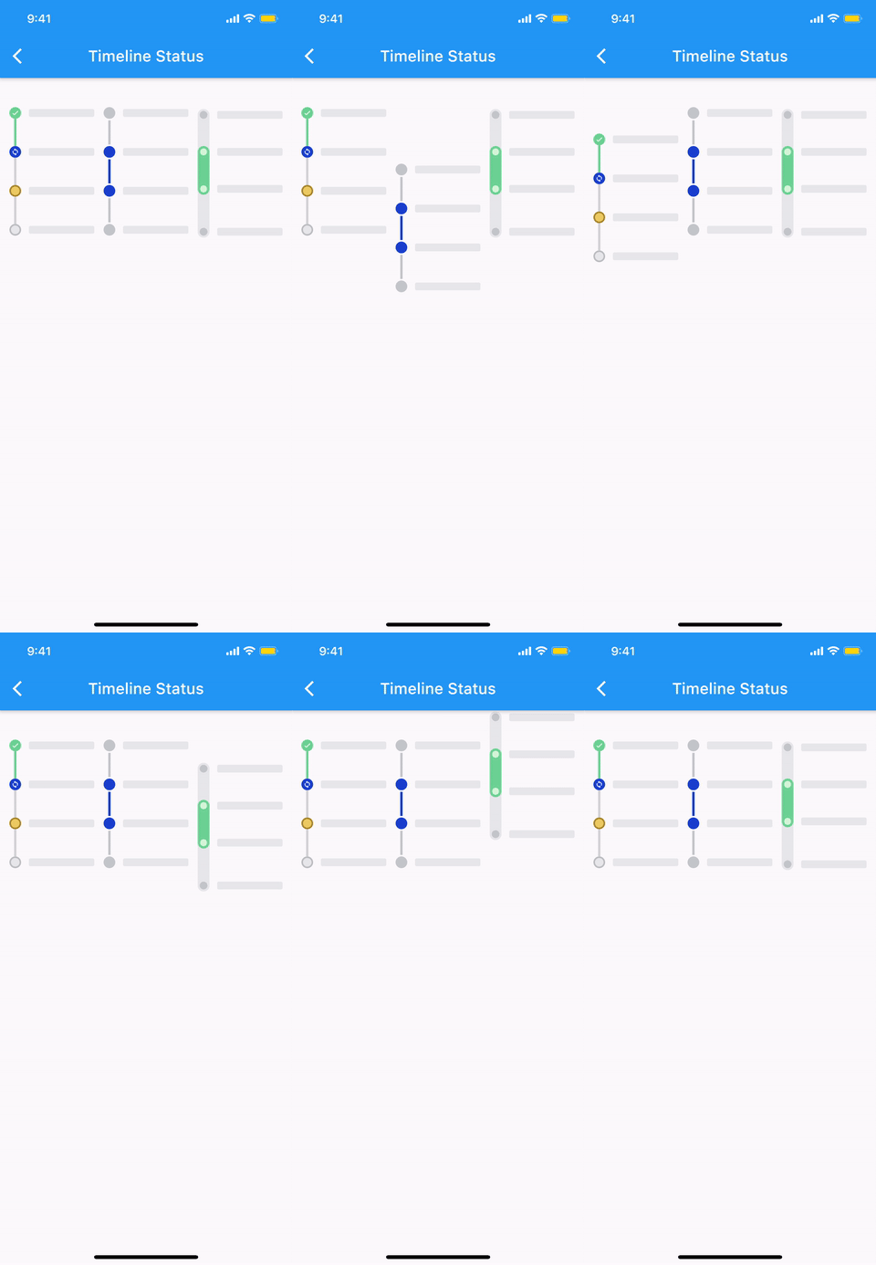
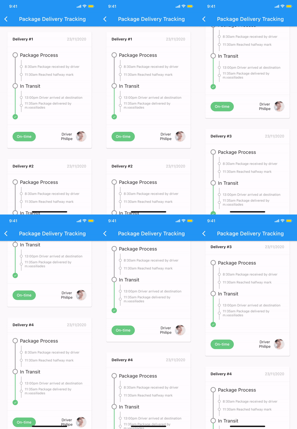
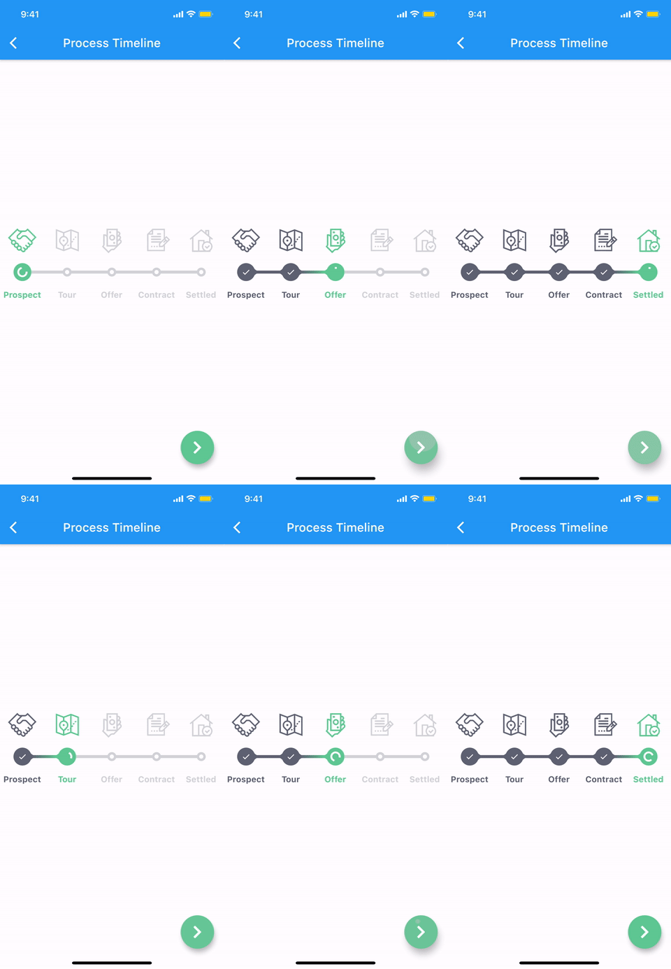
Timeline status Package delivery tracking Process timeline
timeline_status package_delivery_tracking.gif process_timeline.gif

More examples
🚧 WIP 🚧

Features

The timeline and each components are all WIDGET.
  • Common styles can be easily implemented with predefined components.
  • Vertical, horizontal direction.
  • Alternating contents.
  • Combination with Flutter widgets(Row, Column, CustomScrollView, etc).
  • Customize each range with themes.

Getting started

Installation

1. Depend on it

Add this to your package's pubspec.yaml file:

dependencies:
  timelines: ^[latest_version]
2. Install it

You can install packages from the command line:

with Flutter:

$ flutter pub get

Alternatively, your editor might support flutter pub get. Check the docs for your editor to learn more.

3. Import it

Now in your Dart code, you can use:

import 'package:timelines/timelines.dart';

Basic Usage

@override
Widget build(BuildContext context) {
  return Timeline.tileBuilder(
    builder: TimelineTileBuilder.fromStyle(
      contentsAlign: ContentsAlign.alternating,
      contentsBuilder: (context, index) => Padding(
        padding: const EdgeInsets.all(24.0),
        child: Text('Timeline Event $index'),
      ),
      itemCount: 10,
    ),
  );
}

Check the Example or the API reference for more details.

Components

Theme

Check out Theme Demo to see how the values inside TimelineTile work with the theme.

To customize the timeline component with a theme, do the following:

TimelineTheme(
  data: TimelineThemeData(...),
  child: DotIndicator(...),
);

If you only want to change part of the parent theme, use TimelineTheme.of(context):

TimelineTheme(
  data: TimelineThemeData.of(context).copyWith(...),
  child: DotIndicator(...),
);

If the component you want to customize is Timeline or FixedTimeline, this is also possible:

FixedTimeline(
  theme: TimelineThemeData(...),
  children: [...],
);
Indicator
ContainerIndicator
ContainerIndicator
ContainerIndicator(
  child: Container(
    width: 15.0,
    height: 15.0,
    color: Colors.blue,
  ),
)
DotIndicator
DotIndicator
DotIndicator()
OutlinedDotIndicator
OutlinedDotIndicator()
Connector
SolidLineConnector
SolidLineConnector
SizedBox(
  height: 20.0,
  child: SolidLineConnector(),
)
DashedLineConnector
DashedLineConnector
SizedBox(
  height: 20.0,
  child: DashedLineConnector(),
)
DecoratedLineConnector
SizedBox(
  height: 20.0,
  child: DecoratedLineConnector(
    decoration: BoxDecoration(
      gradient: LinearGradient(
        begin: Alignment.topCenter,
        end: Alignment.bottomCenter,
        colors: [Colors.blue, Colors.lightBlueAccent[100]],
      ),
    ),
  ),
)
TimelineNode

Pure timeline UI component with no content.

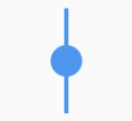
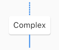
The TimelineNode contains an indicator and two connectors on both sides of the indicator:

Simple TimelineNode
Simple TimelineNode
SizedBox(
  height: 50.0,
  child: TimelineNode.simple(),
)
Complex TimelineNode
SizedBox(
  height: 80.0,
  child: TimelineNode(
    indicator: Card(
      margin: EdgeInsets.zero,
      child: Padding(
        padding: EdgeInsets.all(8.0),
        child: Text('Complex'),
      ),
    ),
    startConnector: DashedLineConnector(),
    endConnector: SolidLineConnector(),
  ),
)
TimelineTile

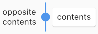
Displays content on both sides of the node:

TimelineTile
TimelineTile
TimelineTile(
  oppositeContents: Padding(
    padding: const EdgeInsets.all(8.0),
    child: Text('opposite\ncontents'),
  ),
  contents: Card(
    child: Container(
      padding: EdgeInsets.all(8.0),
      child: Text('contents'),
    ),
  ),
  node: TimelineNode(
    indicator: DotIndicator(),
    startConnector: SolidLineConnector(),
    endConnector: SolidLineConnector(),
  ),
)
TimelineTileBuilder

TimelineTileBuilder provides powerful build features.

Connection

Each tile draws only half of the line connecting the neighboring tiles. Using the connected constructor, lines connecting adjacent tiles can build as one index.

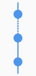
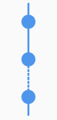
ConnectionDirection.before
Connection direction before
FixedTimeline.tileBuilder(
  builder: TimelineTileBuilder.connectedFromStyle(
    connectionDirection: ConnectionDirection.before,
    connectorStyleBuilder: (context, index) {
      return (index == 1) ? ConnectorStyle.dashedLine : ConnectorStyle.solidLine;
    },
    indicatorStyleBuilder: (context, index) => IndicatorStyle.dot,
    itemExtent: 40.0,
    itemCount: 3,
  ),
)
ConnectionDirection.after
Connection direction after
FixedTimeline.tileBuilder(
  builder: TimelineTileBuilder.connectedFromStyle(
    connectionDirection: ConnectionDirection.after,
    connectorStyleBuilder: (context, index) {
      return (index == 1) ? ConnectorStyle.dashedLine : ConnectorStyle.solidLine;
    },
    indicatorStyleBuilder: (context, index) => IndicatorStyle.dot,
    itemExtent: 40.0,
    itemCount: 3,
  ),
)
ContentsAlign

This value determines how the contents of the timeline will be built:

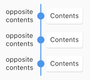
ContentsAlign.basic
Basic contents align
FixedTimeline.tileBuilder(
  builder: TimelineTileBuilder.connectedFromStyle(
    contentsAlign: ContentsAlign.basic,
    oppositeContentsBuilder: (context, index) => Padding(
      padding: const EdgeInsets.all(8.0),
      child: Text('opposite\ncontents'),
    ),
    contentsBuilder: (context, index) => Card(
      child: Padding(
        padding: const EdgeInsets.all(8.0),
        child: Text('Contents'),
      ),
    ),
    connectorStyleBuilder: (context, index) => ConnectorStyle.solidLine,
    indicatorStyleBuilder: (context, index) => IndicatorStyle.dot,
    itemCount: 3,
  ),
)
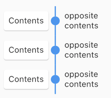
ContentsAlign.reverse
Reverse contents align
FixedTimeline.tileBuilder(
  builder: TimelineTileBuilder.connectedFromStyle(
    contentsAlign: ContentsAlign.reverse,
    oppositeContentsBuilder: (context, index) => Padding(
      padding: const EdgeInsets.all(8.0),
      child: Text('opposite\ncontents'),
    ),
    contentsBuilder: (context, index) => Card(
      child: Padding(
        padding: const EdgeInsets.all(8.0),
        child: Text('Contents'),
      ),
    ),
    connectorStyleBuilder: (context, index) => ConnectorStyle.solidLine,
    indicatorStyleBuilder: (context, index) => IndicatorStyle.dot,
    itemCount: 3,
  ),
)
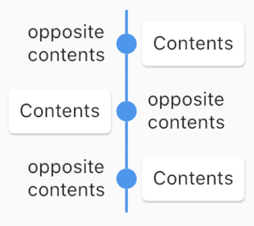
ContentsAlign.alternating
Alternating contents align
FixedTimeline.tileBuilder(
  builder: TimelineTileBuilder.connectedFromStyle(
    contentsAlign: ContentsAlign.alternating,
    oppositeContentsBuilder: (context, index) => Padding(
      padding: const EdgeInsets.all(8.0),
      child: Text('opposite\ncontents'),
    ),
    contentsBuilder: (context, index) => Card(
      child: Padding(
        padding: const EdgeInsets.all(8.0),
        child: Text('Contents'),
      ),
    ),
    connectorStyleBuilder: (context, index) => ConnectorStyle.solidLine,
    indicatorStyleBuilder: (context, index) => IndicatorStyle.dot,
    itemCount: 3,
  ),
)
Timeline

The timeline component has two widgets, Timeline similar to ScrollView and FixedTimeline similar to Flex.

Also their constructors are similar to ScrollView and Flex.

The main difference is that they has TimelineTheme as an ancestor.

The tileBuilder constructor provides more powerful features using TimelineTileBuilder.

If you don't need TimelineTileBuilder, you can use other flutter widgets like ListView, Column, Row, etc.

Even if you use the flutter widget, you can use TimelineTheme.

Documentation

See full documentation

Changelog

See CHANGELOG.md.

Code of conduct

See CODE_OF_CONDUCT.md.

License

MIT

Categories

Source repository

Projects using this package