Package selection guidance compiled from public package information, community data, and project usage.
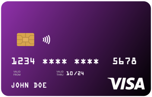
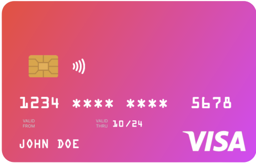
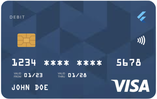
uCreditCard is a Flutter package that provides an easy-to-use, visually appealing credit card UI component. Designed for developers seeking a clean and modern card interface, it supports multiple platforms including Android, iOS, Web, macOS, Windows, and Linux. The package enhances user experience with intuitive design and seamless integration into payment or finance-related apps. It's ideal for displaying card details securely and stylishly within Flutter applications.
Use cases
Displaying credit card details in apps
Creating payment form interfaces
Building finance or banking applications
Enhancing checkout experiences
Designing secure card input screens
Key features
Beautiful and customizable card UI
Cross-platform compatibility
Simple integration with Flutter
Supports multiple operating systems
Responsive design for all devices
Suitable for
Flutter developers building payment apps
Designers wanting sleek card components
Apps requiring secure card display
Frontend-focused financial tools
Rapid prototyping of card-based interfaces
Considerations
Does not include full payment processing
Requires manual handling of sensitive data
Limited to UI; no scanning functionality
Not suitable for production payment gateways
User must implement additional security measures
Original README
Original README snapshot from the linked source repository. Visit the repository for the latest content.
u_credit_card
A Flutter widget that renders a realistic, customizable credit-card UI with optional flip animation, balance display, and provider-logo support.
Because card text is rendered in white, avoid light gradient colors.
Sizing the card
Use the width parameter rather than wrapping the widget in a SizedBox. The card is laid out at its natural width of 300 logical pixels and scales proportionally to fit width. Values above 300 are clamped.
cardType controls the small label at the top of the card (CREDIT, DEBIT, PREPAID, GIFT CARD); pass CardType.other to hide the label.
creditCardType controls the network logo (Visa, Mastercard, Amex, Discover). If omitted, the widget auto-detects the network from cardNumber. Pass CreditCardType.none to hide the logo entirely.
cardProviderLogo accepts any widget — typically your bank or wallet logo. Position it on the left or right of the card-type label with cardProviderLogoPosition. Add a background image with backgroundDecorationImage; both NetworkImage and AssetImage are supported.
Set showBalance: true and pass a balance to render the amount in the top-left of the card. Enabling autoHideBalance: true replaces the figure with a "TAP TO SEE BALANCE" placeholder; tapping reveals it for two seconds. currencySymbol defaults to $.
Set enableFlipping: true to render a back side (with the CVV) and enable a horizontal-drag gesture that flips between sides. Provide the CVV with cvvNumber.
Haptic feedback fires on each flip; disable it with disableHapticFeedBack: true.
Programmatic flipping API
For flows that need to flip the card in response to UI events — for example, flipping to the back when a CVV input field gains focus — attach a CreditCardController.