Package selection guidance compiled from public package information, community data, and project usage.
A fully customizable and easy-to-use Flutter package for implementing UI blocking elements in apps. It provides a simple way to overlay content with loading indicators, progress bars, or custom widgets, ensuring users are informed during asynchronous operations. Ideal for preventing interaction during data loading or processing, it supports all major platforms including Android, iOS, Web, macOS, Windows, and Linux. The package is lightweight and designed for seamless integration into existing Flutter projects.
Use cases
Blocking UI during data loading
Showing custom loading overlays
Preventing user interaction during async tasks
Enhancing UX with visual feedback
Implementing refresh indicators
Creating modal loading screens
Key features
Fully customizable appearance
Simple API for quick integration
Supports all Flutter platforms
Extensible for custom overlays
Lightweight and performant
Built-in loading and progress indicators
Suitable for
Developers seeking quick UI blocking solutions
Apps requiring consistent loading states
Teams focused on UX improvements
Projects with cross-platform needs
Frontend developers using Flutter
Applications with frequent async operations
Considerations
May require additional styling for complex designs
Custom overlays need manual implementation
Limited built-in themes
Not optimized for high-frequency updates
Depends on correct widget tree structure
Best used with proper state management
Original README
Original README snapshot from the linked source repository. Visit the repository for the latest content.
uiblock
Easiest and simplest method to block/unblock ui for your flutter apps.
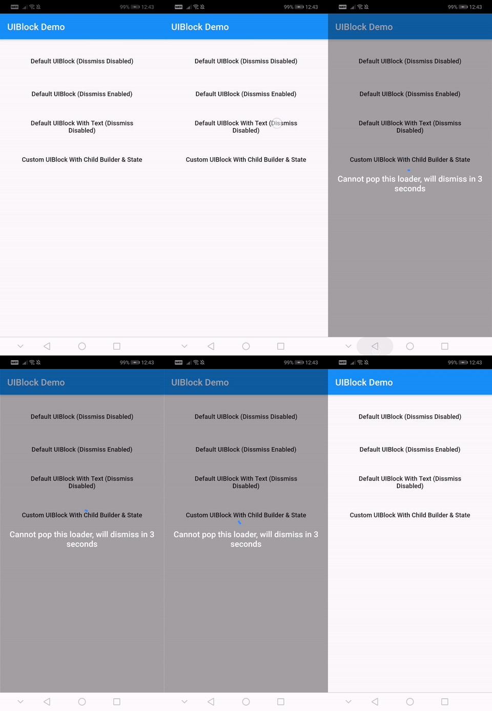
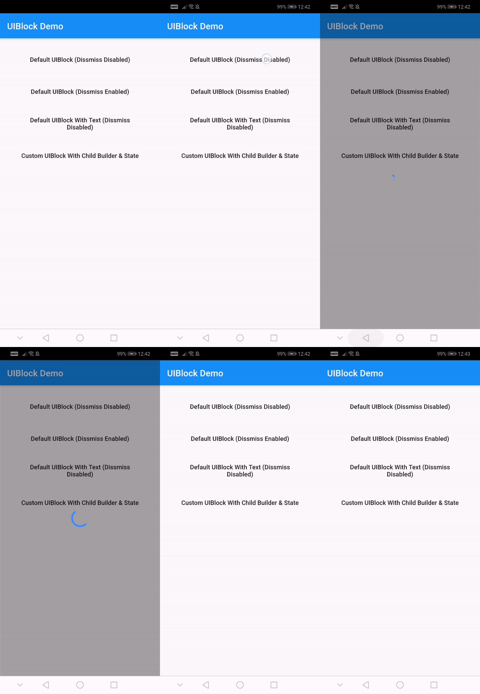
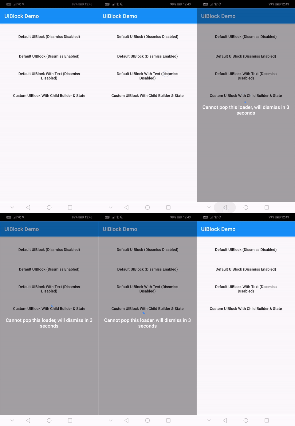
One line of code to block/unblock ui and stop user from navigating during loading or processing in your flutter apps. You could use it as a widget or directly as a global service/util.
Fully customizable
Android and IOS
Easy and Simple
No other dependencies
Well documented
Production ready
Installation
With null-safety
      dependencies:
        uiblock: ^2.0.1
Without null-safety
      dependencies:
        uiblock: 1.2.0
Getting Started
Add the dependency to your project and start using uiblock everywhere:
Import the package.
import'package:uiblock/uiblock.dart';
To block ui
// defaultUIBlock.block(context);
//OR// if using globalKeyUIBlock.block(_scaffoldGlobalKey.currentContext);
To unblock ui
// call unblock after blockui to dissmissUIBlock.unblock(context);
//OR// if using globalKeyUIBlock.unblock(_scaffoldGlobalKey.currentContext);
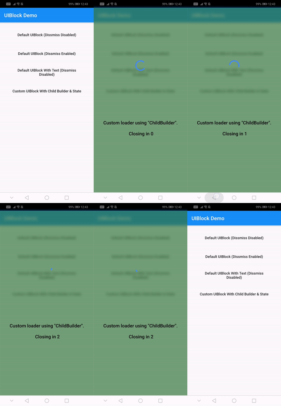
// easily create custom block ui bodyUIBlock.block(
_scaffoldGlobalKey.currentContext,
backgroundColor: Colors.green.withOpacity(0.5),
imageFilter: ImageFilter.blur(sigmaX: 5.0, sigmaY: 5.0),
childBuilder: (BuildContext context) {
// return your widget here
},
);
// Don't forget to call unblock after block :)
Creating custom block modal transitions (only applicable on static UIBlock.block)
// NOTE : only for on UIBlock.block as this uses Modal Barrier// widget block is inline widget replacement with loader widgetUIBlock.block(
//...// more code
customBuildBlockModalTransitions:
(context, animation, secondaryAnimation, child) {
returnRotationTransition(
turns: animation,
child: child,
);
},
// ...
);
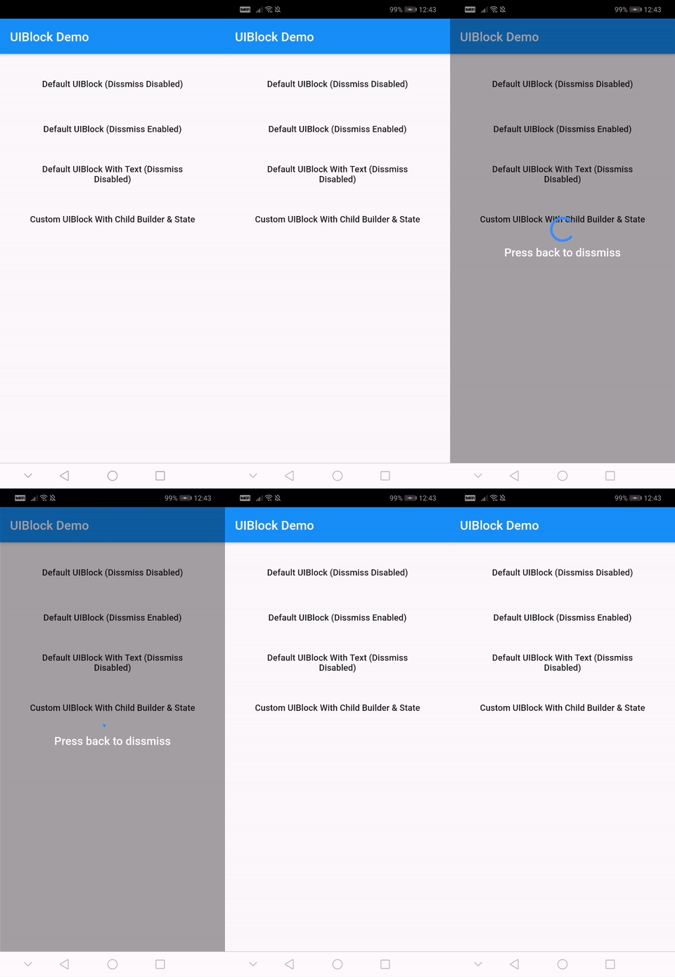
Using with data return
// NOTE : canDissmissOnBack is alaways truevar result = awaitUIBlock.blockWithData(
_scaffoldGlobalKey.currentContext,
loadingTextWidget: Padding(
padding: constEdgeInsets.all(8.0),
child: FlatButton(
onPressed: () {
// unblock and return dataUIBlock.unblockWithData(context, "hello world");
},
child: Text(
'Press here to dissmiss with data. Back for null',
textAlign: TextAlign.center,
style: TextStyle(
color: Colors.white,
fontSize: 18.0,
fontWeight: FontWeight.w600,
),
),
),
),
);
print(result);
For more details have a look at the other examples.
Properties
Property
Type
Default
Note
context (required)
BuildContext
-
childBuilder
Function
-
customLoaderChild
Widget
-
loadingTextWidget
Widget
-
imageFilter
ImageFilter
-
backgroundColor
Color
Transparent
canDissmissOnBack
bool
false
safeAreaLeft
bool
true
Set as 'false' to disable 'Left' Safe Area
safeAreaTop
bool
true
Set as 'false' to disable 'Top' (usually status bar) Safe Area
safeAreaRight
bool
true
Set as 'false' to disable 'Right' Safe Area
safeAreaBottom
bool
true
Set as 'false' to disable 'Bottom' Safe Area
safeAreaMinimumPadding
EdgeInsets
EdgeInsets.zero
safeAreaMaintainBottomViewPadding
bool
false
isSlideTransitionDefault
bool
true
Toggle between slide or fade transition
buildBlockModalTransitions
Function
-
Use this to create custom transition other than fade/slide
Widget Properties
Property
Type
Default
builder
Function
you implement it
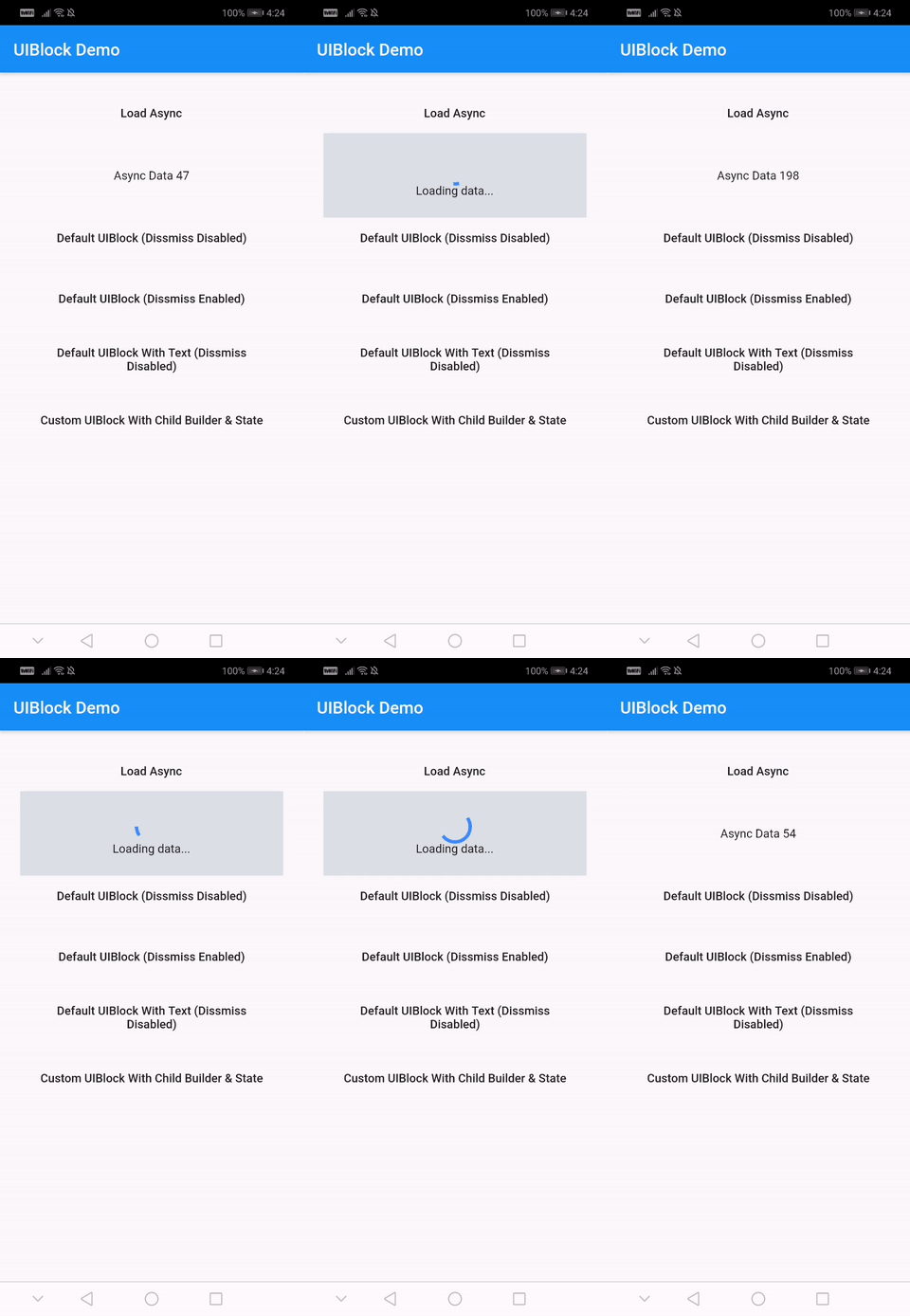
loadingStateFromFuture
Future Function()
your future function (APIs,etc)
loaderBuilder
Function
-
customLoaderChild
Widget
-
loadingTextWidget
Widget
-
offset
offset
-
barrierOpacity
double
0.4
barrierColor
Color
black45
canDismiss
bool
false
hideBuilderOnNullData
bool
false
Improve
Help me by reporting bugs, submit new ideas for features or anything else that you want to share.