Package selection guidance compiled from public package information, community data, and project usage.
A versatile Flutter package that offers a universal stepper widget, supporting both horizontal and vertical layouts. It simplifies the creation of step-by-step interfaces for forms, onboarding flows, or multi-stage processes across all major platforms. The widget is customizable and integrates seamlessly into existing Flutter applications. Designed for flexibility and ease of use, it enables developers to maintain consistent UI patterns with minimal code. Its cross-platform compatibility ensures uniform behavior on Android, iOS, Web, macOS, Windows, and Linux.
Use cases
Onboarding wizards
Multi-step form navigation
Checkout process design
Progress tracking interfaces
Setup wizards
Key features
Supports horizontal and vertical orientations
Cross-platform compatibility
Customizable styling
Simple API integration
Reusable step components
Suitable for
Developers building guided workflows
Teams needing consistent stepper UIs
Apps requiring multi-step user input
Design systems with reusable components
Cross-platform applications
Considerations
May require additional styling for complex themes
Limited built-in animation options
Best suited for linear step sequences
Not ideal for highly dynamic step logic
Depends on proper state management for step control
Original README
Original README snapshot from the linked source repository. Visit the repository for the latest content.
A simple package to build steppers with custom elements. You can set up your own body content, badges, and paths using indexed builders.
Vertical Stepper
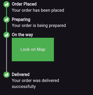
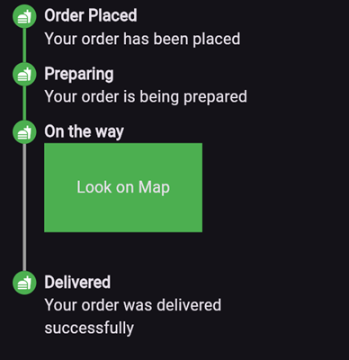
To create a vertical stepper, set stepperDirection to Axis.vertical.
Here’s an example of what the result might look like:
Parameters
elementBuilder: A builder for the content of the stepper.
badgeBuilder: A builder for the badge.
badgePosition: Determines the alignment of the badge. Options include StepperBadgePosition.start, StepperBadgePosition.center, or StepperBadgePosition.end.
pathBuilder: A builder for the main path (e.g., a line, dotted line, etc.). This is the most commonly used path.
subPathBuilder: A builder for the secondary path, used when badgePosition is set to StepperBadgePosition.center. This path is displayed under the badge and allows you to control its visibility based on the active step.
elementCount: The number of elements in the stepper.
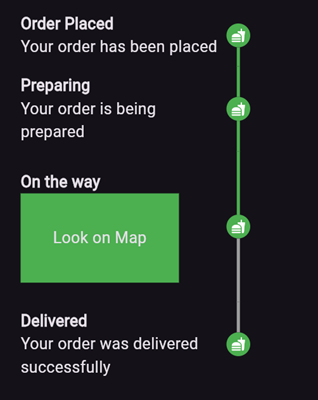
inverted: A flag to invert the position of the path and badge relative to the element. By default, this is false, and for vertical steppers, the path appears on the left. When set to true, the path appears on the right. For horizontal steppers, the path appears on the top and when set to true, the path appears on the bottom.
For example, if you set inverted to true and badgePosition to StepperBadgePosition.center, the result will look like this:
Horizontal Stepper
To create a horizontal stepper, set stepperDirection to Axis.horizontal.