Original README snapshot from the linked source repository. Visit the repository for the latest content.
Wheel Picker
A superset version of original ListWheelScrollView for easily creating wheel scroll input.


Key Features
- Item Selection: Retrieve the selected item index effortlessly.
- Highlight Selection: Highlight selected items with a color shader.
- Tap Navigation: Enable tap scrolls.
- Horizontal Scroll Direction: Horizontal wheel scroll view.
- Styling Flexibility: Customize wheel appearance with
WheelPickerStyle.
- Precise Control: Manage and synchronize
WheelPicker widgets with a WheelPickerController.
- Mounting Controllers: Easily integrate and shift multiple controllers.
Installing
Add it to your pubspec.yaml file:
dependencies:
  wheel_picker: ^0.3.0
Install packages from the command line:
flutter packages get
Usage
To use package, just import package import 'package:wheel_picker/wheel_picker.dart';
Example
Here's a quick example to get you started:
const daysOfWeek = ['Sunday','Monday','Tuesday','Wednesday','Thursday','Friday','Saturday'];
return WheelPicker(
  itemCount: 7,
  builder: (context, index) => Text(daysOfWeek[index]),
  selectedIndexColor: Colors.orange,
  looping: false,
);
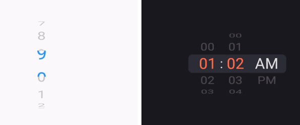
Basic (Left Gif)
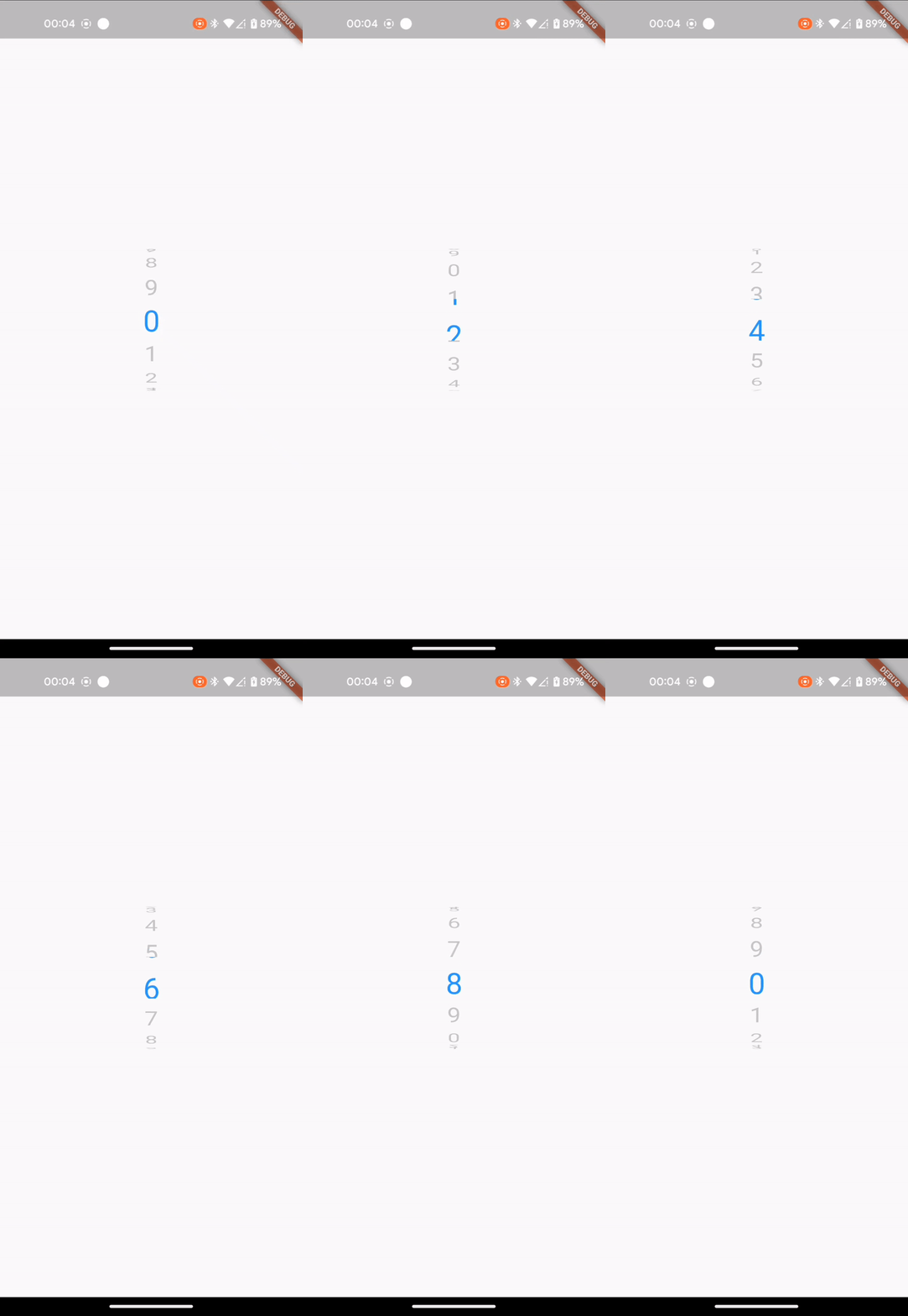
For more control, you can attach a controller and adjust it to your liking:
import 'dart:async';
import 'package:flutter/material.dart';
import 'package:wheel_picker/wheel_picker.dart';
class WheelPickerExample extends StatelessWidget {
const WheelPickerExample({super.key});
@override
Widget build(BuildContext context) {
final secondsWheel = WheelPickerController(itemCount: 10);
const textStyle = TextStyle(fontSize: 32.0, height: 1.5);
Timer.periodic(const Duration(seconds: 1), (_) => secondsWheel.shiftDown());
return WheelPicker(
builder: (context, index) => Text("$index", style: textStyle),
controller: secondsWheel,
selectedIndexColor: Colors.blue,
onIndexChanged: (index, interactionType) => print("On index $index"),
style: WheelPickerStyle(
itemExtent: textStyle.fontSize! * textStyle.height!,
squeeze: 1.25,
diameterRatio: .8,
surroundingOpacity: .25,
magnification: 1.2,
),
);
}
}
class MyApp extends StatelessWidget {
const MyApp({super.key});
@override
Widget build(BuildContext context) {
return const MaterialApp(
title: 'Flutter Example',
home: Scaffold(
body: Center(
child: WheelPickerExample(),
),
),
);
}
}
void main() => runApp(const MyApp());
Note: This works for this short example but don't forget to manually dispose controllers you initialize youself.
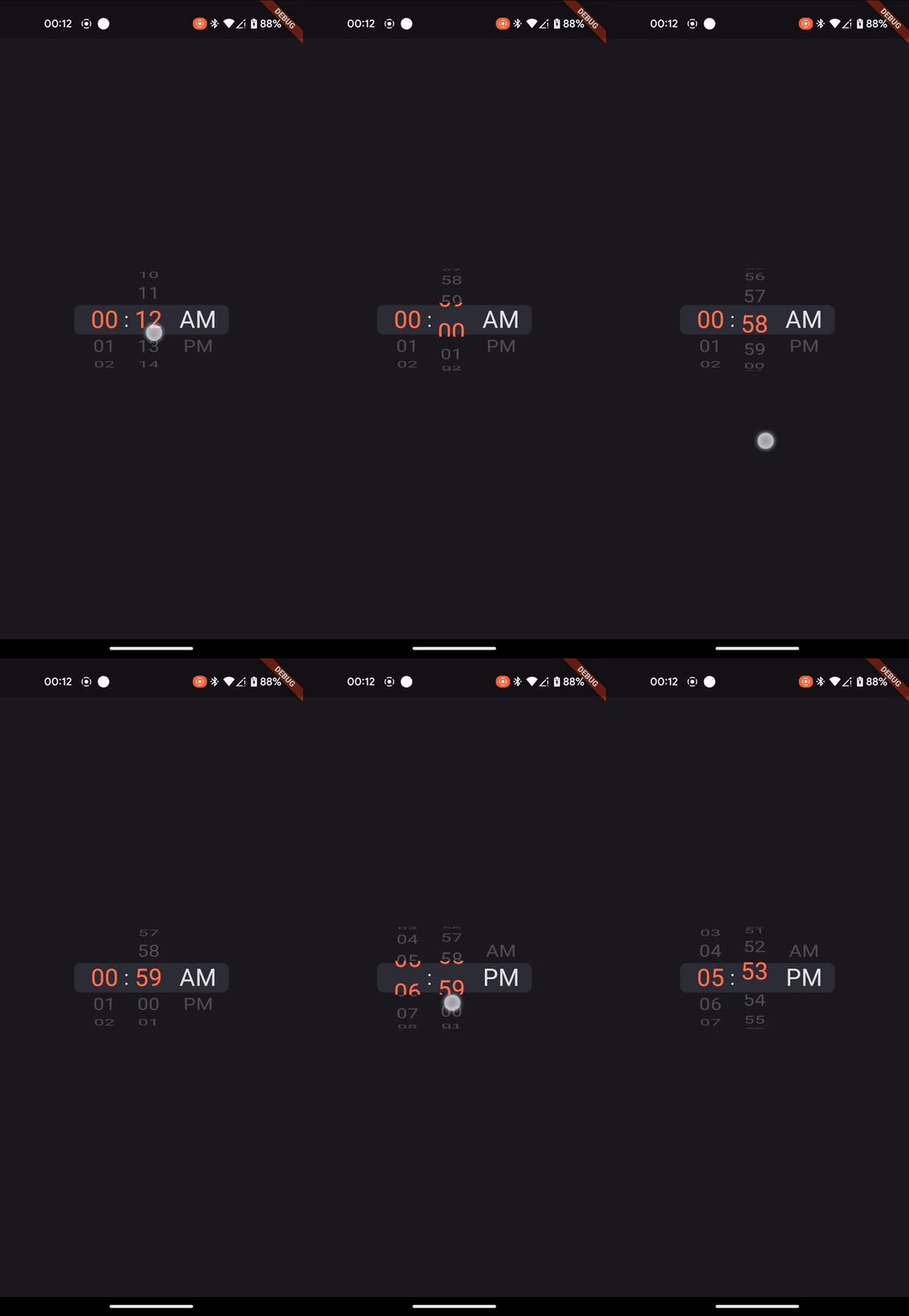
Advanced (Right Gif)
For more advanced usage, you can also mount controllers, making them shift each other. See example.
Example: Listening for the scroll end event
const daysOfWeek = ['Sunday','Monday','Tuesday','Wednesday','Thursday','Friday','Saturday'];

return NotificationListener(
  onNotification: (notification) {
    if (notification is ScrollEndNotification) {
      print('User has ended scrolling');
    }
    return false;
  },
  child: WheelPicker(
    itemCount: 7,
    builder: (context, index) => Text(daysOfWeek[index]),
    selectedIndexColor: Colors.orange,
    looping: false,
  ),
);
Feel free to share your feedback, suggestions, or contribute to this package :handshake:.
If you like this package, consider supporting it by giving it a star on GitHub and a like on pub.dev :heart:.