Search packages, repositories and app categories

animated_stack cover
Package detailsv0.3.3

animated_stack

Custom animated stacked pages, to create customisable side menu buttons.

AndroidiOSWebmacOSWindowsLinux
30-day downloads
266
Likes
252
Pub points
150

Install package

flutter pub add animated_stack

Package Overview

Package selection guidance compiled from public package information, community data, and project usage.

AnimatedStack is a Flutter package that enables the creation of custom animated stacked pages, ideal for designing interactive side menu buttons with smooth transitions. It provides a flexible foundation for building dynamic navigation interfaces, allowing developers to layer widgets and animate their visibility and positioning. The package supports multiple platforms including Android, iOS, Web, macOS, Windows, and Linux, making it suitable for cross-platform applications. With intuitive configuration options, it enhances user experience through fluid animations and responsive design. Its lightweight nature ensures efficient performance across devices.

Use cases

  • Custom side menu implementations
  • Interactive navigation interfaces
  • Animated page transitions
  • Floating action button enhancements
  • Cross-platform UI components

Key features

  • Smooth animated stacking
  • Customizable page transitions
  • Multi-platform support
  • Lightweight and performant
  • Easy integration with existing UI
  • Flexible widget layering

Suitable for

  • Developers building custom navigation drawers
  • UI designers seeking animated interactions
  • Cross-platform app creators
  • Apps requiring dynamic layout changes
  • Teams focused on polished user experiences

Considerations

  • May require additional styling for complex layouts
  • Performance depends on animation complexity
  • Limited documentation beyond basic usage
  • Not optimized for extremely large stacks
  • Best suited for moderate animation intensity
Original README

Original README snapshot from the linked source repository. Visit the repository for the latest content.

Animated Stack

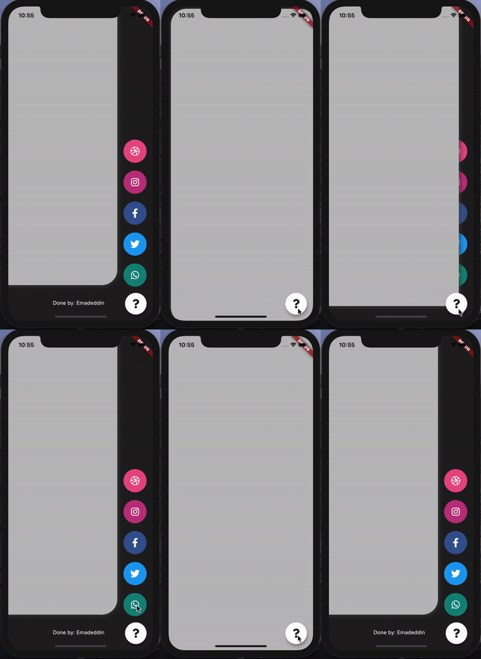
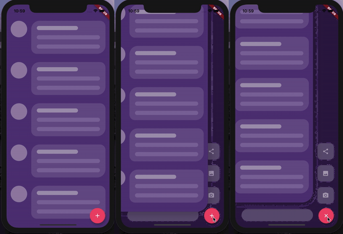
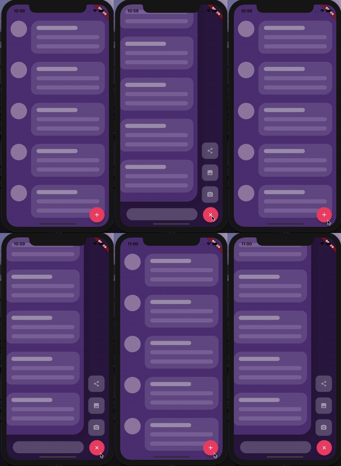
Custom animated stacked pages, to create customisable side menu buttons. Providing simple menu for sharing buttons, side menu, message sending, about page, ... etc.


Getting Started

At first, you have to create Foreground and Background Widgets.

Here is a simple example to meet minimum requirements.

class MyApp extends StatelessWidget {
  @override
  Widget build(BuildContext context) {
    return MaterialApp(
      title: 'Animated Stack Demo',
      theme: ThemeData(
        splashColor: Colors.transparent,
        highlightColor: Colors.transparent,
      ),
      home: AnimatedStack(
        backgroundColor: Colors.white,
        fabBackgroundColor: Colors.black,
        foregroundWidget: ..., // Main page
        columnWidget: ..., // Right widget, preferably Column
        bottomWidget: ...,// Right widget, preferably Row
      ),
    );
  }
}

Complete Features

Here's all what you can customize in this widget!

Stack attributes

AnimatedStack(
backgroundColor: ...,     // Background Container color
foregroundWidget: ...,    // Foreground Container color

columnWidget: ...,        // Right Widget, (use Column for best results)
bottomWidget: ...,        // Bottom Widget, (use Row for best results)

scaleHeight: 100,         // Sliding animation height, default is 60
scaleWidth: 100,          // Sliding animation width, default is 60


buttonIcon: ...,          // FAB icon (IconData)
fabIconColor: ...,        // FAB icon color
animateButton: false,     // Sometimes, we don't want to animate the button!
fabBackgroundColor: ...,  // FAB background color

slideAnimationDuration: ..., // Animation Duration, default is 800 Milliseconds
buttonAnimationDuration: ...,// Animation Duration, default is 240 Milliseconds

openAnimationCurve: ...,    // Animation Curve, default is ElasticOutCurve(0.9)
closeAnimationCurve: ...,   // Animation Curve, default is ElasticInCurve(0.9)
enableClickToDismiss: true, // Enable Click on Main Widget to close
preventForegroundInteractions: true, // Prevent Clicks on Main Widget
onForegroundCallback: () => print('on Close Callback'), // On Close Callback
);
For complete examples, check example folder

License

MIT License.

Categories

Source repository

Projects using this package