Package selection guidance compiled from public package information, community data, and project usage.
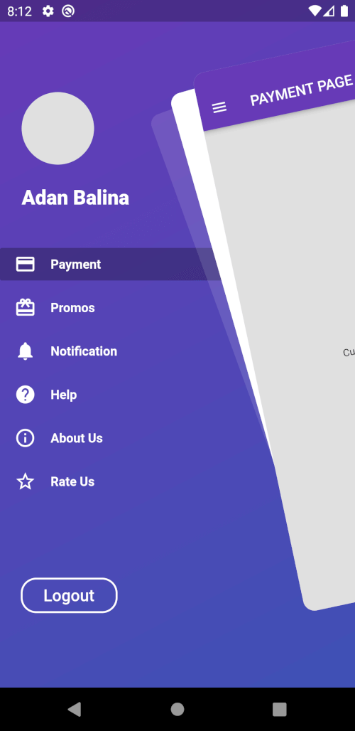
Awesome Drawer Bar is a Flutter package that provides a customizable side menu (drawer) with a modern, sleek design. Built for developers seeking a polished navigation experience, it offers smooth animations, responsive layouts, and easy integration into apps across multiple platforms. The drawer supports both light and dark themes, and can be tailored with custom widgets, icons, and transitions. It's ideal for apps requiring intuitive navigation with a clean interface. The package is actively maintained and open-source, allowing community contributions and transparency.
Use cases
Mobile app navigation
Web dashboard interfaces
Desktop application menus
Customizable side panels
Cross-platform navigation
Key features
Smooth animations
Customizable design
Multi-platform support
Light and dark theme compatibility
Easy integration with existing Flutter projects
Suitable for
Flutter developers building cross-platform apps
Designers needing flexible navigation components
Apps requiring elegant side menus
Considerations
Requires basic Flutter knowledge
May need additional styling for complex layouts
Depends on platform-specific rendering behaviors
Original README
Original README snapshot from the linked source repository. Visit the repository for the latest content.
Flutter Awesome Drawer Bar
A Flutter package with custom implementation of the Side Menu (Drawer)
Getting Started
To start using this package, add awesome_drawer_bar dependency to your pubspec.yaml
Controller to have access to the open/close/toggle function of the drawer
mainScreen
Widget
Yes
Screen containing the main content to display
menuScreen
Widget
Yes
Screen containing the menu/bottom screen
slideWidth
double
No
Sliding width of the drawer - defaults to 275.0
borderRadius
double
No
Border radius of the slided content - defaults to 16.0
angle
double
No
Rotation angle of the drawer - defaults to -12.0 - should be 0.0 to -30.0
backgroundColor
Color
No
Background color of the drawer shadows - defaults to white
showShadow
bool
No
Boolean, whether to show the drawer shadows - defaults to false
openCurve
Curve
No
open animation curve - defaults to Curves.easeOut
closeCurve
Curve
No
close animation curve - defaults to Curves.easeOut
Controlling the drawer
To get access to the drawer, and be able to control it, there are 2 ways:
Using a AwesomeDrawerBarController inside the main widget where ou have the AwesomeDrawerBar widget and providing it to the widget, which will allow you to trigger the open/close/toggle methods.
    final _drawerController = AwesomeDrawerBarController();

    _drawerController.open();
    _drawerController.close();
    _drawerController.toggle();
    _drawerController.isOpen();
    _drawerController.stateNotifier;
Using the static method inside ancestor widgets to get access to the AwesomeDrawerBar.
Please file any issues, bugs or feature request as an issue on our GitHub page.
Want to contribute
If you would like to contribute to the plugin (e.g. by improving the documentation, solving a bug or adding a cool new feature), please carefully review our contribution guide and send us your pull request.
Credits
Credits goes to pedromassango as most of this package comes from his implementation.