Search packages, repositories and app categories

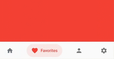
bottom_bar cover
Package detailsv2.0.5

bottom_bar

Bottom bar helps create an optimized bottom navigation bar with beautiful animations

AndroidiOSWebmacOSWindowsLinux
30-day downloads
1.4K
Likes
137
Pub points
160

Install package

flutter pub add bottom_bar

Package Overview

Package selection guidance compiled from public package information, community data, and project usage.

Bottom Bar is a Flutter package that enables developers to create optimized, visually appealing bottom navigation bars with smooth animations. Designed for cross-platform use, it supports Android, iOS, Web, macOS, Windows, and Linux. The package simplifies the implementation of bottom navigation with customizable transitions, responsive design, and built-in accessibility features. It enhances user experience by providing intuitive navigation patterns across different devices. Ideal for apps requiring persistent bottom navigation with modern aesthetics.

Use cases

  • Mobile app navigation
  • Web application dashboards
  • Cross-platform desktop apps
  • Enhanced user interface design
  • Responsive navigation layouts

Key features

  • Smooth animated transitions
  • Customizable appearance
  • Cross-platform compatibility
  • Accessibility support
  • Responsive design integration

Suitable for

  • Developers building mobile or web apps
  • Design-focused UI implementations
  • Apps needing consistent navigation
  • Teams prioritizing animation quality
  • Projects targeting multiple platforms

Considerations

  • Requires Flutter SDK setup
  • Limited customization beyond basic styling
  • May need additional state management
  • Not ideal for complex tab structures
  • Depends on external repository for updates

Original README

Original README snapshot from the linked source repository. Visit the repository for the latest content.

Bottom Bar

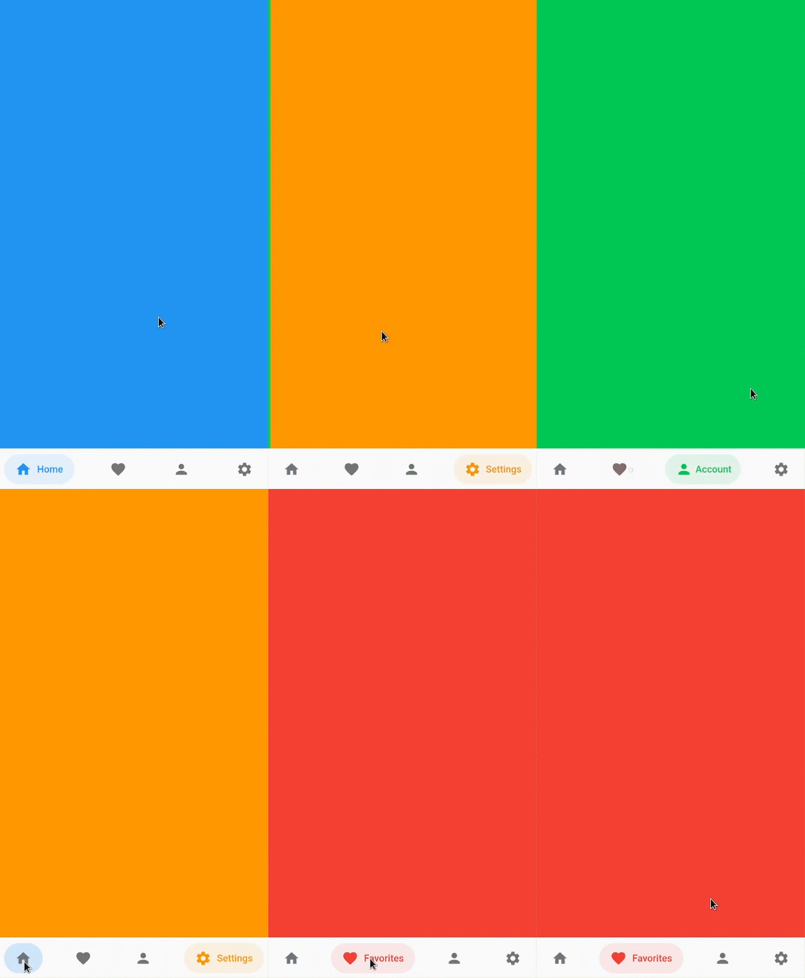
Bottom bar helps create an optimized bottom navigation bar with beautiful animations.

Bottom Bar

Content

Installation

Add bottom_bar to pubspec.yaml

dependencies:
  bottom_bar: ^2.0.5

Breaking Changes

  • darkActiveColor is removed to simplify the api. Instead, use PlatformBrightness to check dark mode and adjust the color accordingly

Usage

Import the Package

import 'package:bottom_bar/bottom_bar.dart';

Example

  int _currentPage = 0;
  final _pageController = PageController();

  @override
  Widget build(BuildContext context) {
    return Scaffold(
      body: PageView(
        controller: _pageController,
        children: [
          Container(color: Colors.blue),
          Container(color: Colors.red),
          Container(color: Colors.greenAccent.shade700),
          Container(color: Colors.orange),
        ],
        onPageChanged: (index) {
          // Use a better state management solution
          // setState is used for simplicity
          setState(() => _currentPage = index);
        },
      ),
      bottomNavigationBar: BottomBar(
        selectedIndex: _currentPage,
        onTap: (int index) {
          _pageController.jumpToPage(index);
          setState(() => _currentPage = index);
        },
        items: <BottomBarItem>[
          BottomBarItem(
            icon: Icon(Icons.home),
            title: Text('Home'),
            activeColor: Colors.blue,
          ),
          BottomBarItem(
            icon: Icon(Icons.favorite),
            title: Text('Favorites'),
            activeColor: Colors.red,
          ),
          BottomBarItem(
            icon: Icon(Icons.person),
            title: Text('Account'),
            activeColor: Colors.greenAccent.shade700,
          ),
          BottomBarItem(
            icon: Icon(Icons.settings),
            title: Text('Settings'),
            activeColor: Colors.orange,
          ),
        ],
      ),
    );
  }

Parameters

BottomBar

Creates a BottomBar that displays a list of BottomBarItem
Required:
Optional:
  • backgroundColor - Background Color of BottomBar
  • height - Height of BottomBar
  • padding - Padding of BottomBar container
  • mainAxisAlignment - Describes how BottomBarItems are horizontally laid out
  • curve - Curve of animation
  • duration - Duration of animation
  • border - Border of BottomBarItem's background color
  • boxShadow - BoxShadow of BottomBar
  • itemPadding - Padding of BottomBarItem's background color
  • textStyle - TextStyle of title widget
  • showActiveBackgroundColor - Shows the background color of a selected BottomBarItem if set to true

BottomBarItem

Contains information about the item that BottomBar has to display
Required:
  • icon - Icon of BottomBarItem
  • title - Title of BottomBarItem (Typically a Text widget)
  • activeColor - Primary color of a selected BottomBarItem
Optional:
  • activeIconColor - Icon color of a selected BottomBarItem
  • activeTitleColor - Text color of a selected BottomBarItem
  • backgroundColorOpacity - Opacity of a selected BottomBarItem background color (Defaults to 15%)
  • inactiveIcon- Icon to display when BottomBarItem is not active
  • inactiveColor - Primary color of BottomBarItem when it is NOT selected

FAQ

My phone's notch is overlapping with BottomBar. How do I fix this?
  • Simply wrap BottomBar with a SafeArea widget.
How do I change the overall color of BottomBarItem when in dark mode?
  @override
  Widget build(BuildContext context) {
    bool isDarkMode = MediaQuery.of(context).platformBrightness == Brightness.dark;

    BottomBarItem(
      activeColor: isDarkMode ? Colors.orange : Colors.blue, // Is dark mode true? (Yes -> Colors.orange | No -> Colors.blue)
    ),
  }

Community Support

If you have any suggestions or issues, feel free to open an issue

If you would like to contribute, feel free to create a PR

Categories

Source repository

Projects using this package