Package selection guidance compiled from public package information, community data, and project usage.
A Flutter package that provides a customizable AppBar featuring an integrated full calendar view. It enhances the standard AppBar with advanced calendar functionalities, enabling users to navigate dates, view events, and interact with calendar data directly within the app bar. Designed for seamless integration across multiple platforms, it supports Android, iOS, Web, macOS, Windows, and Linux. The package is ideal for apps requiring date-centric navigation and visual calendar access in a compact, user-friendly interface.
Use cases
Date selection in app bars
Event scheduling interfaces
Calendar navigation in mobile apps
Time management applications
Dashboard widgets with calendar views
Cross-platform calendar integration
Key features
Full calendar view in AppBar
Customizable date picker
Multi-platform support
Event highlighting
Smooth date navigation
Responsive design
Suitable for
Developers building calendar-heavy apps
UI designers seeking elegant date controls
Apps needing compact calendar UIs
Cross-platform Flutter projects
Productivity and scheduling tools
Considerations
Requires careful layout planning
May impact performance with large datasets
Limited customization beyond basic styling
Depends on platform-specific rendering
Not suitable for complex calendar workflows
Best used in apps with primary date interaction
Original README
Original README snapshot from the linked source repository. Visit the repository for the latest content.
Calendar AppBar
Flutter package for custom AppBar with calendar view.
The package is currently optimized for mobile devices, therefore used only for mobile devices is prefered. It also works for larger screens, although it does not follow the rules of good UI. It is planned to be optimized shortly.
Features
Define your custom color scheme
Enable or disable full-screen calendar view
Provide a list of dates that will be marked on the calendar view
There are three required attributes of class CalendarAppBar. Attribute onDateChange is a function, which defines what happens when the user selects a date. firstDate attribute defines the first date, which will be available for selection. The date saved in lastDate attribute is the last date available for selection. At first initialization of the object, the date provided as lastDate will be selected, but will not be returned with onDateChange function.
More Custom Usage
Hide Full Screen Calendar View
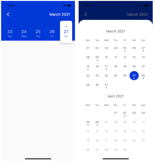
This package enables the usage of a full-screen calendar view. It is displayed when the user presses on month and year text in the top right corner of the AppBar. It comes in two different versions. If the first and last date are part of the same month the full-screen calendar will be displayed as seen on the third image at the top of this file. In the other way, it will be displayed as seen in the second image. It is possible to disable the full-screen view (which is enabled by default) by adding the following code:
fullCalendar: false,
Define Your Custom Color Scheme
You can define your custom color scheme by defining white, black and accent color. Those three colors are set to Colors.white, Colors.black87 and Color(0xFF0039D9) by default. It is possible to customize those three colors as shown below.
The design is currently optimized for light mode and therefore also suggested to be used in that way to achieve better UX. Dark mode will be added soon.
Custom Padding
The horizontal padding can be customized (default it is set to 25px) by adding the following code:
padding: 10.0,
Mark Dates with Events
It is possible to provide the list of dates of type List<DateTime>, which will be marked on calendar view with a dot.
    events: List.generate(
            10, (index) => DateTime.now().subtract(Duration(days: index * 2))),
The code above will generate the list of 10 dates for every second day from today backwards.
Back Button
The last attribute of CalendarAppbar is backButton, which is default set to true. Customize that feature by setting this attribute to false.
backButton: false,
Internationalization
The newest feature the CalendarAppbar package is offering is local support for different languages. Use atribute locale to customize the language used for the plugin by adding the language code as shown below. If this atribute is not set, English language will be used.
locale: 'en',
Thank you
Special thanks goes to all contributors to this package. Make sure to check them out.
For help getting started with Flutter, view Flutter official documentation
online documentation, which offers tutorials,
samples, guidance on mobile development, and a full API reference.