Search packages, repositories and app categories

cart_stepper cover
Package detailsv4.3.0

cart_stepper

A fully customizable Flutter Widget to get count. It can be applicable in e-commerce apps for getting cart count.

AndroidiOSWebmacOSWindowsLinux
30-day downloads
717
Likes
69
Pub points
160

Install package

flutter pub add cart_stepper

Package Overview

Package selection guidance compiled from public package information, community data, and project usage.

A fully customizable Flutter widget designed to manage and display item counts, ideal for e-commerce applications. It enables users to increment or decrement quantities with smooth animations and supports customization of buttons, text style, and behavior. The widget is lightweight and integrates seamlessly into shopping carts or product quantity selectors across multiple platforms.

Use cases

  • E-commerce product quantity selection
  • Shopping cart item count management
  • Customizable numeric input in forms
  • Mobile and web inventory tracking
  • Real-time order updates

Key features

  • Fully customizable appearance
  • Smooth increment/decrement animations
  • Supports all major platforms
  • Configurable button styles and sizes
  • Built-in validation and bounds control
  • Easy integration with existing UI

Suitable for

  • Developers building e-commerce apps
  • UI designers needing interactive counters
  • Cross-platform mobile and web projects
  • Apps requiring intuitive quantity inputs

Considerations

  • Requires manual handling of state management
  • Limited built-in validation beyond bounds
  • Not optimized for very large numbers
  • May need additional styling for complex themes
  • Depends on external dependencies for advanced features

Original README

Original README snapshot from the linked source repository. Visit the repository for the latest content.

cart_stepper

pub package

A fully customizable Flutter Widget to get count. It can be applicable in e-commerce apps for getting cart count.

This package is Forked from AYNStepperView

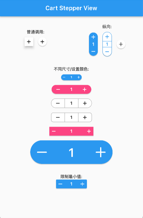
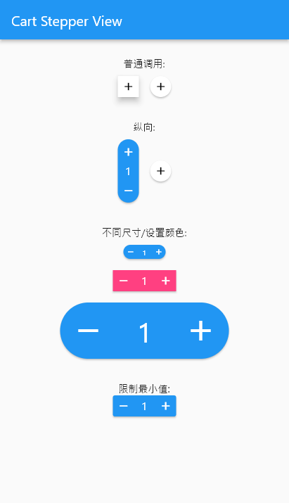
Preview

Arguments

  • count: int/double, the number to show
  • stepper: int/double, the number to increasing or decreasing
  • size: double, widget size
  • axis: Axis, layout direction
  • numberSize: double, number spacer, default 2
  • didChangeCount: Function, @required to set the release counter
  • style: CartStepperStyle
  • alwaysExpanded: bool, always expanded while value is 0
  • elevation: double, display a shadow around this widget

CartStepperStyle:

  • activeForegroundColor: Color, text color when counter > 0
  • activeBackgroundColor: Color, background color when counter > 0
  • foregroundColor: Color, text color when counter == 0
  • backgroundColor: Color, background color when counter == 0
  • shape: BoxShape,
  • radius: Radius, the borderRadius of this widget, default caculating a roundedRectAngle
  • BoxBorder: Border of the Widget
  • shadowColor: Color
  • textStyle,
  • iconTheme = const IconThemeData(),
  • iconPlus: IconData, customize the plus icon
  • iconMinus: IconData, customize the minus icon
  • buttonAspectRatio: plus & minux button's aspectRatio, default 1,
  • elevation: Widget's elevation,

Using

Create a widget to show and modify a number:

Widget _buildStepper() {
  return CartStepperInt(
        count: _counter,
        size: 30,
        style: CartStepperTheme.of(context).copyWith(activeForegroundColor: Colors.purple,)
        didChangeCount: (count) {
        setState(() {
        _counter = count;
        });
      },
  );
}

Migrating

// from 3.x to 4.x
// CartStepperStyle.
deActiveForegroundColor => foregroundColor
deActiveBackgroundColor => backgroundColor

OnlineDemo

Categories

Dependencies

Dependency list 1 items

Source repository

Projects using this package

No data available yet.