Search packages, repositories and app categories

Package detailsv0.1.5

clean_settings

Settings UI generator with sane defaults. Removes the need for boilerplate code and provides a rich set of highly opinionated widgets.

30-day downloads
68
Likes
62
Pub points
40

Install package

flutter pub add clean_settings

Package Overview

Package selection guidance compiled from public package information, community data, and project usage.

Clean Settings is a Flutter package that simplifies the creation of settings interfaces with pre-designed, opinionated widgets and sensible defaults. It eliminates repetitive boilerplate code by offering a structured, consistent UI for app settings, enabling developers to build polished, professional-looking settings screens quickly. The package focuses on usability and visual harmony, reducing setup time while maintaining flexibility for customization. It's ideal for apps requiring intuitive, well-organized configuration panels.

Use cases

  • Building app settings screens
  • Creating user preference panels
  • Rapid prototyping of configuration interfaces
  • Reducing UI boilerplate in settings
  • Designing consistent settings layouts

Key features

  • Opinionated, ready-to-use widgets
  • Sane default styling
  • Minimal boilerplate
  • Consistent UI patterns
  • Easy integration with existing apps

Suitable for

  • Flutter developers seeking fast settings UIs
  • Projects with complex user preferences
  • Apps needing clean, modern settings interfaces
  • Teams prioritizing design consistency
  • Developers avoiding manual widget scaffolding

Considerations

  • Limited customization flexibility
  • Strong opinionated design choices
  • May require adaptation for highly unique UIs
  • Not suitable for non-settings use cases
  • Depends on GitHub source for updates

Original README

Original README snapshot from the linked source repository. Visit the repository for the latest content.

pub package

clean_settings

Settings UI generator with sane defaults.

Creating a settings screen requires the same boiler plate code over and over. Settings also need a rich set of widgets to cover all possible cases. This library aims to provide sane defaults while creating a setting screen.

Features

  • Setting Sections
  • Out-of-the-box widgets for multiple types
  • Read-only items

Widgets supported

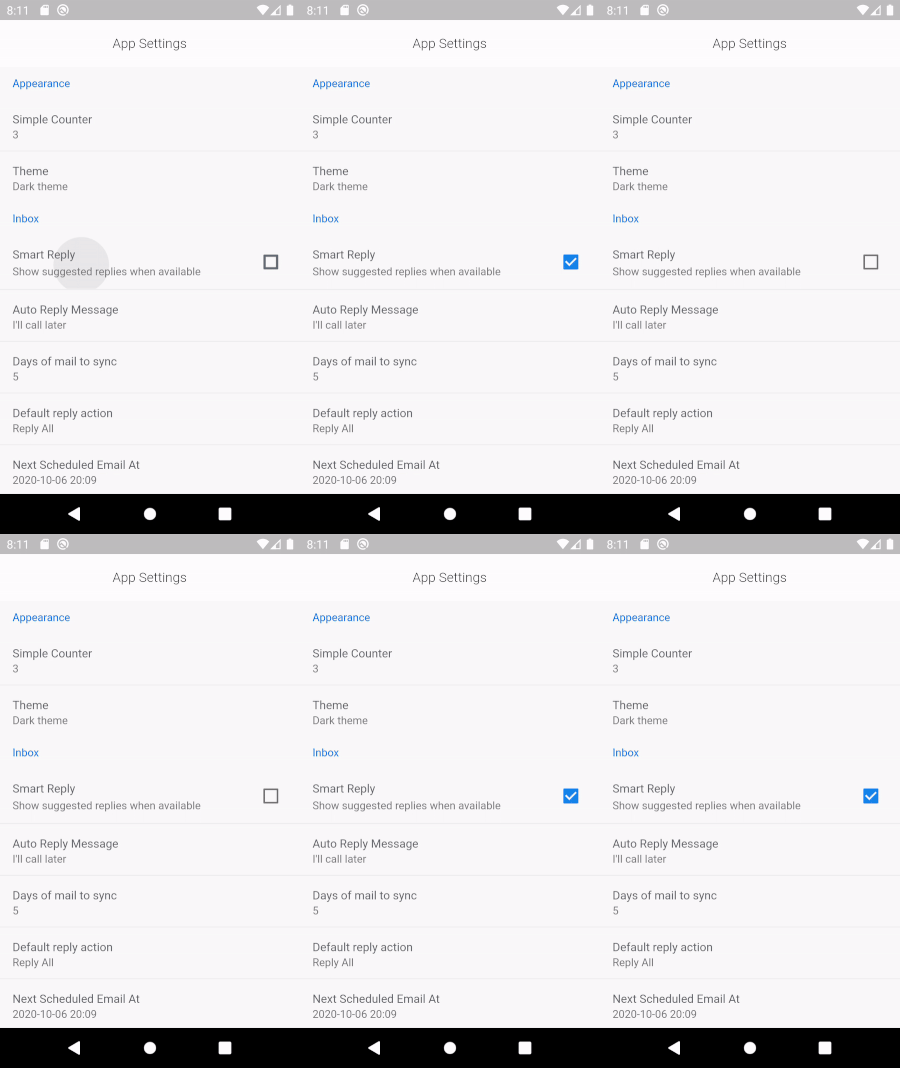
  • Checkbox

Checkbox Widget


SettingCheckboxItem(
    title: 'Smart Reply',
    value: smartReply,
    onChanged: (v) => setState(() => smartReply = v),
    description: 'Show suggested replies when available'),
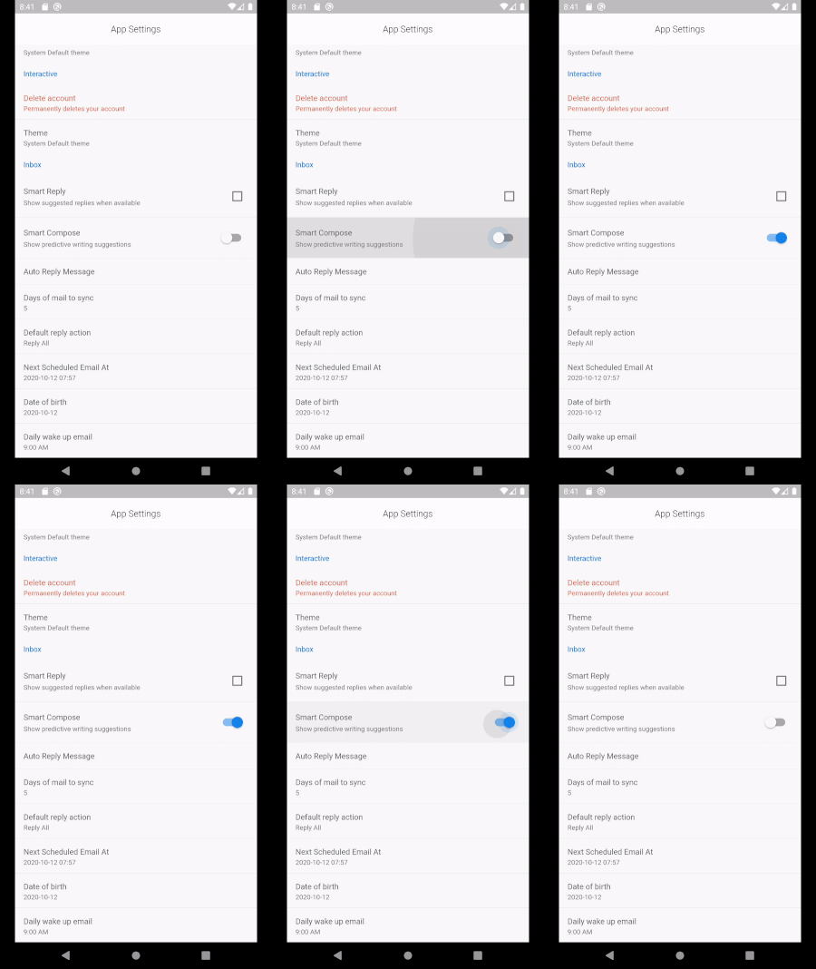
  • Switch

Switch Widget


SettingSwitchItem(
  title: 'Smart Compose',
  value: smartCompose,
  onChanged: (v) => setState(() => smartCompose = v),
  description: 'Show predictive writing suggestions',
  priority: ItemPriority.high,
),
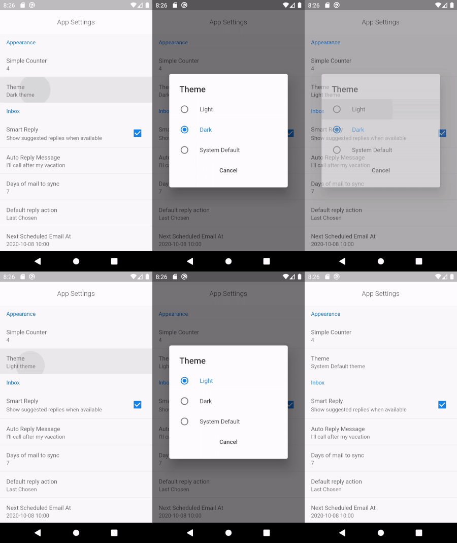
  • Radio Picker

Radio Picker


SettingRadioItem<String>(
  title: 'Theme',
  displayValue: '$theme theme',
  selectedValue: theme,
  items: [
    SettingRadioValue('Light', 'Light'),
    SettingRadioValue('Dark', 'Dark'),
    SettingRadioValue('System Default', 'System Default'),
  ],
  onChanged: (v) => setState(() => theme = v),
),

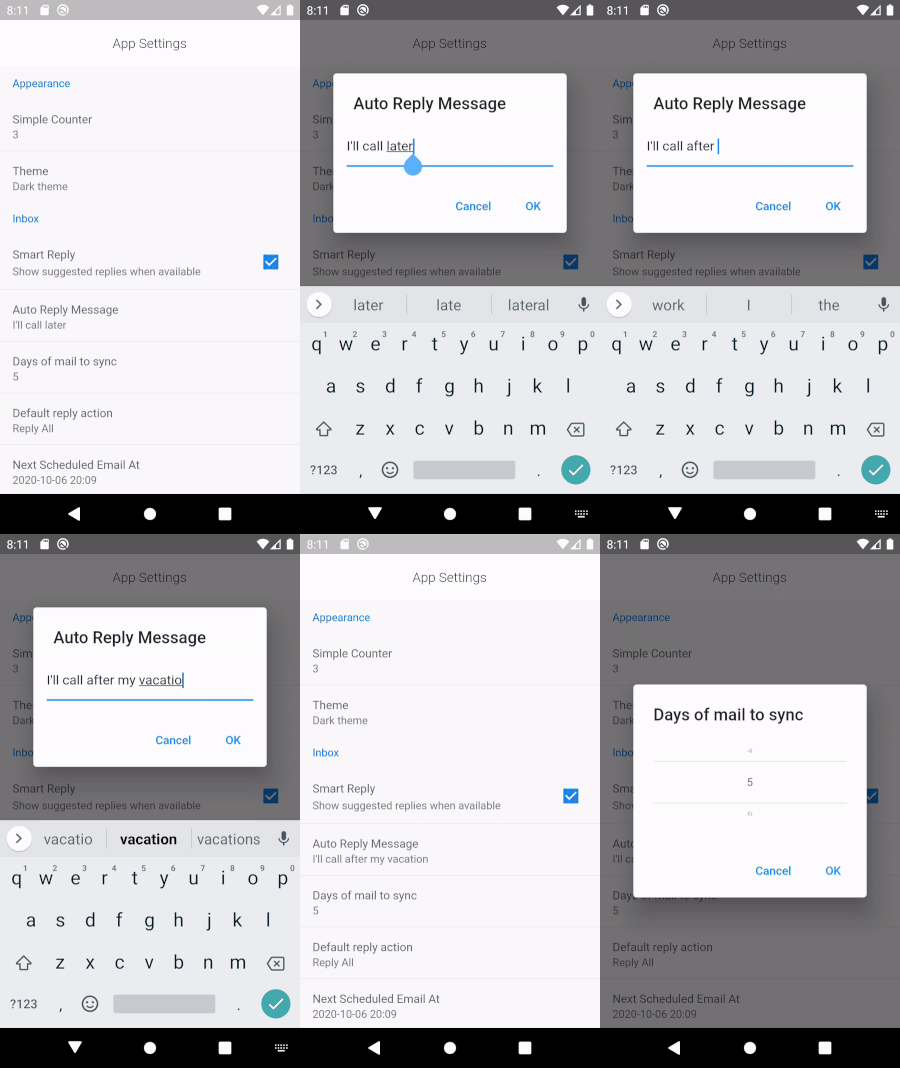
  • Text Input

Text Input

SettingTextItem(
  title: 'Auto Reply Message',
  displayValue: autoReplyMessage,
  initialValue: autoReplyMessage,
  hintText: 'Sent by system on away',
  onChanged: (v) => setState(() => autoReplyMessage = v),
),

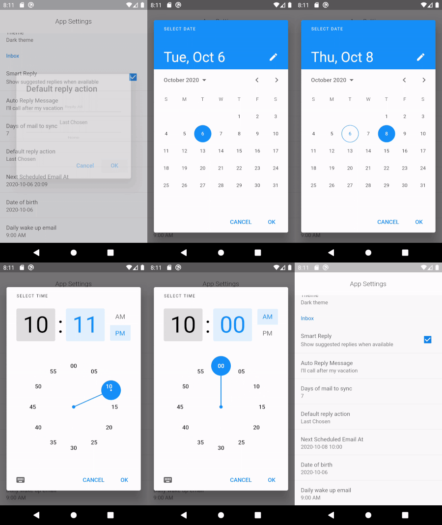
  • Date and Time Picker

Date Time Picker

SettingDateTimeItem<DateTime>(
  title: 'Next Scheduled Email At',
  displayValue: scheduledEmailSlug,
  onChanged: (v) => setState(() => scheduledEmailDateTime = v),
),
  • Date Picker

Date Picker

SettingDateTimeItem<DateTime>(
  title: 'Date of birth',
  displayValue: dateOfBirthSlug,
  onChanged: (v) => setState(() => dateOfBirth = v),
  timePicker: false,
),
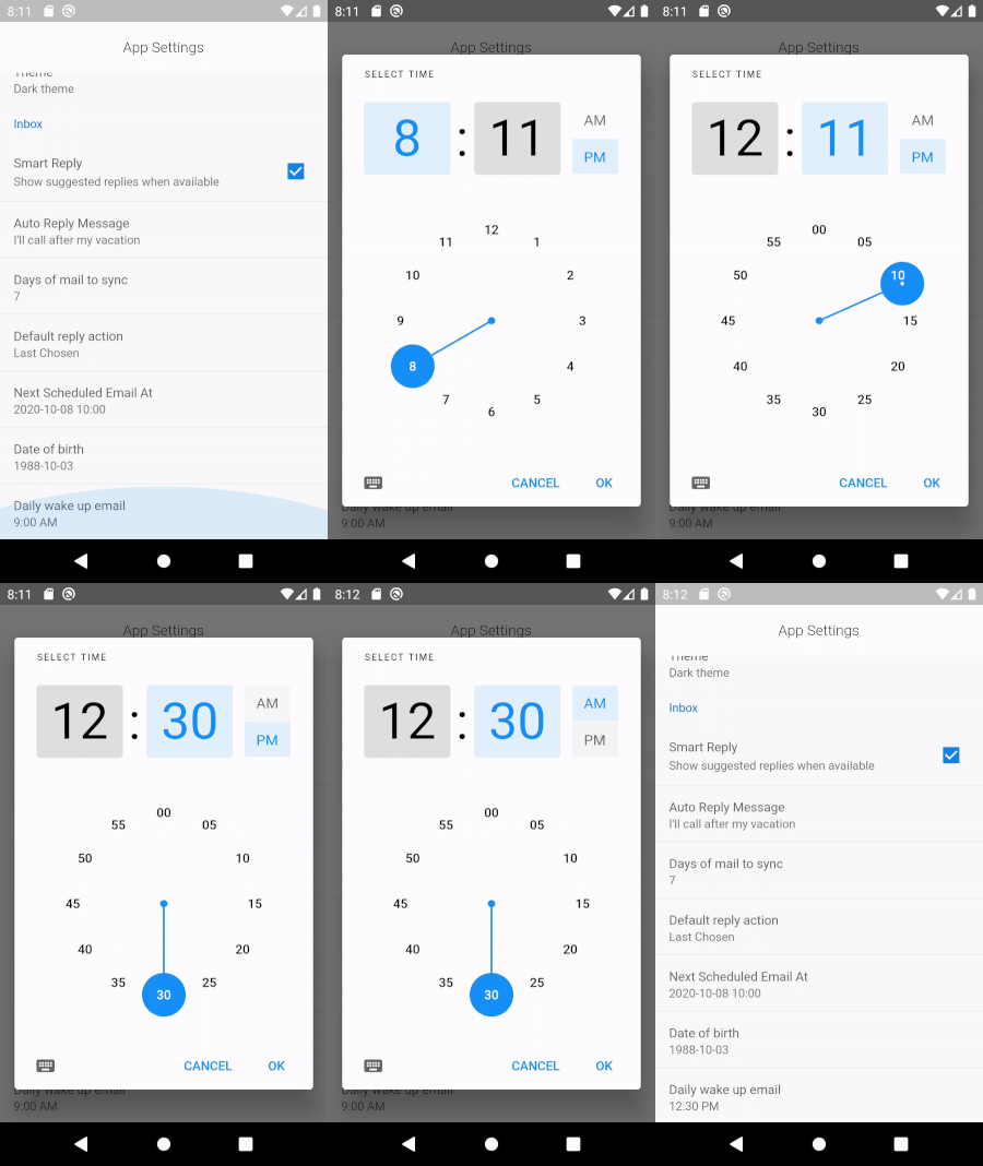
  • Time Picker

Time Picker

SettingDateTimeItem<TimeOfDay>(
  title: 'Daily wake up email',
  displayValue: dailyEmailAt.format(context),
  onChanged: (v) => setState(() => dailyEmailAt = v),
  datePicker: false,
),
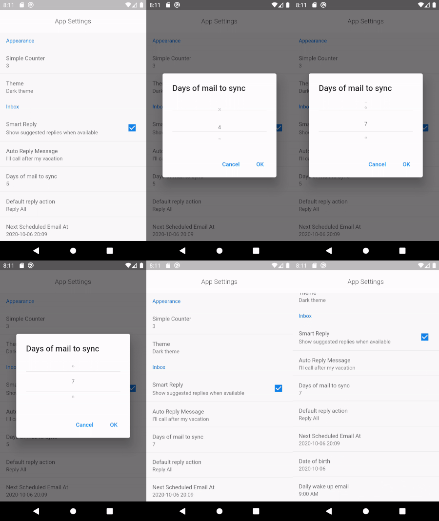
  • Wheel - Number List

Wheel Number

SettingWheelPickerItem(
  title: 'Days of mail to sync',
  displayValue: daysOfMailToSync.toString(),
  initialValueIndex: daysOfMailToSync,
  items: List.generate(10, (index) => index.toString()),
  onChanged: (v) => setState(() => daysOfMailToSync = v),
),
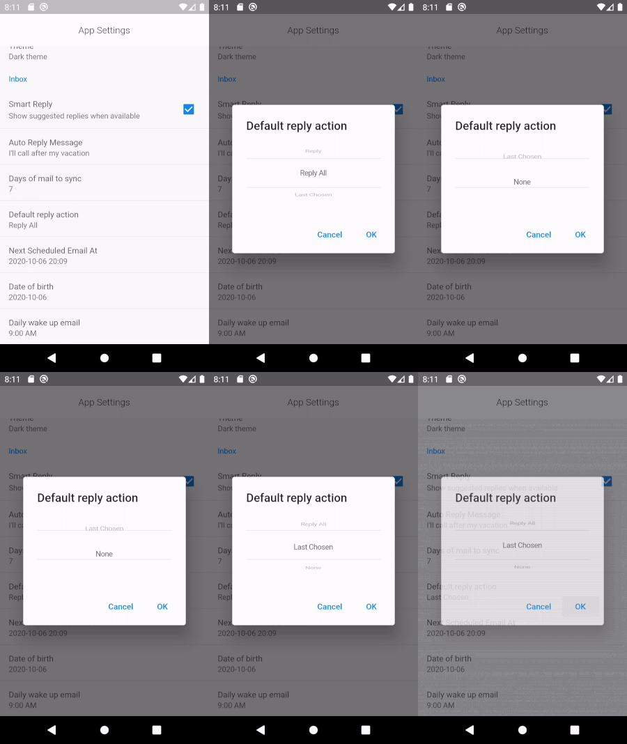
  • Wheel - Text

Wheel Text

var replyOptions = ['Reply', 'Reply All', 'Last Chosen', 'None'];
SettingWheelPickerItem(
  title: 'Default reply action',
  displayValue: replyOptions[chosenReplyOptionIndex],
  initialValueIndex: chosenReplyOptionIndex,
  items: replyOptions,
  onChanged: (v) => setState(() => chosenReplyOptionIndex = v),
),

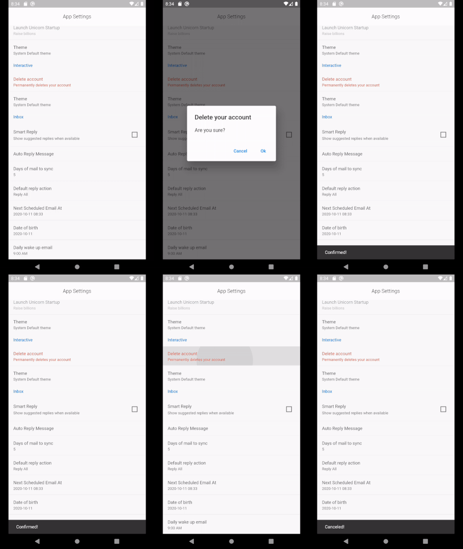
  • Confirm Dialog

Confirm Dialog

SettingConfirmItem(
  title: 'Delete account',
  displayValue: 'Permanently deletes your account',
  alertTitle: 'Delete your account',
  alertMessage: 'Are you sure?',
  priority: ItemPriority.high,
  onConfirm: () => {},
  onCancel: () => {},
),

  • Custom Handler

Custom Handler

SettingItem(
  title: 'Simple Counter',
  displayValue: counter.toString(),
  onTap: () => setState(() => counter++),
),

Structure


Root - SettingContainer
         \
          \_ SettingSection
                 \
                  \_ SettingItem (or Variants) 

Common Options

  • priority

Set the priority of the item to one of:

  • ItemPriority.high - Shows red color
  • ItemPriority.normal - Default color
  • ItemPriority.low - Shows in green color
  • ItemPriority.disabled - Disables the item

Example

Creates a simple Checkbox setting item

SettingContainer(
  sections: [
    SettingSection(
      title: 'Appearance',
      items: [
        SettingCheckboxItem(
            title: 'Smart Reply',
            value: smartReply,
            onChanged: (v) => setState(() => smartReply = v),
            description: 'Show suggested replies when available'),
      ],
    ),
  ],
)

Notes

  • Early version
  • API bound to change as more widgets get added
  • Please report bugs/issues/features

Buy Me A Coffee

Buy Me A Coffee

Categories

Source repository

Projects using this package

No data available yet.