Search packages, repositories and app categories

color_picker_field cover
Package detailsv2.1.0

color_picker_field

Color Picker field for Material and Cupertino, including a Radial Color picker(Hue based)

AndroidiOSWebmacOSWindowsLinux
30-day downloads
199
Likes
16
Pub points
150

Install package

flutter pub add color_picker_field

Package Overview

Package selection guidance compiled from public package information, community data, and project usage.

A Flutter package providing a customizable color picker field for both Material and Cupertino designs, featuring a radial color picker that is hue-based for intuitive color selection. It supports multiple platforms including Android, iOS, Web, macOS, Windows, and Linux. The widget integrates seamlessly into forms and allows users to pick colors with precision using a circular hue wheel and saturation/value sliders. Ideal for apps requiring dynamic color input in UI customization or design tools.

Use cases

  • Form inputs requiring color selection
  • UI theme customization
  • Design tool interfaces
  • Color palette creation
  • Mobile and web app styling
  • Interactive color pickers in dashboards

Key features

  • Radial hue-based color picker
  • Material and Cupertino compatibility
  • Cross-platform support
  • Customizable UI components
  • Integration with form fields
  • Real-time color preview

Suitable for

  • App developers building design tools
  • UI/UX designers implementing color pickers
  • Apps needing dynamic theme options
  • Form-heavy applications with color inputs
  • Cross-platform mobile and web apps

Considerations

  • May require additional styling for complex themes
  • Performance impact with many instances
  • Limited to basic color picking (no advanced color models)
  • Not suitable for high-precision color workflows
  • Depends on external dependency management

Original README

Original README snapshot from the linked source repository. Visit the repository for the latest content.

Color Picker Field

Pub

Color Picker field for Material and Cupertino, including a Radial Color picker(Hue based)

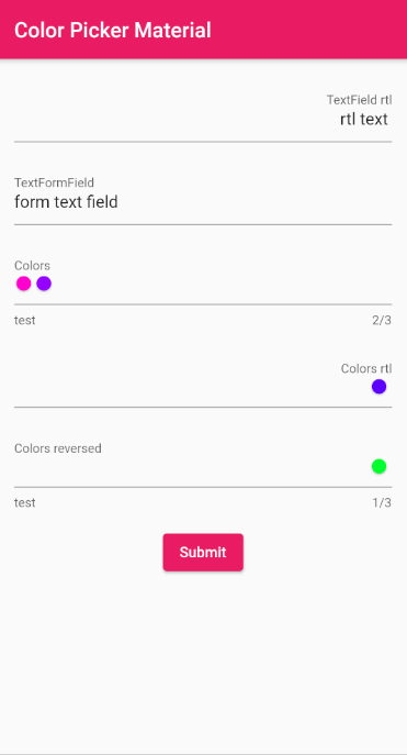
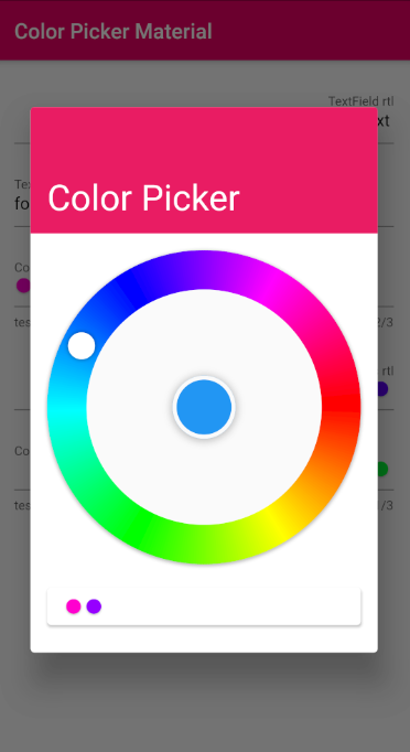
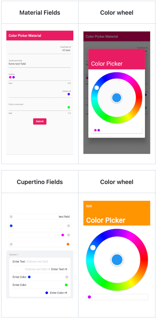
Material

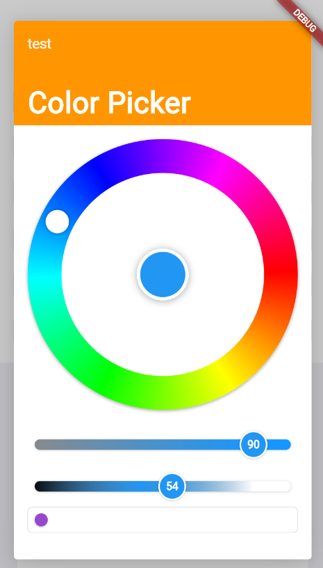
Material Fields Color wheel Remove colors Saturation and Lightness

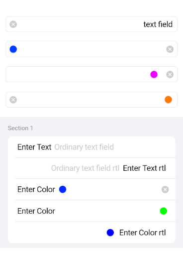
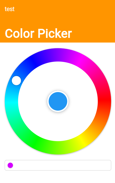
Cupertino

Cupertino Fields Color wheel Remove colors Saturation and Lightness

Usage

Just the ColorPickerField without a Form with a controller set
final ColorPickerFieldController controller = ColorPickerFieldController();
ColorPickerField(
  colors: [],
  defaultColor: Colors.blue,
  onChanged: (Color value) {},
  controller: controller,
  decoration: InputDecoration(
    labelText: 'Colors',
  ),
),
ColorPickerFieldFor with a validator, decoration and an onChange callback
ColorPickerFormField(
  initialValue: [],
  defaultColor: Colors.blue,
  autovalidateMode: AutovalidateMode.onUserInteraction,
  maxColors: 3,
  decoration: InputDecoration(
    labelText: 'Colors',
    helperText: 'test',
  ),
  validator: (List<Color>? value) {
    if (value!.isEmpty) {
      return 'a minimum of 1 color is required';
    }
    return null;
  },
  onChanged: (Color value) {},
),
Just a CupertinoColorPickerField without a Form
CupertinoColorPickerField(
  placeholder: 'CupertinoColorPickerField',
  colors: [],
  defaultColor: Colors.blue,
  onChanged: (Color value) {},
  clearButtonMode: ClearButtonVisibilityMode.always,
),
A CupertinoColorPickerField inside a CupertinoFormSection using CupertinoColorPickerFormFieldRow
CupertinoFormSection.insetGrouped(
  header: const Text('Section 1'),
  children: [
    // A field with an always showing clear button
    CupertinoColorPickerFormFieldRow(
      prefix: const Text('Enter Color'),
      defaultColor: defaultColor,
      clearButtonMode: ClearButtonVisibilityMode.always,
      placeholder: 'Enter Color',
      onChanged: _onChanged,
      validator: (List<Color>? value) {
        if (value == null || value.isEmpty) {
          return 'Please enter at least one color';
        }
        return null;
      },
    ),
    
    // A field with a reversed position and order of the chosen colors list
    CupertinoColorPickerFormFieldRow(
      prefix: const Text('Enter Color'),
      defaultColor: defaultColor,
      placeholder: 'Enter Color',
      onChanged: (Color value) {},
      colorListReversed: true,
      validator: (List<Color>? value) {
        if (value == null || value.isEmpty) {
          return 'Please enter at least one color';
        }
        return null;
      },
    ),

    // Forcing Text Direction using Directionality widget, 
    // by default the TextDirection will be read from the Localization
    Directionality(
      textDirection: TextDirection.rtl,
      child: CupertinoColorPickerFormFieldRow(
        prefix: const Text('Enter Color rtl'),
        defaultColor: defaultColor,
        placeholder: 'Enter Color rtl',
        onChanged: (Color value) {},
        validator: (List<Color>? value) {
          if (value == null || value.isEmpty) {
            return 'Please enter at least one color';
          }
          return null;
        },
      ),
    ),
  ],
),

API reference

Categories

Dependencies

Dependency list 2 items

Source repository

Projects using this package

No data available yet.