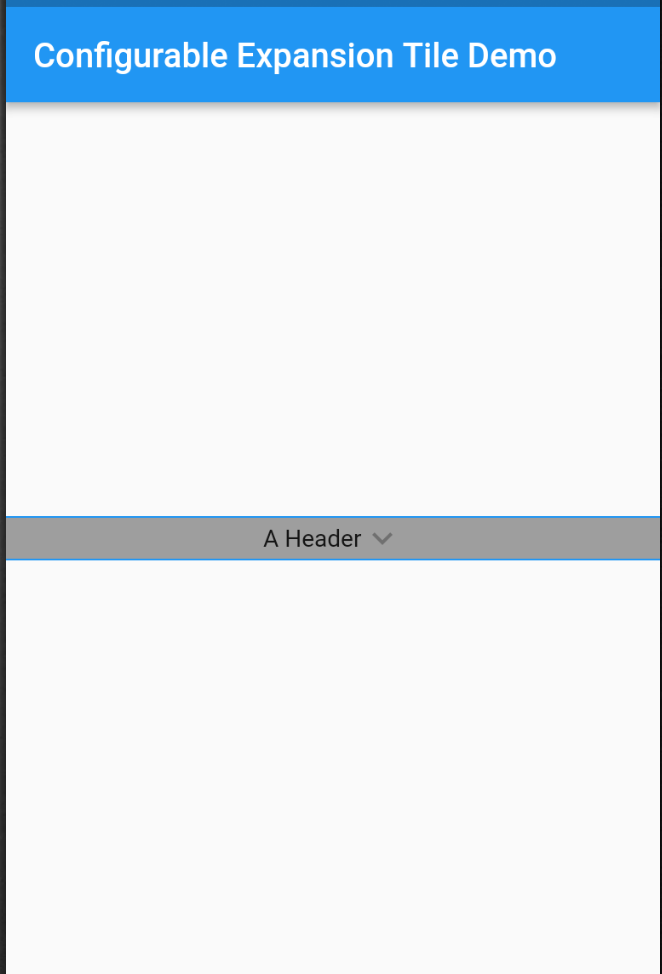
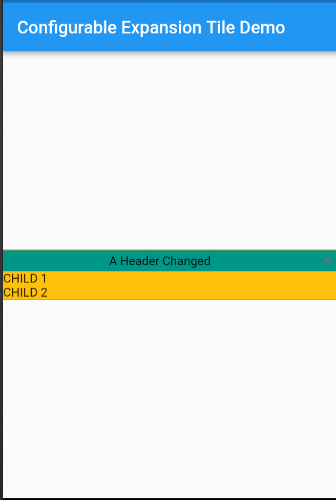
A customizable version of Flutter's ExpansionTile, derived from the Material implementation, offering enhanced control over appearance and behavior. It allows developers to tailor the tile's visual elements, such as icons, colors, and animations, while maintaining the core functionality of expandable content sections. Ideal for creating dynamic, user-friendly interfaces with collapsible content.
Use cases
- Customizable accordions
- Dynamic form sections
- Interactive FAQ displays
- Nested expandable lists
- Settings panels with collapsible options
Key features
- Fully customizable header
- Adjustable animation duration
- Support for custom trailing icons
- Extensible theme integration
- Configurable expansion states
Suitable for
- Developers needing flexible expansion tiles
- UI designers wanting unique tile styles
- Apps with complex collapsible layouts
- Projects requiring consistent theming across tiles
Considerations
- Requires manual handling of state management
- Limited platform-specific optimizations
- May increase bundle size slightly
- Not suitable for simple static expansions
- Depends on upstream Material design conventions