Search packages, repositories and app categories

container_tab_indicator cover
Package detailsv0.3.0

container_tab_indicator

Build your own Tab indicator using familiar Container-like properties.

AndroidiOSWebmacOSWindowsLinux
30-day downloads
6.8K
Likes
44
Pub points
160

Install package

flutter pub add container_tab_indicator

Package Overview

Package selection guidance compiled from public package information, community data, and project usage.

ContainerTabIndicator is a Flutter package that allows developers to create custom tab indicators using familiar Container properties such as color, border, padding, and margin. It provides a flexible and intuitive way to design tab indicators without relying on default Material or Cupertino widgets. Ideal for apps requiring unique visual styles or consistent branding across platforms, it supports all major Flutter platforms including Android, iOS, Web, macOS, Windows, and Linux.

Use cases

  • Custom tab UIs
  • Branding consistency
  • Cross-platform tab designs
  • Non-Material tab indicators
  • Dynamic indicator styling

Key features

  • Container-like styling
  • Platform agnostic
  • Easy integration
  • Flexible layout control
  • Supports animations
  • Minimal boilerplate

Suitable for

  • Designers seeking visual control
  • Developers building custom navigation
  • Apps with branded UIs
  • Multi-platform applications
  • Teams avoiding Material defaults

Considerations

  • Limited to tab indicator use
  • No built-in animation support
  • Requires manual positioning
  • Not suitable for complex tab layouts
  • Depends on parent TabBar structure

Original README

Original README snapshot from the linked source repository. Visit the repository for the latest content.

ContainerTabIndicator

pub package

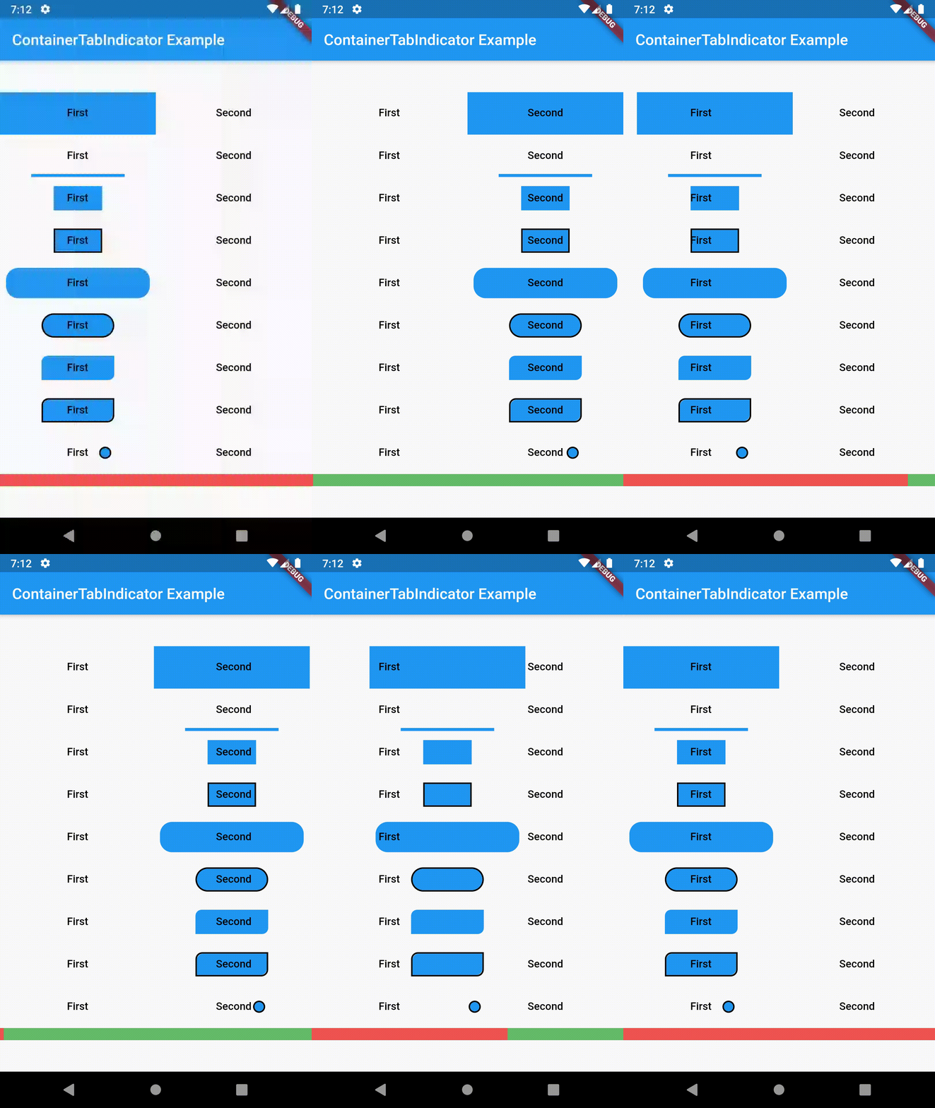
Add customized ContainerTabIndicator as an indicator for your TabBar. You can manipulate width, height, color, radius, border and positioning within Tab.

class ContainerTabIndicator extends Decoration {
  final double width;
  final double widthFraction;
  final double height;
  final double heightFraction;
  final EdgeInsetsGeometry padding;
  final Color color;
  final BorderRadius radius;
  final double borderWidth;
  final Color borderColor;
  ...
}

Example

The full example code can be found here.

import 'package:container_tab_indicator/container_tab_indicator.dart';

...

TabBar(
  tabs: [
    Text('First', style: TextStyle(color: Colors.black)),
    Text('Second', style: TextStyle(color: Colors.black)),
  ],
  indicator: ContainerTabIndicator(
    width: 16,
    height: 16,
    radius: BorderRadius.circular(8.0),
    padding: const EdgeInsets.only(left: 36),
    borderWidth: 2.0,
    borderColor: Colors.black,
  ),
),

example

Contributing

This package is still in early stages. To see the upcoming features, check the Issue board. If you notice any bugs not present in issues, please file a new issue. If you are willing to fix or enhance things yourself, you are very welcome to make a pull request.

Categories

Source repository

Projects using this package