Search packages, repositories and app categories

cupertino_tabbar cover
Package detailsv2.0.0

cupertino_tabbar

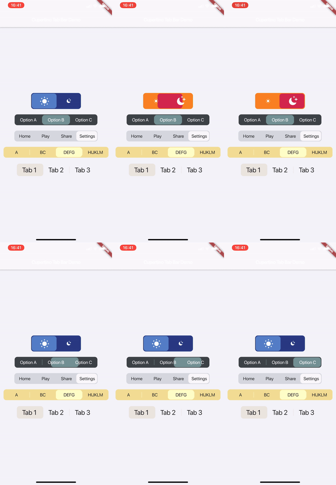
A highly customisable and simple widget for having iOS 13 style tab bars.

AndroidiOSWebmacOSWindowsLinux
30-day downloads
2.5K
Likes
72
Pub points
140

Install package

flutter pub add cupertino_tabbar

Package Overview

Package selection guidance compiled from public package information, community data, and project usage.

A customizable and straightforward Flutter widget that replicates the iOS 13-style tab bar, offering a native-like experience across platforms. It supports smooth animations, custom icons, labels, and styling options to match modern iOS design principles. The widget is lightweight and easy to integrate, making it ideal for apps aiming for consistent iOS aesthetics on Android and other platforms. It's particularly useful for navigation-heavy applications requiring a clean, minimal tab interface.

Use cases

  • iOS-style navigation in cross-platform apps
  • Custom tab bars with animated transitions
  • Simple yet elegant bottom navigation
  • Apps targeting iOS user experience consistency
  • Replacing default TabBar with enhanced visuals

Key features

  • iOS 13 design mimicry
  • Highly customizable appearance
  • Smooth animation support
  • Supports icons and labels
  • Cross-platform compatibility
  • Easy integration with existing Flutter projects

Suitable for

  • Developers seeking iOS-native UI components
  • Projects requiring minimalistic tab navigation
  • Cross-platform apps with iOS design focus
  • Teams prioritizing visual consistency
  • Flutter beginners exploring tab bar customization

Considerations

  • Limited to iOS 13 aesthetic style
  • May require additional styling for non-iOS platforms
  • Not suitable for complex tab layouts
  • Best used in conjunction with CupertinoTheme
  • Potential performance impact with many tabs

Original README

Original README snapshot from the linked source repository. Visit the repository for the latest content.

cupertino_tabbar

Cosmos Software

Pub License

A highly customisable and simple widget for having iOS 13 style tab bars.

It is highly recommended to read the documentation and run the example project on a real device to fully understand and inspect the full range of capabilities.

Media | Description | Installation | How-to-Use

Recent

  • [useShadow] is added. If set to true, a shadow will be displayed under the indicator that is much more similar to the actual iOS version. See Media for examples.

  • [allowScrollable], [fittedWhenScrollable], [animateWhenScrollable], [animateUntilScrolled], [outerHorizontalPadding] and [outerVerticalPadding] are added. These all work towards making an easy-to-use scrollable tab bar. Please refer to the documentation and the examples for instructions and see Media for examples.


Warning

  • Variables previously named as [horizontalPadding], [verticalPadding] and [expand] are now named [innerHorizontalPadding], [innerVerticalPadding] and [allowExpand].

Media

Watch on Youtube:

v1.1.0

v1.0.0


Description

This is a highly customisable and simple widget for having iOS 13 style tab bars.

How-to-Use

Simply create a CupertinoTabBar as shown in the example:

CupertinoTabBar(
  Colors.black                  //_backgroundColor
  Colors.white                  //_foregroundColor
  [...],                        //_widgets
  cupertinoTabBarValueGetter,   //_valueGetter
  (int index) {                 //_onTap
    setState(() {
      cupertinoTabBarValue = index;
    });
  },
  {Key key,
  useSeparators             : false,
  innerHorizontalPadding    : 10.0,
  innerVerticalPadding      : 10.0,
  borderRadius              : const BorderRadius.all(const Radius.circular(10.0)),
  curve                     : Curves.linearToEaseOut,
  duration                  : const Duration(milliseconds: 350),
  allowExpand               : false,
  allowScrollable           : false,
  fittedWhenScrollable      : false,
  animateWhenScrollable     : false,
  animateUntilScrolled      : false,
  outerHorizontalPadding    : 10.0,,
  outerVerticalPadding      : 0})
)

int cupertinoTabBarValue = 0;
int cupertinoTabBarValueGetter() => cupertinoTabBarValue;

Further Explanations:

For a complete set of descriptions for all parameters and methods, see the documentation.

  • Do not set both [allowExpand] and [allowScrollable] to true.

Notes

Any help, suggestion or criticism is appreciated!

Cheers.


Categories

Source repository

Projects using this package

No data available yet.