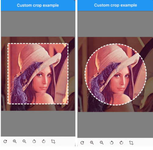
Package selection guidance compiled from public package information, community data, and project usage.
A highly customizable image cropper for Flutter that enables users to rotate, scale, and translate images using intuitive gestures or a controller. Designed for seamless integration across multiple platforms, it provides fine-grained control over the cropping experience. Ideal for apps requiring advanced image manipulation with responsive and interactive interfaces. The package supports Android, iOS, Web, macOS, Windows, and Linux, ensuring broad compatibility.
Use cases
Custom image editing in photo apps
User profile picture cropping
Interactive image selection tools
Dynamic image resizing in design apps
Image preprocessing for machine learning workflows
Key features
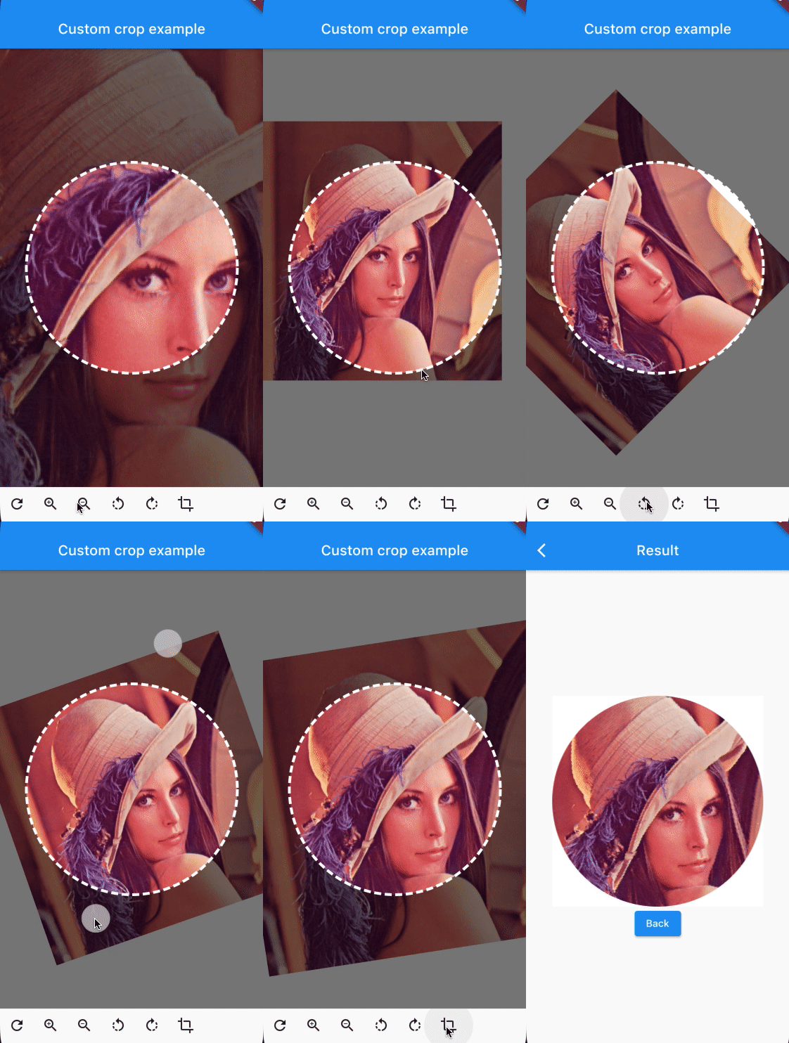
Gesture-based rotation, scaling, and translation
Controller-driven image manipulation
Cross-platform support
Highly customizable UI components
Real-time preview during cropping
Responsive design for all screen sizes
Suitable for
Developers building image editing features
Apps requiring precise image cropping
Multi-platform image manipulation tools
Interactive user interfaces with image handling
Prototyping advanced image editing workflows
Considerations
Requires careful handling of large images to avoid performance issues
May need additional state management for complex use cases
Initial setup requires understanding of gesture detectors and controllers
Not optimized for very high-resolution images without downsampling
Limited built-in presets; customization required for specific crop ratios
Original README
Original README snapshot from the linked source repository. Visit the repository for the latest content.
You can provide the image using any Imageprovider.
Parameters
required image
The image that needs to be cropped
cropController
The controller used to adjust the image and crop it.
overlayColor
The color above the image that will be cropped
backgroundColor
The color behind the image. This color will also be used when there are gaps/empty space after the cropping
shape
The shape of the cropping path.
maskShape
The shape of the UI masking.
cropPercentage
How big the crop should be in regards to the width and height available to the cropping widget.
drawPath
How the border of the crop should be painted. default DottedCropPathPainter.drawPath and SolidCropPathPainter.drawPath are provided, but you can create/provide any CustomPaint.
pathPaint
Custom painting for the crop area border style.
canRotate
Whether to allow the image to be rotated.
customProgressIndicator
Custom widget for progress indicator.
ratio
Ratio of the cropping area.
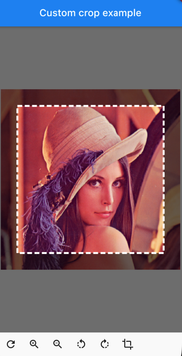
If shape`` is set to CustomCropShape.Ratio, this property is required. For example, to create a square crop area, use [Ratio(width: 1, height: 1).
To create a rectangular crop area with a 16:9 aspect ratio, use [Ratio(width: 16, height: 9)`.
borderRadius
The radius for rounded corners of the cropping area.
forceInsideCropArea
Whether image area must cover clip path.
Controller Methods
addTransition
void addTransition(CropImageData transition)
Add the position, angle and scale to the current state. This can be used to adjust the image with sliders, buttons, etc.
setData
void setData(CropImageData data)
Set the position, angle and scale to the specified values. This can be used to center the image by pressing a button for example.
reset
void reset()
Reset the image to its default state
onCropImage
Future<MemoryImage> onCropImage()
Crops the image in its current state, this will return a MemoryImage that contains the cropped image