Package selection guidance compiled from public package information, community data, and project usage.
The dashboard package provides a dynamic, user-configurable widget for building customizable layouts. Users can freely resize, move, and rearrange widgets within the dashboard, with support for indirect resizing and automatic re-layout. Ideal for dashboards requiring interactive customization, it works across all major platforms including Android, iOS, Web, macOS, Windows, and Linux. The package is designed for developers seeking flexible, responsive UIs that adapt to user preferences in real time.
Use cases
Customizable analytics dashboards
User-defined layout interfaces
Interactive admin panels
Real-time data visualization
Responsive grid-based applications
Key features
Drag-and-drop widget repositioning
Resizable widgets with auto re-layout
Indirect resize/move support
Cross-platform compatibility
Dynamic layout persistence
Configurable grid system
Suitable for
Developers building interactive dashboards
Apps requiring user-customizable UIs
Projects with dynamic content grids
Frontend teams focused on UX flexibility
Web and mobile apps needing responsive layouts
Considerations
May require performance optimization for large numbers of widgets
Initial setup involves configuring grid and widget constraints
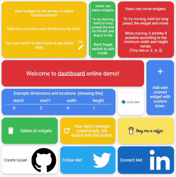
Dashboard can be thought of as a dynamic grid. Your users can create their own layouts, add new widgets or remove widgets.
Layout divides the screen into horizontal slots according to the entered value. The aspect ratio of the slots also determine their height. Widgets called DashboardItem are placed in these slots. This layout can be changed later.
Resize
Dashboard Items can be resized both by long pressing on mobile and by holding and moving on desktop/browser.
Move
Dashboard Item locations can be changed by long pressing on mobile or by holding and pulling on desktop/browser.
Slots Changes
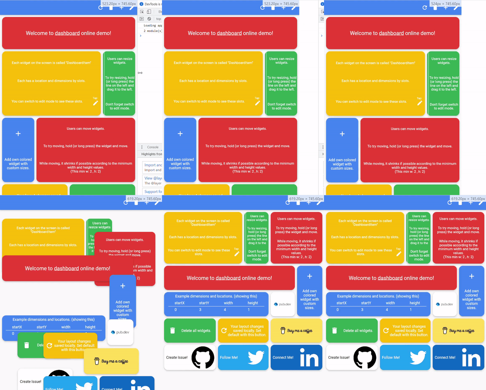
With dynamic slot count, you can re-layout window size changes.
>
Storage Delegate
The layout information of the users can be stored in the database or on the local disk.
Define your storage delegate.
classMyItemStorageextendsDashboardItemStorageDelegate{
@overrideFutureOr<List<DashboardItem>> getAllItems(int slotCount) {
// return items from db.
}
@overrideFutureOr<void> onItemsUpdated(
List<DashboardItem> items, int slotCount) {
// save new layouts to db.
}
//[...]
}
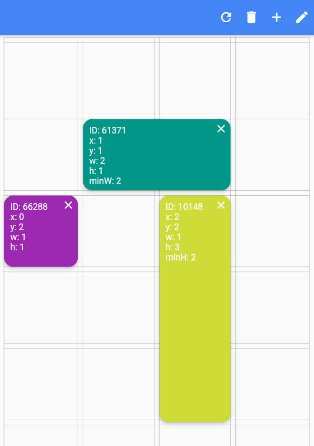
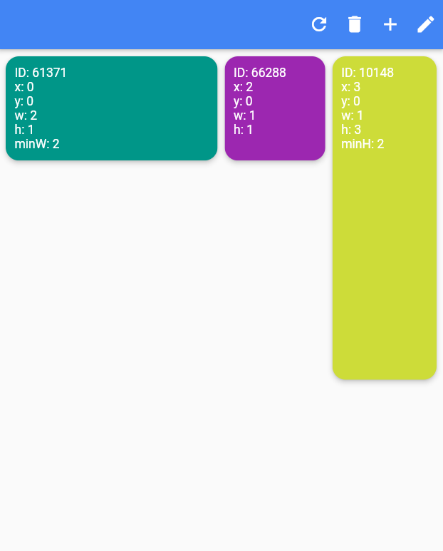
Slide to top items initially. Auto relayout places items to top as possible.
slideToTop: true
Before:
>
After:
>
Shrink
Shrink items when re-layout or editing is possible.
Edit Mode Settings
See code comments for edit mode settings parameters.
All is optional.
EditModeSettings(
// animation settings
curve: Curves.easeInOutCirc,
duration: constDuration(milliseconds: 200),
// fill editing item actual size
fillEditingBackground: true,
// space that can be held to resize
resizeCursorSide: 20,
// draw lines for slots
paintBackgroundLines: true,
// shrink items when editing if possible and necessary
shrinkOnMove: true,
// long press to edit
longPressEnabled: true,
// pan to edit
panEnabled: true,
backgroundStyle: constEditModeBackgroundStyle(
fillColor: Colors.red,
lineWidth: 1.5,
lineColor: Colors.black,
// line by vertical space
dualLineHorizontal: true,
// line by horizontal space
dualLineVertical: true));



 >
 >
 >