
Overview
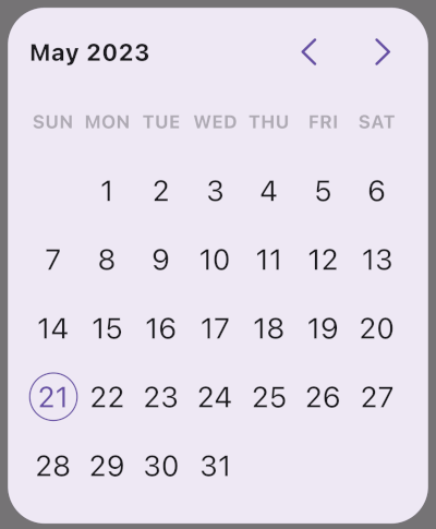
A Flutter library offering customizable Material Design date and range picker widgets. It supports all major platforms including Android, iOS, Web, macOS, Windows, and Linux. The package enhances user experience with intuitive, visually consistent date selection interfaces that align with Material Design principles. Developers can easily tailor the appearance and behavior of pickers to match app themes and requirements. Built for flexibility and ease of integration, it simplifies handling date inputs in Flutter applications.
Use cases
- Form date input
- Booking or scheduling apps
- Event planning tools
- User profile setup
- Data filtering by date
- Multi-day event selection
Key features
- Customizable UI
- Material Design compliance
- Range date picker support
- Cross-platform compatibility
- Easy integration with forms
- Theme-aware styling
Suitable for
- Developers building form-heavy apps
- Apps requiring date selection
- Teams using Material Design
- Cross-platform Flutter projects
- UI-focused date input solutions
Considerations
- Requires manual theme configuration for non-Material designs
- Limited customization beyond Material specs
- No built-in validation
- May need additional localization setup
- Not optimized for complex calendar logic
- Depends on Flutter's Material package