
Overview
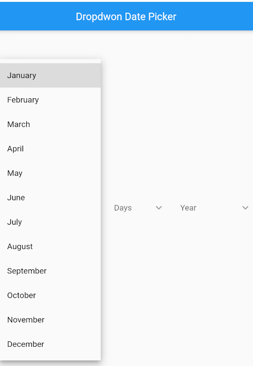
A Flutter package that provides a dropdown-style date picker with customizable options for selecting dates. It integrates seamlessly into forms and UIs, offering a compact and user-friendly way to pick dates without opening a full calendar modal. Supports multiple platforms including Android, iOS, Web, macOS, Windows, and Linux. The widget is lightweight and designed for developers seeking a simple, accessible alternative to standard date pickers. Customization includes styling, date format, and selection behavior.
Use cases
- Form inputs requiring date selection
- Lightweight date input in mobile and web apps
- Customizable date pickers in constrained UI spaces
- Integrating date selection into dropdown menus
- Accessibility-focused date input components
Key features
- Dropdown-based date selection
- Cross-platform compatibility
- Customizable appearance and behavior
- Supports various date formats
- Easy integration with existing forms
- Minimal boilerplate required
Suitable for
- Developers needing a compact date picker
- Projects with space constraints on the UI
- Apps targeting multiple platforms
- Teams prioritizing accessibility
- UIs requiring consistent date input design
Considerations
- Limited to single date selection
- No built-in validation
- Requires manual handling of date parsing
- Not suitable for complex date ranges
- Less visual feedback compared to full calendar pickers