Package selection guidance compiled from public package information, community data, and project usage.
The day_picker package is a Flutter library designed to simplify the selection of days within a week. It provides a clean, customizable widget for users to pick specific weekdays, making it ideal for scheduling, planning, or recurring event setups. The package supports multiple platforms including Android, iOS, Web, macOS, Windows, and Linux, ensuring consistent behavior across devices. With intuitive UI components and easy integration via pub, it enhances date-related interactions in Flutter apps.
Use cases
Scheduling recurring events
Planning weekly routines
Setting up appointment calendars
Configuring user preferences
Building task management tools
Key features
Weekday selection interface
Cross-platform compatibility
Customizable UI
Easy integration with pub
Supports all major Flutter platforms
Suitable for
App developers building calendar features
Teams creating productivity or planning apps
Developers needing simple weekday pickers
Flutter beginners exploring date pickers
Considerations
Limited to weekday selection only
No date range support
Does not include month/year navigation
Best suited for weekly-focused workflows
Requires manual handling of selected days logic
Original README
Original README snapshot from the linked source repository. Visit the repository for the latest content.
Day Picker
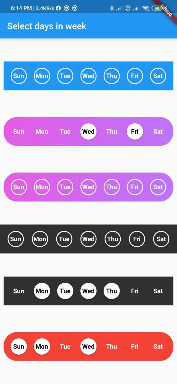
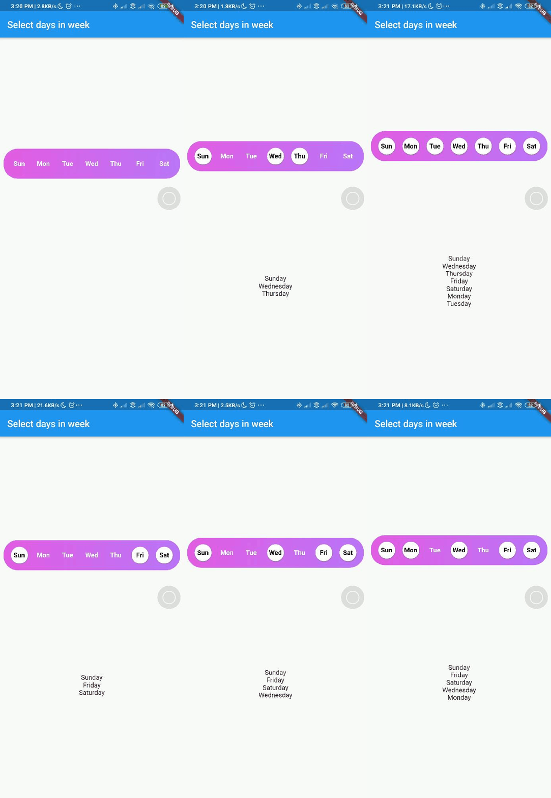
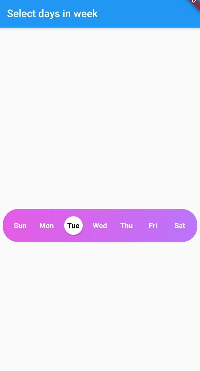
A Flutter widget library which helps us to select days in a week.
DayInWeek consist of three Properties [dayName], [dayKey] and [isSelected].
By default [isSelected] value will be false
Example:
voidhandleOnSelect(List<String> days){
//TODO: Manipulate the List of days selectedprint(days);
}
Customization
Property
Type
Description
onSelect
List<String>
Callback invoked when days are selected
days
List<DayInWeek>
List of days that need to be passed
padding
double
Padding between container and the buttons [by default it is 8.0]
boxdecoration
BoxDecoration
provides variety of ways to style the background container[gradient, color, border radius]
backgroundColor
Color
Property to change the color of the container
fontSize
double
Property to change size of font
fontWeight
FontWeight
Property to change the font weight of text
daysFillColor
Color
Property to change the color of rounded buttons when the days are selected
daysBorderColor
Color
Property to change the border color of rounded button
selectedDayTextColor
Color
property to change the text color of the selected days
unSelectedDayTextColor
Color
property to change the text color when the days are not selected
border
bool
Set this property to false if border is not needed around the rounded buttons[by default this property will be true]
With the implementation of the setDaysState method, developers can dynamically modify which days are selected within their application's code, even after the SelectWeekDays widget has already been constructed.
By utilizing the Global Key that is passed into the widget, one can easily update the selected dates as desired.
Contributions
Contributions of any kind are more than welcome😊! Feel free to fork and improve day_picker or open an issue.