Package selection guidance compiled from public package information, community data, and project usage.
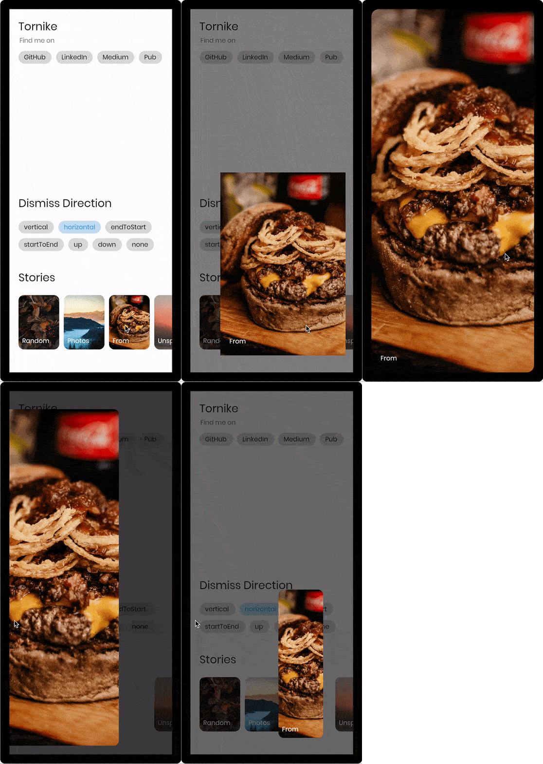
A Flutter widget that enables users to dismiss a page by swiping in any direction, replacing traditional back buttons and basic transitions. It provides fluid, gesture-driven navigation with customizable dismissal behavior, enhancing user experience on mobile and web platforms. The package supports multiple platforms including Android, iOS, Web, macOS, Windows, and Linux, making it versatile for cross-platform apps. Built with smooth animations and intuitive interactions, it's ideal for modern, interactive UIs.
Use cases
Swipe-to-dismiss modals
Interactive onboarding flows
Gesture-based navigation
Custom page dismissal
Enhanced user engagement
Key features
Direction-agnostic swipe dismissal
Smooth animated transitions
Cross-platform support
Customizable drag sensitivity
Built-in edge detection
Easy integration with Navigator
Suitable for
Modern app interfaces
Interactive tutorials
Gesture-heavy applications
Design-focused UX
Mobile-first development
Considerations
May conflict with other gesture detectors
Requires careful handling of nested navigations
Not suitable for complex navigation stacks
Performance impact with heavy widgets
Limited accessibility support
Needs testing across all target platforms
Original README
Original README snapshot from the linked source repository. Visit the repository for the latest content.
const imageUrl =
'https://user-images.githubusercontent.com/26390946/155666045-aa93bf48-f8e7-407c-bb19-bc247d9e12bd.png';
classFirstPageextendsStatelessWidget{
@overrideWidgetbuild(BuildContext context) {
returnScaffold(
backgroundColor: Color.fromRGBO(228, 217, 236, 1),
body: GestureDetector(
onTap: () {
// Use extension method to use [TransparentRoute]// This will push page without route background
context.pushTransparentRoute(SecondPage());
},
child: Center(
child: SizedBox(
width: 200,
// Hero widget is needed to animate page transition
child: Hero(
tag: 'Unique tag',
child: Image.network(
imageUrl,
fit: BoxFit.cover,
),
),
),
),
),
);
}
}
classSecondPageextendsStatelessWidget{
@overrideWidgetbuild(BuildContext context) {
returnDismissiblePage(
onDismissed: () {
Navigator.of(context).pop();
},
// Note that scrollable widget inside DismissiblePage might limit the functionality// If scroll direction matches DismissiblePage direction
direction: DismissiblePageDismissDirection.multi,
isFullScreen: false,
child: Hero(
tag: 'Unique tag',
child: Image.network(
imageUrl,
fit: BoxFit.cover,
),
),
);
}
}
Properties
constDismissiblePage({
requiredthis.child,
requiredthis.onDismissed,
this.onDragStart,
this.onDragEnd,
this.onDragUpdate,
this.isFullScreen = true,
this.disabled = false,
this.backgroundColor = Colors.black,
this.direction = DismissiblePageDismissDirection.vertical,
this.dismissThresholds = const <DismissiblePageDismissDirection, double>{},
this.dragStartBehavior = DragStartBehavior.down,
this.dragSensitivity = 0.7,
this.minRadius = 7,
this.minScale = .85,
this.maxRadius = 30,
this.maxTransformValue = .4,
this.startingOpacity = 1,
this.hitTestBehavior = HitTestBehavior.opaque,
this.reverseDuration = constDuration(milliseconds: 200),
Key? key,
}) : super(key: key);
/// Called when the widget has been dismissed.finalVoidCallback onDismissed;
/// Called when the user starts dragging the widget.finalVoidCallback? onDragStart;
/// Called when the user ends dragging the widget.finalVoidCallback? onDragEnd;
/// Called when the widget has been dragged. (0.0 - 1.0)finalValueChanged<DismissiblePageDragUpdateDetails>? onDragUpdate;
/// If true widget will ignore device padding/// [MediaQuery.of(context).padding]finalbool isFullScreen;
/// The minimum amount of scale widget can have while dragging/// Note that scale decreases as user dragsfinaldouble minScale;
/// The minimum amount fo border radius widget can havefinaldouble minRadius;
/// The maximum amount of border radius widget can have while dragging/// Note that radius increases as user dragsfinaldouble maxRadius;
/// The amount of distance widget is able to drag. value (0.0 - 1.0)finaldouble maxTransformValue;
/// If true the widget will ignore gesturesfinalbool disabled;
/// Widget that should be dismissedfinalWidget child;
/// Background color of [DismissiblePage]finalColor backgroundColor;
/// The amount of opacity [backgroundColor] will have when start dragging the widget.finaldouble startingOpacity;
/// The direction in which the widget can be dismissed.finalDismissiblePageDismissDirection direction;
/// The offset threshold the item has to be dragged in order to be considered/// dismissed. default is [_kDismissThreshold], value (0.0 - 1.0)finalMap<DismissiblePageDismissDirection, double> dismissThresholds;
/// Represents how much responsive dragging the widget will be/// Doesn't work on [DismissiblePageDismissDirection.multi]finaldouble dragSensitivity;
/// Determines the way that drag start behavior is handled.finalDragStartBehavior dragStartBehavior;
/// The amount of time the widget will spend returning to initial position if widget is not dismissed after dragfinalDuration reverseDuration;
/// How to behave during hit tests.////// This defaults to [HitTestBehavior.opaque].finalHitTestBehavior hitTestBehavior;