Search packages, repositories and app categories

fab_circular_menu_plus cover
Package detailsv0.0.4

fab_circular_menu_plus

A Flutter package to create a nice circular menu using a Floating Action Button.

AndroidiOSWebmacOSWindowsLinux
30-day downloads
571
Likes
56
Pub points
160

Install package

flutter pub add fab_circular_menu_plus

Package Overview

Package selection guidance compiled from public package information, community data, and project usage.

A Flutter package that enables the creation of elegant circular menus centered around a Floating Action Button (FAB). It provides smooth animations and customizable options for menu items, making it ideal for enhancing user interaction in mobile and web applications. The package supports multiple platforms including Android, iOS, Web, macOS, Windows, and Linux, ensuring consistent behavior across devices. With intuitive configuration and responsive design, it simplifies the implementation of interactive FAB-based navigation.

Use cases

  • Adding interactive FAB menus in mobile apps
  • Enhancing UI with animated circular action panels
  • Creating contextual quick-action interfaces
  • Implementing gesture-driven navigation in web apps
  • Designing accessible touch-friendly controls

Key features

  • Smooth circular animation for menu expansion
  • Customizable menu item layout and styling
  • Support for multiple platform targets
  • Easy integration with existing FAB components
  • Configurable trigger gestures and timing

Suitable for

  • Developers building feature-rich mobile UIs
  • Designers seeking dynamic FAB interactions
  • Teams targeting cross-platform consistency
  • Apps requiring intuitive gesture-based navigation
  • Projects emphasizing visual polish and user engagement

Considerations

  • May require performance tuning on low-end devices
  • Limited customization for complex menu behaviors
  • Depends on Flutter's gesture system stability
  • Not ideal for dense menu structures
  • Best suited for moderate numbers of menu items (4-8)

Original README

Original README snapshot from the linked source repository. Visit the repository for the latest content.

FAB Circular Menu

Pub package License Null safety Platform

A Flutter package to create a nice circular menu using a Floating Action Button.

Originally inspired by Mayur Kshirsagar's great FAB Microinteraction design. It is implemented as a Flutter plugin by Mariano Cordova (source code). This plugin is the continuation of the discontinued original plugin. I merged some of my bug fixes and made some changes to my liking.

I forked this plugin out of necessity and I have only a very limited time for maintenance, so PRs are highly welcome if any change is desired.

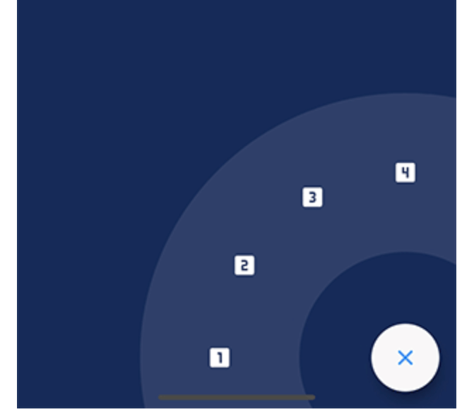
Showcase

Installation

Just add fab_circular_menu_plus to your pubspec.yml file

dependencies:
  fab_circular_menu_plus: ^0.0.1

Example

class MyApp extends StatelessWidget {
  @override
  Widget build(BuildContext context) {
    return MaterialApp(
      home: Scaffold(
        body: Placeholder(),
        floatingActionButton: FabCircularMenuPlus(
          children: <Widget>[
            IconButton(icon: Icon(Icons.home), onPressed: () {
              print('Home');
            }),
            IconButton(icon: Icon(Icons.favorite), onPressed: () {
              print('Favorite');
            })
          ]
        )
      )
    );
  }
}

You can check for a more complete example in the example directory.

Customize

You can customize the widget appearance using the following properties:

Property Description Default
alignment Sets the widget alignment Alignment.bottomRight
ringColor Sets the ring color accentColor
ringDiameterLimitFactor Sets the ring diameter limit factor 1.5
ringDiameter Sets the ring diameter screenWidth * ringDiameterLimitFactor (portrait)
screenHeight * ringDiameterLimitFactor (landscape)
ringWidthLimitFactor Sets the ring width limit factor 0.2
ringWidth Sets the ring width ringDiameter * ringWidthLimitFactor
fabSize Sets the FAB size 64.0
fabElevation Sets the elevation for the FAB 8.0
fabColor Sets the FAB color primaryColor
fabOpenColor Sets the FAB color while the menu is open. This property takes precedence over fabColor -
fabCloseColor Sets the FAB color while the menu is closed. This property takes precedence over fabColor -
fabChild Sets the child inside the FAB. This property takes precedence over fabOpenicon and fabCloseIcon -
fabOpenIcon Sets the FAB icon while the menu is open Icon(Icons.menu)
fabCloseIcon Sets the FAB icon while the menu is closed Icon(Icons.close)
fabMargin Sets the widget margin EdgeInsets.all(16.0)
animationDuration Changes the animation duration Duration(milliseconds: 800)
animationCurve Allows you to modify the animation curve Curves.easeInOutCirc
onDisplayChange This callback is called every time the menu is opened or closed, passing the current state as a parameter. -

Handling the menu programmatically

It is possible to handle the menu programmatically by using a key. Just create a key and set it in the key property of the FabCircularMenuPlus, then use the key to get the current state and open, close or check the status of the menu.

class MyApp extends StatelessWidget {
  final GlobalKey<FabCircularMenuPlusState> fabKey = GlobalKey();

  @override
  Widget build(BuildContext context) {
    return MaterialApp(
      home: Scaffold(
        body: RaisedButton(
          onPressed: () {
            if (fabKey.currentState.isOpen) {
              fabKey.currentState.close();
            } else {
              fabKey.currentState.open();
            }
          },
          child: Text('Toggle menu')
        ),
        floatingActionButton: FabCircularMenuPlus(
          key: fabKey,
          children: <Widget>[
            // ...
          ]
        )
      )
    );
  }
}

Contributing

I will be very happy if you contribute to this project, feel free to submit a PR.

Categories

Dependencies

Dependency list 1 items

Source repository

Projects using this package