Search packages, repositories and app categories

floating_bottom_bar cover
Package detailsv0.0.4

floating_bottom_bar

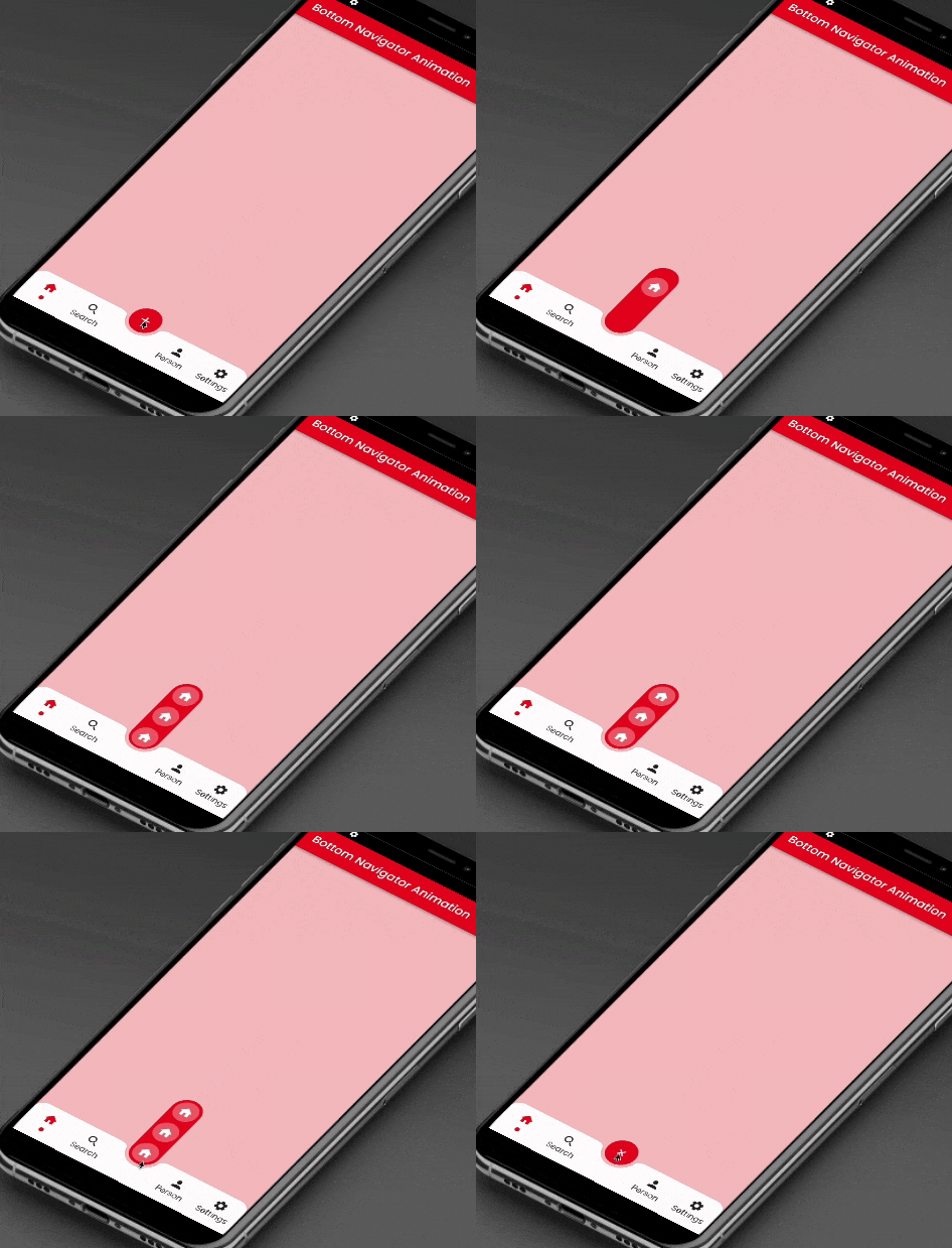
This package provides sliding animation to floating action button located at the center and bottom tab button.

AndroidiOSWebmacOSWindowsLinux
30-day downloads
1.4K
Likes
115
Pub points
150

Install package

flutter pub add floating_bottom_bar

Package Overview

Package selection guidance compiled from public package information, community data, and project usage.

The floating_bottom_bar package enhances user interfaces by adding smooth sliding animations to a floating action button positioned at the center and bottom tab buttons. Designed for Flutter apps, it seamlessly integrates with bottom navigation bars, offering an engaging and interactive experience across Android, iOS, Web, macOS, Windows, and Linux platforms. The package supports customizable transitions and responsive layouts, making it ideal for modern app designs that prioritize intuitive navigation and visual appeal.

Use cases

  • Enhancing mobile app navigation
  • Creating animated floating action buttons
  • Improving user engagement in dashboards
  • Designing responsive bottom navigation
  • Adding dynamic UI elements to web apps
  • Supporting multi-platform app development

Key features

  • Smooth sliding animation for FAB
  • Center-aligned floating action button
  • Bottom tab integration
  • Cross-platform compatibility
  • Customizable transition effects
  • Responsive layout support

Suitable for

  • Flutter developers seeking animated UIs
  • Apps requiring intuitive bottom navigation
  • Designers focused on interactive components
  • Multi-platform application builders
  • Mobile and web app UX enhancement

Considerations

  • Requires Flutter SDK 2.0 or higher
  • May impact performance on low-end devices
  • Limited customization beyond animation
  • Best suited for simple navigation patterns
  • Dependent on platform-specific rendering
  • Not ideal for complex navigation hierarchies

Original README

Original README snapshot from the linked source repository. Visit the repository for the latest content.

floating_bottom_bar

This package will animate a floating action button at the center and icons at the bottomNavigationBar using AnimatedContainer and SlideTransition respectively.

Floating Bottom Bar

Floating Bottom Bar

Usage

Example
    bottomNavigationBar: AnimatedBottomNavigationBar(
      barColor: Colors.white,
      controller: FloatingBottomBarController(initialIndex: 1),
      bottomBar: [
        BottomBarItem(
          icon: const Icon(Icons.home, size: example.Dimens.iconNormal),
          iconSelected: const Icon(Icons.home,
              color: example.AppColors.cherryRed,
              size: example.Dimens.iconNormal),
          title: example.Strings.home,
          dotColor: example.AppColors.cherryRed,
          onTap: (value) {
            setState(() {
              index = value;
            });
            log('Home $value');
          },
        ),
        BottomBarItem(
          icon:
              const Icon(Icons.photo, size: example.Dimens.iconNormal),
          iconSelected: const Icon(Icons.photo,
              color: example.AppColors.cherryRed,
              size: example.Dimens.iconNormal),
          title: example.Strings.search,
          dotColor: example.AppColors.cherryRed,
          onTap: (value) {
            setState(() {
              index = value;
            });
            log('Search $value');
          },
        ),
        BottomBarItem(
          icon:
              const Icon(Icons.person, size: example.Dimens.iconNormal),
          iconSelected: const Icon(Icons.person,
              color: example.AppColors.cherryRed,
              size: example.Dimens.iconNormal),
          title: example.Strings.person,
          dotColor: example.AppColors.cherryRed,
          onTap: (value) {
            setState(() {
              index = value;
            });
            log('Profile $value');
          },
        ),
        BottomBarItem(
          icon: const Icon(Icons.settings,
              size: example.Dimens.iconNormal),
          iconSelected: const Icon(Icons.settings,
              color: example.AppColors.cherryRed,
              size: example.Dimens.iconNormal),
          title: example.Strings.settings,
          dotColor: example.AppColors.cherryRed,
          onTap: (value) {
            setState(() {
              index = value;
            });
            log('Settings $value');
          },
        ),
      ],
      bottomBarCenterModel: BottomBarCenterModel(
        centerBackgroundColor: example.AppColors.cherryRed,
        centerIcon: const FloatingCenterButton(
          child: Icon(
            Icons.add,
            color: AppColors.white,
          ),
        ),
        centerIconChild: [
          FloatingCenterButtonChild(
            child: const Icon(
              Icons.home,
              color: AppColors.white,
            ),
            onTap: () => log('Item1'),
          ),
          FloatingCenterButtonChild(
            child: const Icon(
              Icons.access_alarm,
              color: AppColors.white,
            ),
            onTap: () => log('Item2'),
          ),
          FloatingCenterButtonChild(
            child: const Icon(
              Icons.ac_unit_outlined,
              color: AppColors.white,
            ),
            onTap: () => log('Item3'),
          ),
        ],
      ),
    ),
Required parameters
bottomBar:

This property takes List as a parameter which are use to show the icons in the bottomNavigationBar.

bottomBarCenterModel:

BottomBarCenterModel class is model class for bottom menu. It takes icon, iconSelected, title, titleStyle as parameters.

controller:

FloatingBottomBarController is used to give the initial index to the bottom bar to have the pre selected item form the bottom bar.

Guideline for contributors

Contribution towards our repository is always welcome, we request contributors to create a pull request to the develop branch only.

Guideline to report an issue/feature request

It would be great for us if the reporter can share the below things to understand the root cause of the issue.

  • Library version
  • Code snippet
  • Logs if applicable
  • Device specification like (Manufacturer, OS version, etc)
  • Screenshot/video with steps to reproduce the issue

LICENSE!

Animated Segment is MIT-licensed.

Let us know!

We’d be really happy if you send us links to your projects where you use our component. Just send an email to sales@mindinventory.com And do let us know if you have any questions or suggestion regarding our work.

Categories

Dependencies

Dependency list 1 items

Source repository

Projects using this package

No data available yet.