Search packages, repositories and app categories

flutter_awesome_buttons cover
Package detailsv1.1.0

flutter_awesome_buttons

A new Flutter package project.

AndroidiOSWebmacOSWindowsLinux
30-day downloads
126
Likes
34
Pub points
110

Install package

flutter pub add flutter_awesome_buttons

Package Overview

Package selection guidance compiled from public package information, community data, and project usage.

A Flutter package that provides a collection of visually appealing and customizable buttons for mobile, web, and desktop applications. Designed to enhance user interfaces with modern, animated button styles, it supports various themes and interactive feedback. The package is easy to integrate and ideal for developers seeking to improve the aesthetic quality of their app's UI without extensive custom coding. It works across all major platforms including Android, iOS, Web, macOS, Windows, and Linux.

Use cases

  • Enhancing app UI with stylish buttons
  • Creating interactive call-to-action elements
  • Adding animations to standard buttons
  • Improving user engagement through visual feedback
  • Building responsive forms with attractive controls

Key features

  • Pre-designed animated button templates
  • Customizable colors and sizes
  • Cross-platform compatibility
  • Easy integration via pub.dev
  • Support for touch and hover effects

Suitable for

  • UI/UX designers working with Flutter
  • Developers building apps with modern aesthetics
  • Projects requiring engaging interactive elements
  • Beginners learning Flutter UI components
  • Apps targeting multiple platforms

Considerations

  • May increase bundle size slightly
  • Requires understanding of basic Flutter layout
  • Limited customization beyond provided themes
  • Not suitable for highly complex button logic
  • Best used with consistent design system

Original README

Original README snapshot from the linked source repository. Visit the repository for the latest content.

flutter_buttons

A new Flutter package project for createing Buttons.

Show some :heart: and star the repo to support the project
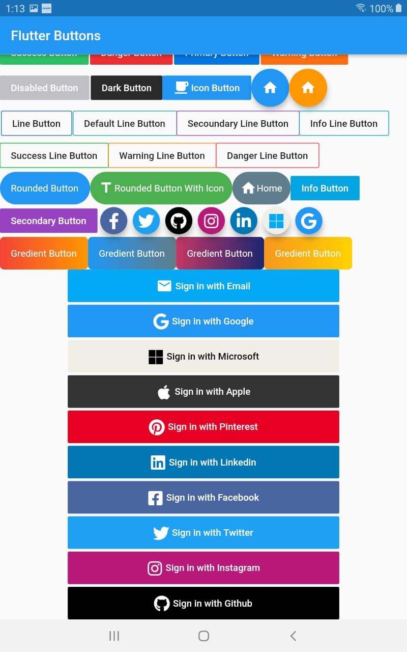
Screenshot Screenshot

Buttons

import 'package:flutter/material.dart';
import 'package:flutter_buttons/flutter_buttons.dart';

void main() => runApp(MyApp());

class MyApp extends StatelessWidget {
  
  @override
  Widget build(BuildContext context) {
    return MaterialApp(
      debugShowCheckedModeBanner: false,
      home: HomePage()
    );
  }
}

class HomePage extends StatefulWidget {
  @override
  _HomePageState createState() => _HomePageState();
}

class _HomePageState extends State<HomePage> {
  var testing = "123";
  @override
  Widget build(BuildContext context) {
    return Scaffold(
          appBar: AppBar(
            title: Text("Flutter Buttons"),
          ),
          body: ListView(
            children: <Widget>[
              Row(
                children: <Widget>[

Success Button

                 SuccessButton(
                   title: "Success Button",
                   onPressed: () {
                     
                   },
                 ),
                 SizedBox(width: 2.0,),

Danger Button

                 DangerButton(
                   title: "Danger Button",
                   onPressed: () {
                      
                   },
                 ),
                SizedBox(width: 2.0,),

Primary Button

                 PrimaryButton(
                   title: "Primary Button",
                   onPressed: () {                       
                   },
                 ),
                SizedBox(width: 2.0,),

Warning Button

                 WarningButton(
                   title: "Warning Button",
                   onPressed: () {                       
                   },
                 ),
                      
               ],
             ),
             Row(
               children: <Widget>[

Disabled Button

                 DisabledButtton(
                   onPressed: (){},
                   title: "Disabled Button",
                 ),
                  SizedBox(width: 2.0,),

Dark Button

               DarkButtton(
                 onPressed: (){},
                 title: "Dark Button",
               ),

ButttonWithIcon Button (we can use both button and icon in this button)

                ButttonWithIcon(icon: Icons.local_cafe,title: "Icon Button",onPressed: (){},),

Floating Icon Button

                FloatingIconButton(
                  icon: Icons.home,
                  onPressed: (){},
                ),
                FloatingIconButton(
                  icon: Icons.home,
                  onPressed: (){},
                  buttonColor: Colors.orange,
                )
                ],
              )
              ,Row(
                children: <Widget>[
                   SizedBox(width: 2,)

Line Buttons

                  PrimaryLineButton(
                    onPressed: (){},
                    title: "Line Button",
                  ),
                  SizedBox(width: 2,),
                  DefaultLineButton(
                    onPressed: (){},
                    title: "Default Line Button",
                  ),
                  SecoundaryLineButton(
                    onPressed: (){},
                    title: "Secoundary Line Button",
                  ),
                             
                  InfoLineButton(
                    onPressed: (){},
                    title: "Info Line Button",
                  ),
                ],
              ),
              Row(children: <Widget>[
              
                SuccessLineButton(
                    onPressed: (){},
                    title: "Success Line Button",
                  ),    
                
                  WarningLineButton(
                    onPressed: (){},
                    title: "Warning Line Button",
                  ),
                  DangerLineButton(
                    onPressed: (){},
                    title: "Danger Line Button",
                  ),
              ],),
              Row(
                children: <Widget>[

Rounded Button

                  RoundedButton(
                    onPressed: (){},
                    title: "Rounded Button",
                  ),
                   RoundedButtonWithIcon(
                    onPressed: (){},
                    icon:Icons.title,
                    title: "Rounded Button With Icon",
                    buttonColor: Colors.green,
                  ),
                  RoundedButtonWithIcon(
                    onPressed: (){},
                    icon:Icons.home,
                    title: "Home",
                    buttonColor: Colors.blueGrey,
                  )
                ,InfoButtton(
                    onPressed: (){},                   
                    title: "Info Button",                    
                  ),                               
                ],
              ),
              Row(
                children: <Widget>[
                  SecondaryButtton(
                    onPressed: (){},                   
                    title: "Secondary Button",                    
                  ),

Social Buttons

                  FacebookButton(onPressed: (){},),
                   TwitterButton(onPressed: (){},),
                   GithubButton(onPressed: (){},),
                   InstagramButton(onPressed: (){},),
                   LinkedinButton(onPressed: (){},),
                   MicrosoftButton(onPressed: (){},),
                   GoogleButton(onPressed: (){},),
                ],
              )
              ,Column(
                children: <Widget>[
                  Row(
                       children: <Widget>[

Gredient Buttons

                          GredientButton(onPressed: (){},
                  splashColor: Colors.orange,
                  colors: [
                    Colors.red,
                    Colors.orange,                    
                  ], title: "Gredient Button",),
                  GredientButton(onPressed: (){},
                  splashColor: Colors.orange,
                  colors: [
                    Colors.blue,
                    Colors.blueGrey,                    
                  ], title: "Gredient Button",),
                  GredientButton(onPressed: (){},
                  splashColor: Colors.orange,
                  colors: [
                    Color(0xFFC33764),
                    Color(0xFF1D2671),
                  ], title: "Gredient Button",),
                  GredientButton(onPressed: (){},
                  splashColor: Colors.orange,
                  colors: [
                    Color(0xFFF7971E),
                    Color(0xFFFFD200),
                  ], title: "Gredient Button",),
                       ],
                  ),
                  

Sign in Buttons

                  Padding(
                    padding: EdgeInsets.symmetric(horizontal: 100),
                    child: SignInWithEmail(onPressed: (){},),
                  ),
                  SizedBox(height: 4.0,),

                  Padding(
                    padding: EdgeInsets.symmetric(horizontal: 100),
                    child: SignInWithGoogle(onPressed: (){},),
                  ),
                  SizedBox(height: 4.0,),
                  Padding(
                    padding: EdgeInsets.symmetric(horizontal: 100),
                    child: SignInWithMicrosoft(onPressed: (){},),
                  ),
                  SizedBox(height: 4.0,),
                  Padding(
                    padding: EdgeInsets.symmetric(horizontal: 100),
                    child: SignInWithApple(onPressed: (){},),
                  ),
                  SizedBox(height: 4.0,),
                  Padding(
                    padding: EdgeInsets.symmetric(horizontal: 100),
                    child: SignInWithPinterest(onPressed: (){},),
                  ),
                   SizedBox(height: 4.0,),
                  Padding(
                    padding: EdgeInsets.symmetric(horizontal: 100),
                    child: SignInWithLinkedin(onPressed: (){},),
                  ),
                   SizedBox(height: 4.0,),
                  Padding(
                    padding: EdgeInsets.symmetric(horizontal: 100),
                    child: SignInWithFacebook(onPressed: (){},),
                  ),
                   SizedBox(height: 4.0,),
                  Padding(
                    padding: EdgeInsets.symmetric(horizontal: 100),
                    child: SignInWithTwitter(onPressed: (){},),
                  ),
                   SizedBox(height: 4.0,),
                  Padding(
                    padding: EdgeInsets.symmetric(horizontal: 100),
                    child: SignInWithInstagram(onPressed: (){},),
                  ),
                  SizedBox(height: 4.0,),
                  Padding(
                    padding: EdgeInsets.symmetric(horizontal: 100),
                    child: SignInWithGithub(onPressed: (){},),
                  ),


                ],
              )
            ],
          ));
  }
} 

Categories

Dependencies

Dependency list 1 items

Source repository

Projects using this package

No data available yet.