Package selection guidance compiled from public package information, community data, and project usage.
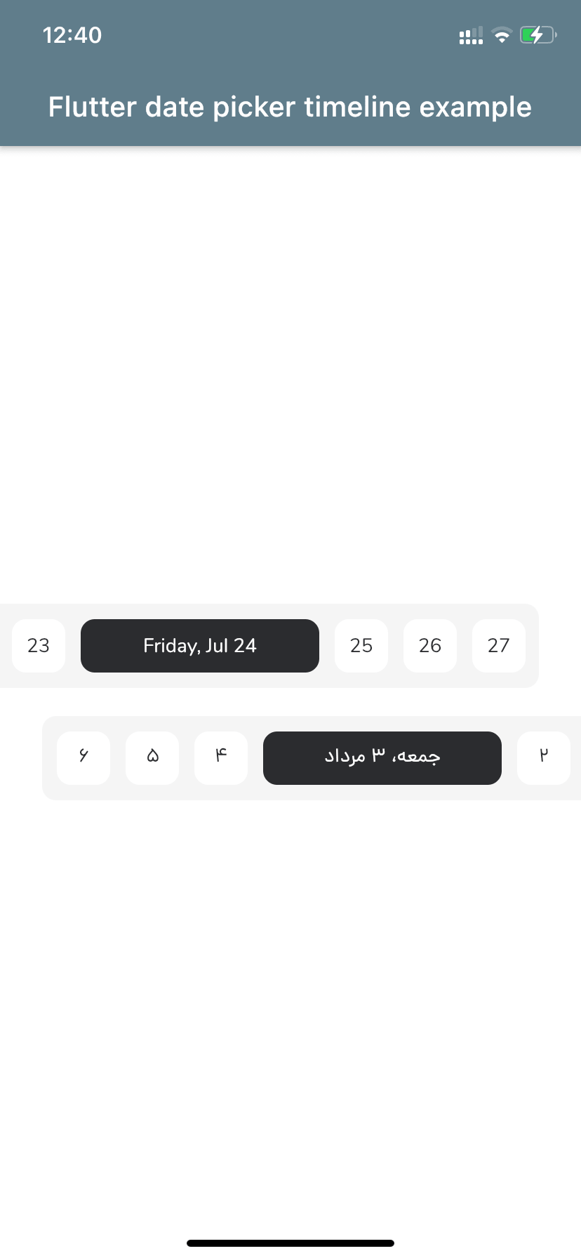
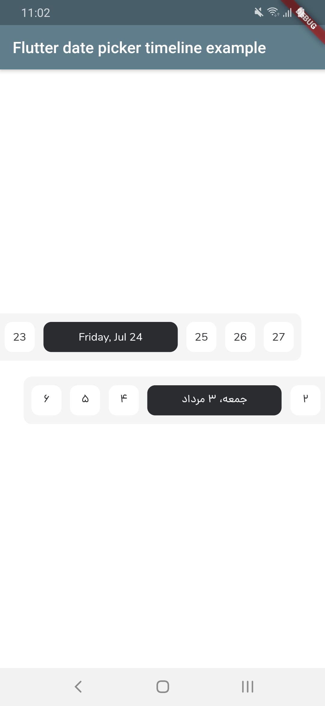
A customizable date picker for Flutter that displays dates as a horizontal timeline, supporting both Gregorian and Jalali (Persian) calendars. It enables users to select dates intuitively with smooth scrolling and visual feedback. The package is designed for apps requiring date navigation across extended periods, such as scheduling, planning, or calendar-based workflows. It works across all major platforms including Android, iOS, Web, macOS, Windows, and Linux.
Use cases
Scheduling applications
Calendar-based task planners
Event booking interfaces
Travel itinerary management
Long-term project timelines
Key features
Supports Gregorian and Jalali calendars
Horizontal scrollable timeline interface
Customizable appearance and styling
Cross-platform compatibility
Smooth date navigation
Configurable date range and selection modes
Suitable for
Apps needing date selection over long periods
Developers targeting Persian-speaking audiences
Projects requiring dual calendar support
UI-heavy calendar implementations
Multi-platform Flutter applications
Considerations
May require additional styling for optimal UX
Performance with very large date ranges
Limited built-in validation beyond date selection
Depends on external localization for non-English locales
Original README
Original README snapshot from the linked source repository. Visit the repository for the latest content.
Flutter Date Picker Timeline
💥 Gregorian and Jalali customizable date picker as a horizontal timeline 💥
FlutterDatePickerTimeline({
Key key,
// Determines the [FlutterDatePickerTimeline] mode.this.calendarMode = CalendarMode.gregorian,
// The first date of [FlutterDatePickerTimeline].@requiredthis.startDate,
// The last date of [FlutterDatePickerTimeline].@requiredthis.endDate,
// Initially selected date.this.initialSelectedDate,
// Initially focused date(If nothing is provided, a [initialSelectedDate] will be used).this.initialFocusedDate,
// Used for setting the textDirection of [FlutterDatePickerTimeline].this.textDirection,
// Used for setting the width of selected items.this.selectedItemWidth = 170,
// Used for setting the width of unselected items.this.unselectedItemWidth = 38,
// Used for setting the height of selected and unselected items.this.itemHeight = 38,
// Used for setting the radius of selected and unselected items background.this.itemRadius = 10,
// Used for setting the padding of [ListView].this.listViewPadding = constEdgeInsets.only(right: 5.5, left: 5.5),
// Used for setting the margin of selected items.this.selectedItemMargin = constEdgeInsets.only(right: 5.5, left: 5.5),
// Used for setting the margin of unselected items.this.unselectedItemMargin = constEdgeInsets.only(right: 5.5, left: 5.5),
// Used for setting the color of selected items background.this.selectedItemBackgroundColor = constColor(0xFF2B2C30),
// Used for setting the color of unselected items background.this.unselectedItemBackgroundColor = Colors.white,
// Used for setting the style of selected items [Text].this.selectedItemTextStyle,
// Used for setting the style of unselected items [Text].this.unselectedItemTextStyle,
// Called whenever any date gets selected.@requiredthis.onSelectedDateChange,
}) : super(key: key);
Props
props
types
defaultValues
calendarMode
CalendarMode
CalendarMode.gregorian
startDate
DateTime
endDate
DateTime
initialSelectedDate
DateTime?
initialFocusedDate
DateTime?
If nothing is provided, a [initialSelectedDate] will be used
textDirection
TextDirection?
If nothing is provided, a [calendarMode] will be used. (CalendarMode.gregorian -> TextDirection.ltr , CalendarMode.jalali -> TextDirection.rtl)