Search packages, repositories and app categories

flutter_date_range_picker cover
Package detailsv0.3.0

flutter_date_range_picker

Flutter package for selecting date ranges with input, dialog, and calendar options.

AndroidiOSWebmacOSWindowsLinux
30-day downloads
5.3K
Likes
66
Pub points
160

Install package

flutter pub add flutter_date_range_picker

Package Overview

Package selection guidance compiled from public package information, community data, and project usage.

A Flutter package that enables users to select date ranges through multiple interfaces, including input fields, dialogs, and interactive calendars. It supports all major platforms—Android, iOS, Web, macOS, Windows, and Linux—making it ideal for cross-platform applications requiring flexible date range selection. The package offers a clean, customizable UI with built-in validation and intuitive navigation between dates. It integrates seamlessly into forms and workflows where time intervals are essential.

Use cases

  • Form inputs requiring date ranges
  • Booking or scheduling systems
  • Data filtering by date intervals
  • Event planning applications
  • Reporting tools with date range selection
  • Calendar-based dashboards

Key features

  • Multiple selection modes (input, dialog, calendar)
  • Cross-platform compatibility
  • Customizable UI and styling
  • Built-in date validation
  • Support for single and multiple date ranges
  • Easy integration with existing Flutter forms

Suitable for

  • Developers building cross-platform apps
  • Applications needing date range filters
  • UI-heavy forms with date inputs
  • Scheduling and booking platforms
  • Tools requiring time interval selection

Considerations

  • Requires careful handling of date formatting
  • May need additional localization setup
  • Custom styling might require deep understanding of widget composition
  • Limited to date-only selection (no time component)
  • Not optimized for very large date ranges

Original README

Original README snapshot from the linked source repository. Visit the repository for the latest content.

Date Range Picker 📅

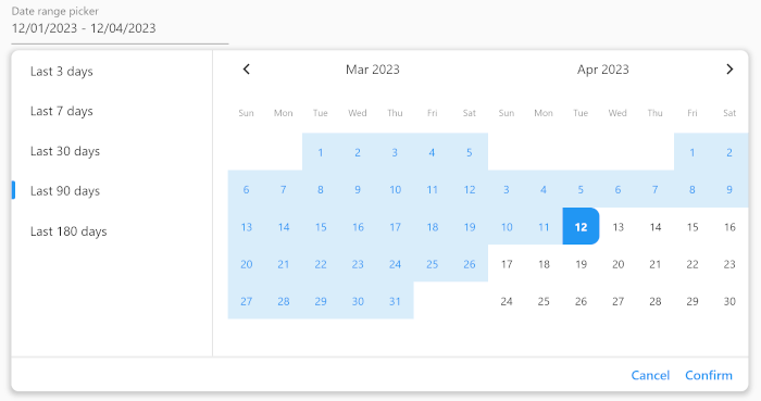
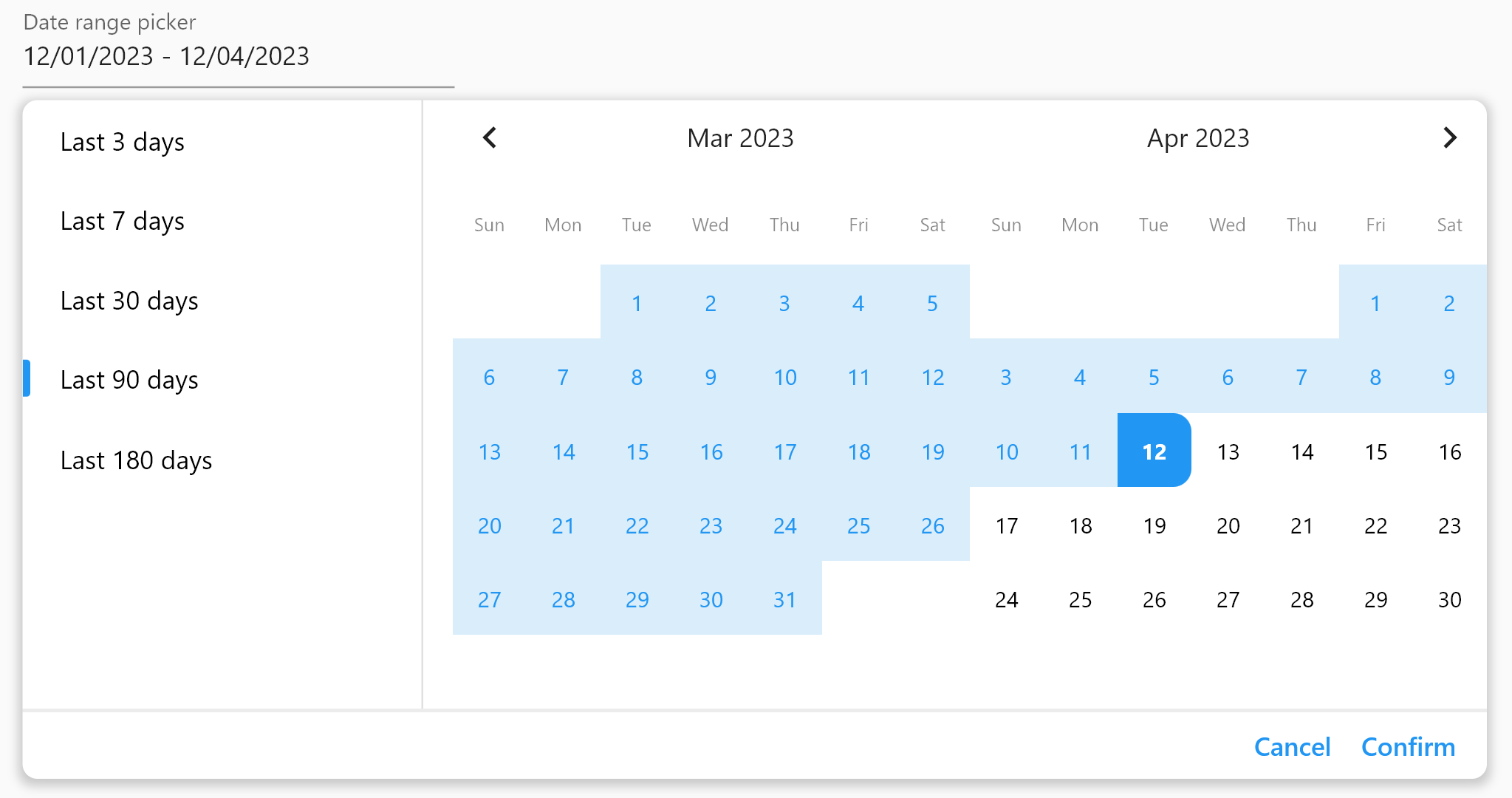
Date Range Picker is a user-friendly and simple package for Flutter that allows users to select a date range. It's designed to evolve over time, and its components are built to be reusable.

Date Range Picker

(Isn't it beautiful?)

Features ✅

  • Simple and user-friendly interface
  • Customizable theme
  • Reusable components
  • Field, form field, and dialog widgets
  • Functions to display a date range picker as a dialog
  • Supports minimum and maximum date limitations
  • Displays two months at once for easy navigation

Installation 🪛

Add the package to your pubspec.yaml file:

dependencies:
  date_range_picker: ^latest_version

Then, run flutter packages get in your terminal.

Usage 📖

To use the Date Range Picker, simply import the package and create a DateRangePickerWidget:

DateRangePickerWidget(
    doubleMonth: doubleMonth,
    maximumDateRangeLength: 10,
    minimumDateRangeLength: 3,
    initialDateRange: selectedDateRange,
    disabledDates: [DateTime(2023, 11, 20)],
    initialDisplayedDate:
    selectedDateRange?.start ?? DateTime(2023, 11, 20),
    onDateRangeChanged: onDateRangeChanged,
);

You can also use the DateRangeField or DateRangeFormField to display a dialog asking the user to select a date range, and to display the selected range. Here is an example:

DateRangeField(
    decoration: InputDecoration(
        label: Text("Date range picker"),
        hintText: 'Please select a date range',
    ),
    onDateRangeSelected: (DateRange? value) {
    // Handle the selected date range here
    },
  selectedDateRange: selectedRange,
);

Lastly, you can use the showDateRangePickerDialog function to display a dialog asking the user to select a date range:

showDateRangePickerDialog(
    context: context, 
    builder: datePickerBuilder
);
...

Widget datePickerBuilder(BuildContext context, dynamic Function(DateRange) onDateRangeChanged) => DateRangePickerWidget(
    doubleMonth: true,
    initialDateRange: selectedDateRange,
    onDateRangeChanged: onDateRangeChanged,
);

Customization 🎨

You can customize the appearance of the Date Range Picker by providing a custom CalendarTheme:

DateRangePickerWidget(
    onDateRangeChanged: (dateRange) {
    // Handle the selected dateRange here
    },
    theme: CalendarTheme(
    selectedColor: Colors.blue,
    dayNameTextStyle: TextStyle(color: Colors.black45, fontSize: 10),
    inRangeColor: Color(0xFFD9EDFA),
    inRangeTextStyle: TextStyle(color: Colors.blue),
    selectedTextStyle: TextStyle(color: Colors.white),
    todayTextStyle: TextStyle(fontWeight: FontWeight.bold),
    defaultTextStyle: TextStyle(color: Colors.black, fontSize: 12),
    radius: 10,
    tileSize: 40,
    disabledTextStyle: TextStyle(color: Colors.grey),
    )
,
);

License 📜

This package is released under the MIT License.

Contributing 🤝

We encourage and welcome contributions from the community to help improve and grow this project. If you would like to contribute, please feel free to fork the repository, make changes, and submit a pull request.

If you have any questions or need guidance, don't hesitate to reach out to the maintainer of this project. We appreciate your interest and support, and we look forward to collaborating with you!

Categories

Dependencies

Dependency list 1 items

Source repository

Projects using this package