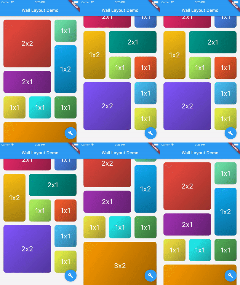
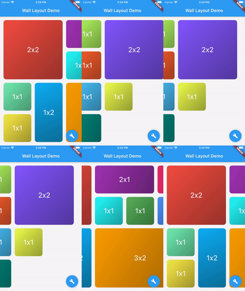
Package selection guidance compiled from public package information, community data, and project usage.
A Flutter package that provides a flexible layout widget for arranging bricks (widgets of varying shapes) in a vertical or horizontal list, resembling a wall. It supports dynamic sizing and positioning, making it ideal for creating visually engaging grids with irregularly shaped elements. The layout adapts to different screen sizes and orientations, ensuring responsive design across platforms. It's particularly useful for photo galleries, dashboards, and creative UIs where non-uniform layouts are desired.
Use cases
Photo galleries with mixed aspect ratios
Dashboard widgets with varied sizes
Creative UI layouts with irregular shapes
Responsive grid displays on multiple platforms
Interactive wall-like interfaces
Key features
Supports bricks of different shapes and sizes
Vertical and horizontal orientation options
Responsive and adaptive layout
Cross-platform compatibility
Easy integration with existing Flutter widgets
Suitable for
Designers seeking visual variety
Developers building dynamic grids
Apps requiring non-uniform layouts
Projects targeting multiple platforms
UI-heavy applications with complex arrangements
Considerations
Performance may vary with large numbers of bricks
Requires careful handling of brick size constraints
Limited built-in animations
Best suited for static or low-dynamic content
May need custom logic for complex interactions
Original README
Original README snapshot from the linked source repository. Visit the repository for the latest content.
flutter_wall_layout - Layout child having different shape into a vertical or horizontal list
This library provides a unique widget, WallLayout, rendering into a list children having different shapes.
There is two main classes: WallLayout and Stone.
A wall is composed by a set of stones, arranged in a certain way.
A stone is a component defining its shape by a width and a height.
Wall Layout Widget
This component has been inspired by the ListView widget, in which you can choose scroll direction and the way.
Added to that, you can also define how many rows or column have the wall, if you want to create a responsive design.
List of Stone widgets, representing wall layout's children.
-
layersCount
Define the number of layers the wall have. Must be higher or equal to 2. When direction is Axis.vertical, it defines the number of columns the wall has. When direction is Axis.horizontal, it defines the number of rows.
-
wallBuilder
Define how the wall is built: where each stone is positioned within the wall.The wall builder is allowed to use less stones than provided, and can create new stones (see ./example for more details).
WallBuilder.standard()
stonePadding
Padding between stones.
16.0
primaryAxisStoneSize
Optional. If specified, indicates the exact size of each stone in the direction of the primary scroll axis. If not specified, each stone will be exactly square.
-
scrollController
Same as [ListView.scrollController]: "control the position to which this scroll view is scrolled".
-
physics
Same as [ListView.physics]: "How the scroll view should respond to user input".
-
restorationId
Same as [ListView.restorationId]: used "to save and restore the scroll offset of the scrollable".
-
dragStartBehavior
Same as [ListView.dragStartBehavior]: "Determines the way that drag start behavior is handled".
DragStartBehavior.start
clipBehavior
Same as [ListView.clipBehavior]: "ways to clip a widget's content".
Clip.hardEdge
primary
Same as [ListView.primary]: "Whether this is the primary scroll view associated with the parent [PrimaryScrollController]"
false
scrollDirection
Same as [ListView.scrollDirection]: "axis along which the scroll view scrolls".
Axis.vertical
reverse
Same as [ListView.reverse property]: "whether the scroll view scrolls in the reading direction".
false
Stone Widget
A Stone Widget is a widget proxy defining stone's size (width and height).
It's rendered object is optimized thanks to it's id property.