Search packages, repositories and app categories

interactive_slider cover
Package detailsv0.5.1

interactive_slider

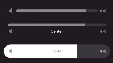
A Cupertino-themed interactive continuous slider widget that is inspired by the slider widgets used in Apple Music.

AndroidiOSWebmacOSWindowsLinux
30-day downloads
2.7K
Likes
139
Pub points
160

Install package

flutter pub add interactive_slider

Package Overview

Package selection guidance compiled from public package information, community data, and project usage.

A Cupertino-themed interactive continuous slider widget inspired by Apple Music's slider interface. It provides a smooth, visually appealing sliding experience with touch and drag interactions across multiple platforms. Designed for use in media playback controls or any application requiring intuitive user input for continuous values. The widget supports responsive design and integrates seamlessly into Flutter apps targeting iOS and cross-platform environments.

Use cases

  • Media playback volume control
  • Adjusting playback speed
  • Customizable range inputs
  • User preference settings
  • Interactive form elements

Key features

  • Cupertino design language
  • Continuous value tracking
  • Cross-platform compatibility
  • Touch and drag interaction
  • Smooth animations
  • Responsive layout

Suitable for

  • iOS-style app interfaces
  • Music and media applications
  • Form inputs requiring sliders
  • Cross-platform Flutter projects
  • Design-focused UI components

Considerations

  • Requires Flutter SDK 3.0 or higher
  • Limited customization beyond theme
  • May need additional styling for non-Cupertino contexts
  • Not optimized for high-frequency updates
  • Best suited for single-value continuous input

Original README

Original README snapshot from the linked source repository. Visit the repository for the latest content.

A continuous or segmented slider widget inspired by the volume slider in the Apple Music app. This widget can be used with little to no setup but is still fully customizable!

Animated gif of slider being used Animated gif of slider being used Animated gif of slider being used

Features

Use the stock slider or customize:

  • Built in padding for convenience
  • Adjustable size transition
  • Use any widget for a start/end icon and center label
  • Use any transition duration and curve
  • Provide any shape border for the progress bar
  • Use the normalized progress value or easily provide a min/max to be automatically transformed
  • Animate start and end icons using slider progress
  • Color the slider's porgress with a gradient
  • Create any number of discrete segments to slide through

Getting started

Add to your dependencies:

dependencies:
  interactive_slider: ^0.5.0

Then import:

import 'package:interactive_slider/interactive_slider.dart';

Usage

InteractiveSlider(
  startIcon: const Icon(CupertinoIcons.volume_down),
  centerIcon: const Text('Center'),
  endIcon: const Icon(CupertinoIcons.volume_up),
  min: 1.0,
  max: 15.0,
  onChanged: (value) => setState(() => _value = value),
)

Additional information

Please report any bugs and open any pull requests via GitHub.

Categories

Source repository

Projects using this package