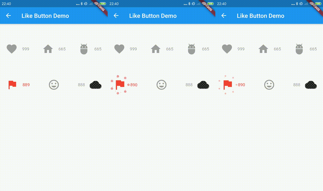
Original README snapshot from the linked source repository. Visit the repository for the latest content.
like_button


Language: English | 中文简体
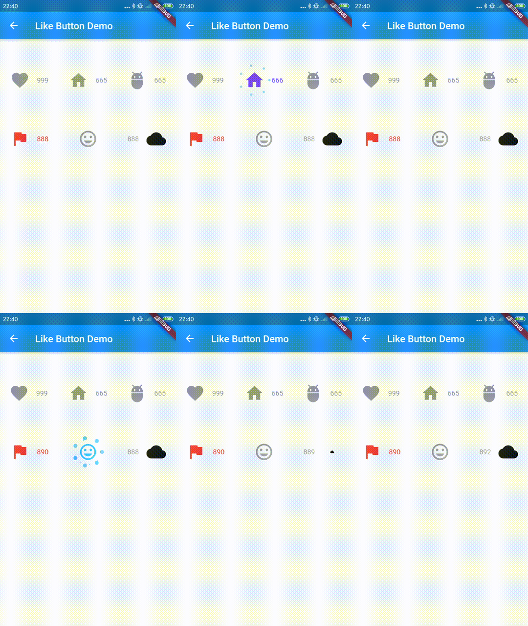
Like Button is a flutter library that allows you to create a button with animation effects similar to Twitter's heart when you like something and animation effects to increase like count.
Reference codes from jd-alexander and 吉原拉面 ,thank them for open source code.
Web Demo for LikeButton
How to use it.
the default effects is Icons.favorite
LikeButton(),
and you can also define custom effects.
  LikeButton(
          size: buttonSize,
          circleColor:
              CircleColor(start: Color(0xff00ddff), end: Color(0xff0099cc)),
          bubblesColor: BubblesColor(
            dotPrimaryColor: Color(0xff33b5e5),
            dotSecondaryColor: Color(0xff0099cc),
          ),
          likeBuilder: (bool isLiked) {
            return Icon(
              Icons.home,
              color: isLiked ? Colors.deepPurpleAccent : Colors.grey,
              size: buttonSize,
            );
          },
          likeCount: 665,
          countBuilder: (int count, bool isLiked, String text) {
            var color = isLiked ? Colors.deepPurpleAccent : Colors.grey;
            Widget result;
            if (count == 0) {
              result = Text(
                "love",
                style: TextStyle(color: color),
              );
            } else
              result = Text(
                text,
                style: TextStyle(color: color),
              );
            return result;
          },
        ),
The time to send your request
    LikeButton(
      onTap: onLikeButtonTapped,
    ),
Future<bool> onLikeButtonTapped(bool isLiked) async{
return !isLiked;
}
parameters
| parameter |
description |
default |
| size |
size of like widget |
30.0 |
| animationDuration |
animation duration to change isLiked state |
const Duration(milliseconds: 1000) |
| bubblesSize |
total size of bubbles |
size * 2.0 |
| bubblesColor |
colors of bubbles |
const BubblesColor(dotPrimaryColor: const Color(0xFFFFC107),dotSecondaryColor: const Color(0xFFFF9800),dotThirdColor: const Color(0xFFFF5722),dotLastColor: const Color(0xFFF44336),) |
| circleSize |
final size of circle |
size * 0.8 |
| circleColor |
colors of circle |
const CircleColor(start: const Color(0xFFFF5722), end: const Color(0xFFFFC107) |
| onTap |
tap call back of like button,you can handle your request in this call back |
|
| isLiked |
whether it is liked(if it's null, always show like animation and increase like count) |
false |
| likeCount |
if null, will not show) |
null |
| mainAxisAlignment |
MainAxisAlignment for like button |
MainAxisAlignment.center |
| likeBuilder |
builder to create like widget |
null |
| countBuilder |
builder to create like count widget |
null |
| likeCountAnimationDuration |
animation duration to change like count |
const Duration(milliseconds: 500) |
| likeCountAnimationType |
animation type to change like count(none,part,all) |
LikeCountAnimationType.part |
| likeCountPadding |
padding for like count widget |
const EdgeInsets.only(left: 3.0) |
| countPostion |
top,right,bottom,left of like button widget |
CountPostion.right |
| countDecoration |
decoration of like count widget |
null |
| postFrameCallback |
call back of first frame with LikeButtonState |
null |