
Overview
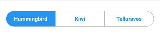
A Flutter widget that implements a segmented control with Material Design aesthetics, offering a visually consistent alternative to iOS-style segmented controls. It enables users to select one option from a set of mutually exclusive choices, commonly used in settings or filters. The control supports customization of colors, labels, and selection behavior while maintaining platform-appropriate styling across Android, iOS, Web, macOS, Windows, and Linux.
Use cases
- Form input selection
- Filtering data by category
- User preference settings
- Navigation between tabs
- Customizable UI components
Key features
- Material Design appearance
- Cross-platform compatibility
- Customizable colors and labels
- Supports single selection
- Easy integration with existing widgets
Suitable for
- Developers building cross-platform apps
- Designers seeking Material-compliant UI elements
- Apps requiring intuitive tab-like navigation
- Teams prioritizing consistency across platforms
- Projects with filtering or configuration interfaces
Considerations
- Limited to single selection only
- Requires manual handling of selection callbacks
- May need additional styling for complex layouts
- Not optimized for large numbers of segments
- Depends on external package maintenance