Search packages, repositories and app categories

msh_checkbox cover
Package detailsv2.0.1

msh_checkbox

An animated checkbox, inspired by BEMCheckbox for iOS, using an API similar to Flutter's own Checkbox.

AndroidiOSWebmacOSWindowsLinux
30-day downloads
2.7K
Likes
57
Pub points
150

Install package

flutter pub add msh_checkbox

Package Overview

Package selection guidance compiled from public package information, community data, and project usage.

msh_checkbox is a Flutter package that provides an animated checkbox inspired by BEMCheckbox for iOS, offering a smooth and visually appealing toggle experience. It uses an API similar to Flutter's built-in Checkbox, making it easy to integrate into existing projects. The checkbox supports all major platforms including Android, iOS, Web, macOS, Windows, and Linux, ensuring consistent behavior across devices. With customizable animations and styling, it enhances user interaction while maintaining simplicity and performance.

Use cases

  • Custom animated form inputs
  • Enhancing UI with smooth transitions
  • Cross-platform checkbox consistency
  • Modern app interfaces
  • Accessibility-focused design
  • Replacing default checkboxes

Key features

  • Smooth animated transitions
  • BEMCheckbox-inspired design
  • Flutter-native API compatibility
  • Cross-platform support
  • Customizable appearance
  • Lightweight and performant

Suitable for

  • Developers seeking modern checkbox designs
  • Projects requiring platform-agnostic UI components
  • Apps focused on user experience and visual polish
  • Teams using Flutter for multi-platform apps
  • Designers wanting animation-rich elements

Considerations

  • May require additional styling for complex themes
  • Limited to checkbox-specific functionality
  • Animation performance depends on device capabilities
  • Not suitable for non-interactive use cases
  • Requires Flutter SDK 2.0+ for full compatibility

Original README

Original README snapshot from the linked source repository. Visit the repository for the latest content.

msh_checkbox

pub package pub points popularity likes

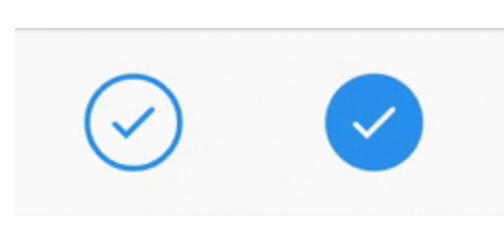
A customizable circular checkbox which plays an animation when checked or unchecked. Inspired by BEMCheckbox for iOS.

Checkbox Examples

Features

  • Choose from 4 animation/visual styles (stroke, scale in checkmark, scale in background, fade in).

  • Customize colors for active, inactive and disabled states.

  • Customize the animation duration.

Getting started

Install the package:

flutter pub add msh_checkbox

Usage

class Example extends StatefulWidget {
  Example({Key? key}): super(key: key);

  @override
  State<Example> createState() => _ExampleState();
}

class _ExampleState extends State<Example> {
  bool isChecked = false;

  @override
  Widget build(BuildContext context) {
    return Center(
      child: MSHCheckbox(
        size: 60,
        value: isChecked,
        colorConfig: MSHColorConfig.fromCheckedUncheckedDisabled(
          checkedColor: Colors.blue,
        ),
        style: MSHCheckboxStyle.stroke,
        onChanged: (selected) {
          setState(() {
            isChecked = selected;
          });
        },
      ),
    );
  }
}

Support

I know it's a small and simple widget, but if you'd like to support it is certainly appreciated!

Buy Me A Coffee

Categories

Source repository

Projects using this package