Search packages, repositories and app categories

Package detailsv2.0.4

page_view_indicator

Builds indication marks for PageView from any Widget and/or Animation.

30-day downloads
257
Likes
31
Pub points
35

Install package

flutter pub add page_view_indicator

Package Overview

Package selection guidance compiled from public package information, community data, and project usage.

A Flutter package that provides customizable indicator marks for PageView widgets, allowing developers to use any Widget or Animation as visual indicators. It enhances user experience by clearly showing the current page position within a scrollable list of pages. The package is lightweight and flexible, supporting custom styling and dynamic animations. Ideal for onboarding flows, image sliders, and guided tours.

Use cases

  • Onboarding screens
  • Image sliders
  • Guided tours
  • Form wizards
  • Content carousels

Key features

  • Customizable widget indicators
  • Support for animations
  • Flexible styling
  • Easy integration with PageView
  • Lightweight and performant

Suitable for

  • Mobile app onboarding
  • Image galleries
  • Interactive tutorials
  • Dynamic content displays
  • User interface enhancements

Considerations

  • Requires manual setup with PageController
  • Limited platform-specific optimizations
  • No built-in accessibility features
  • May need additional styling for complex designs
  • Depends on external animation logic
Original README

Original README snapshot from the linked source repository. Visit the repository for the latest content.

PageViewIndicator Pub Package

Builds indication marks for PageView.

Import

import 'package:page_view_indicator/page_view_indicator.dart';

Usage

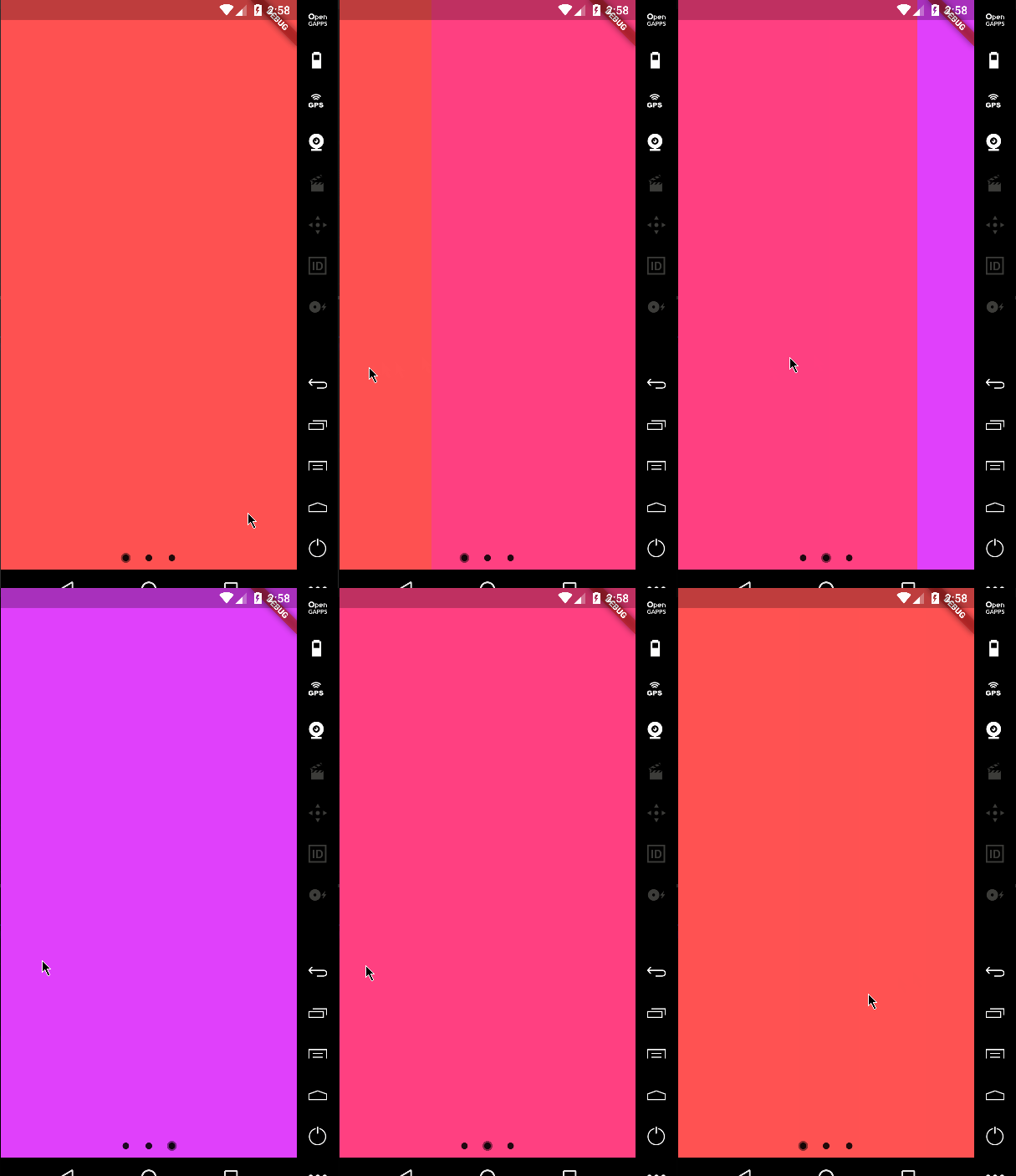
Default Material behavior
return PageViewIndicator(
  pageIndexNotifier: pageIndexNotifier,
  length: length,
  normalBuilder: (animationController, index) => Circle(
        size: 8.0,
        color: Colors.black87,
      ),
  highlightedBuilder: (animationController, index) => ScaleTransition(
        scale: CurvedAnimation(
          parent: animationController,
          curve: Curves.ease,
        ),
        child: Circle(
          size: 12.0,
          color: Colors.black45,
        ),
      ),
);

Example 1


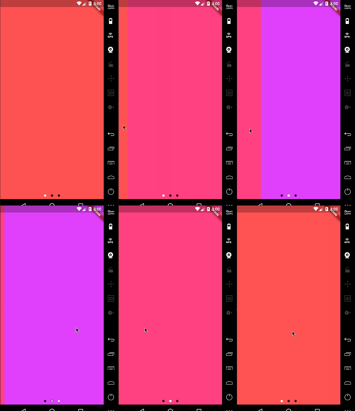
Custom animations
return PageViewIndicator(
  pageIndexNotifier: pageIndexNotifier,
  length: length,
  normalBuilder: (animationController, index) => Circle(
        size: 8.0,
        color: Colors.black87,
      ),
  highlightedBuilder: (animationController, index) => ScaleTransition(
        scale: CurvedAnimation(
          parent: animationController,
          curve: Curves.ease,
        ),
        child: Circle(
          size: 8.0,
          color: Colors.white,
        ),
      ),
);

Example 2


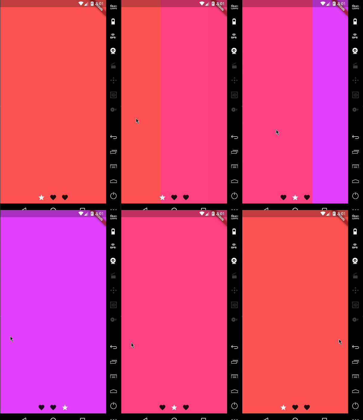
Custom icons

It's not just about dots!

return PageViewIndicator(
  pageIndexNotifier: pageIndexNotifier,
  length: length,
  normalBuilder: (animationController, index) => ScaleTransition(
        scale: CurvedAnimation(
          parent: animationController,
          curve: Curves.ease,
        ),
        child: Icon(
          Icons.favorite,
          color: Colors.black87,
        ),
      ),
  highlightedBuilder: (animationController, index) => ScaleTransition(
        scale: CurvedAnimation(
          parent: animationController,
          curve: Curves.ease,
        ),
        child: Icon(
          Icons.star,
          color: Colors.white,
        ),
      ),
);

Example 3

Changing the space bettwen the indicators

You can change the padding around the indicators using the indicatorPadding property:

return PageViewIndicator(
  pageIndexNotifier: pageIndexNotifier,
  length: length,
  indicatorPadding: const EdgeInsets.all(4.0)
  ...

Default is const EdgeInsets.all(8.0).

Categories

Source repository

Projects using this package