
Overview
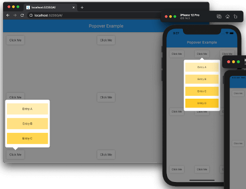
The popover package provides a flexible and platform-aware way to display transient, floating views that appear above other content when triggered by user interaction. Designed for use with controls like buttons or icons, it supports smooth animations and adaptive positioning across Android, iOS, Web, macOS, Windows, and Linux. The package ensures consistent behavior while respecting native design guidelines on each platform. It's ideal for contextual menus, tooltips, or quick action panels without disrupting the main UI flow.
Use cases
- Displaying context menus
- Showing quick action panels
- Creating tooltips
- Presenting form validation hints
- Enabling inline editing options
Key features
- Cross-platform compatibility
- Adaptive positioning
- Smooth animations
- Customizable content
- Supports touch and pointer events
- Responsive to screen boundaries
Suitable for
- Developers building interactive UIs
- Teams targeting multiple platforms
- Apps needing contextual overlays
- Design systems requiring reusable popovers
- Projects using Material or Cupertino widgets
Considerations
- Requires proper handling of dismiss gestures
- May need custom styling for complex layouts
- Performance impact with many concurrent popovers
- Limited built-in theming options
- Not suitable for persistent content