Package selection guidance compiled from public package information, community data, and project usage.
QuickAlert is a Flutter package that enables developers to quickly display animated, customizable alert dialogs with predefined types like success, error, warning, confirm, and loading. It simplifies the process of showing user feedback with minimal code, supporting multiple platforms including Android, iOS, Web, macOS, Windows, and Linux. The package offers smooth animations and easy integration via a single method call, making it ideal for enhancing user experience in apps requiring immediate visual feedback. Custom dialogs are also supported for unique use cases.
Use cases
Displaying success messages after form submission
Showing error alerts for invalid inputs
Confirming actions with yes/no prompts
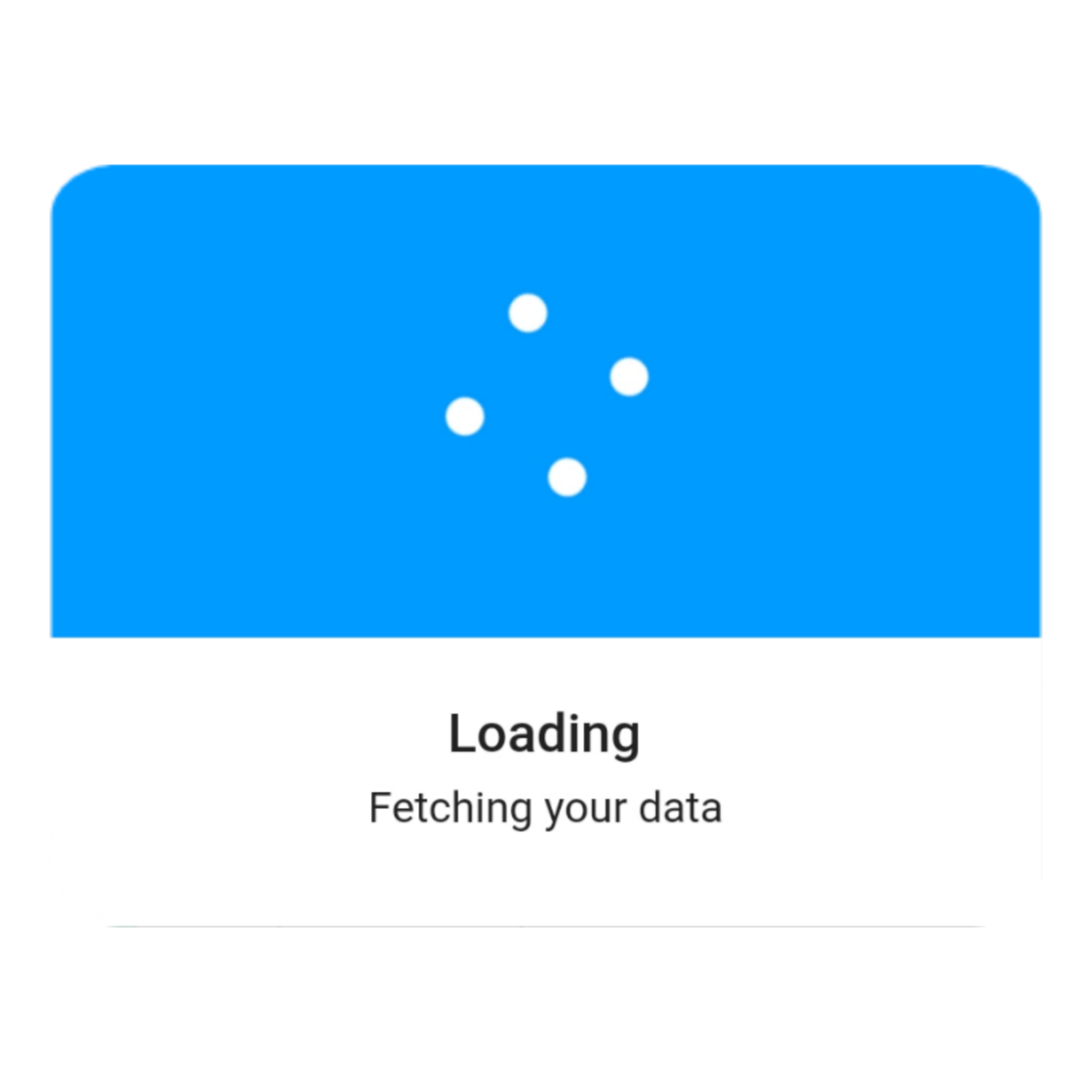
Indicating loading states during async operations
Creating custom alert designs for specific UI needs
May require additional styling for complex layouts
Not ideal for highly dynamic or persistent dialogs
Best suited for temporary notifications
Depends on external animation libraries for effects
Original README
Original README snapshot from the linked source repository. Visit the repository for the latest content.
An instantly ready, full-featured alerts for development on any platform with flutter. Enabling you to complete projects and deploy quickly. With QuickAlert, you can display animated alert dialogs such as success, error, warning, confirm, loading or even a custom dialog.
Key Features 🔮
Easy To Use
The alerts are very flexible and can be customized very easily. In QuickAlert, the QuickAlert.show() triggers the alert, which informs the user about the situations that need acknowledgment.
Predefined Beautiful Alert Styles
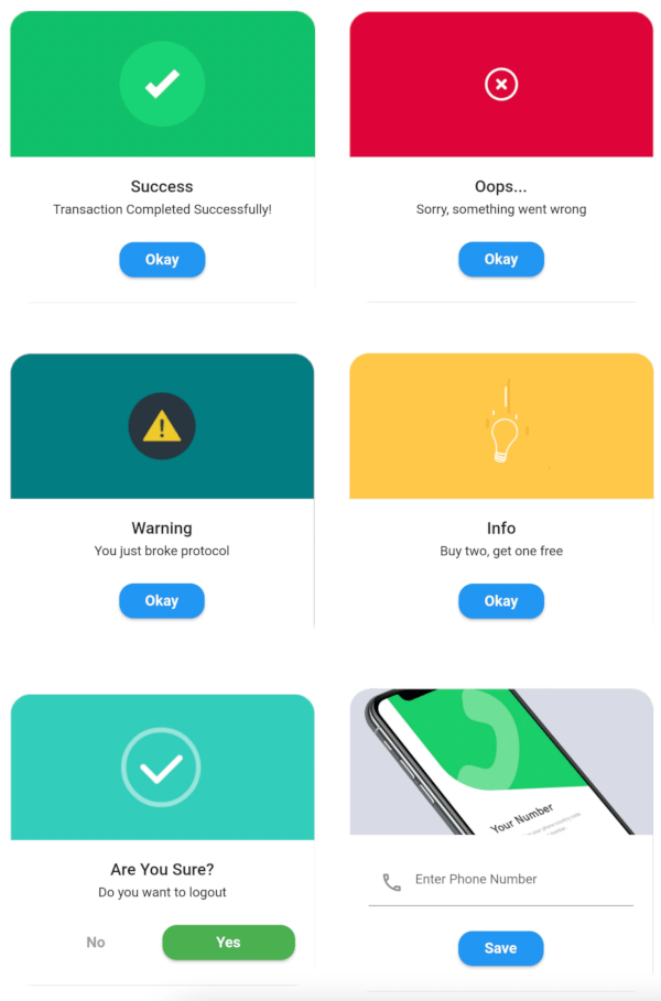
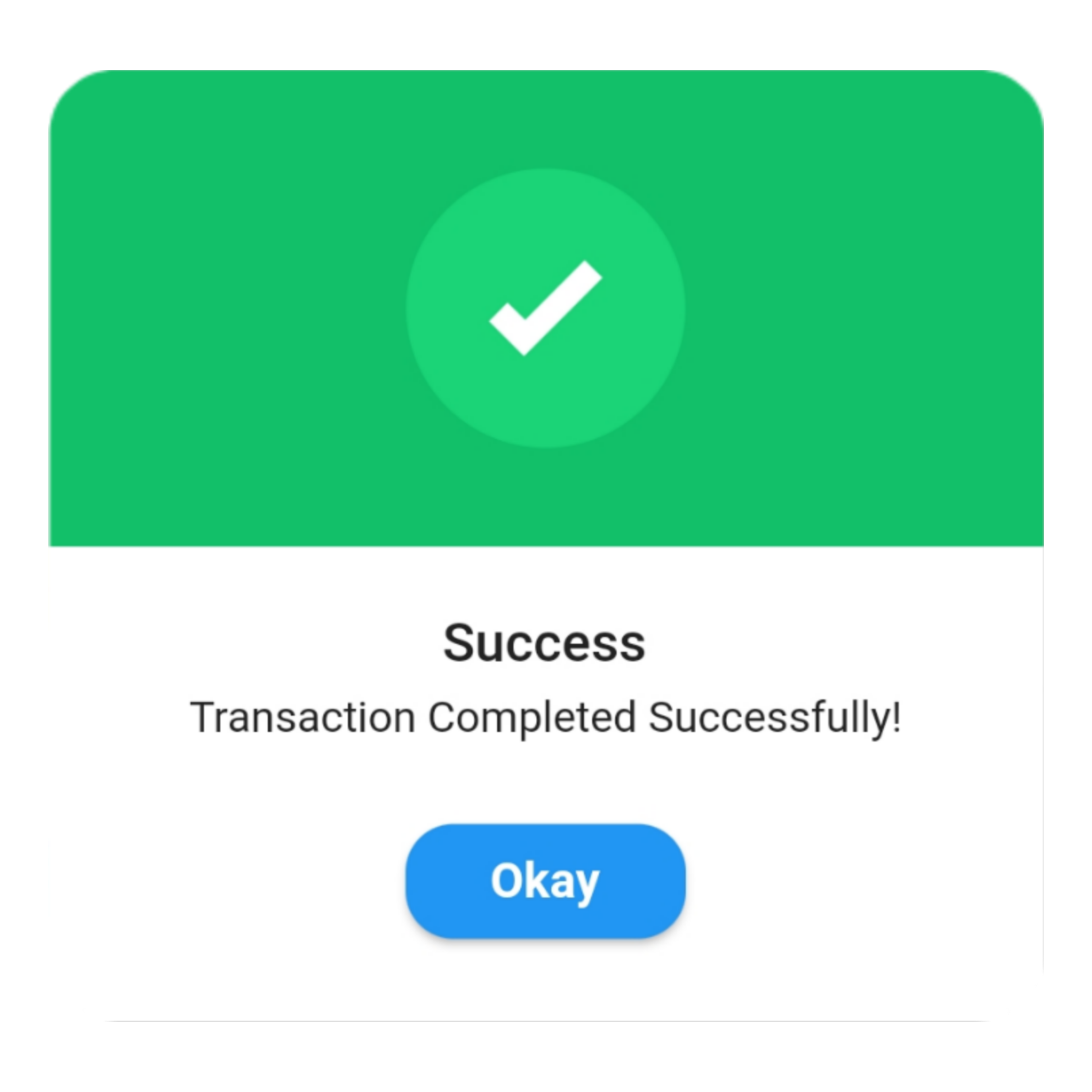
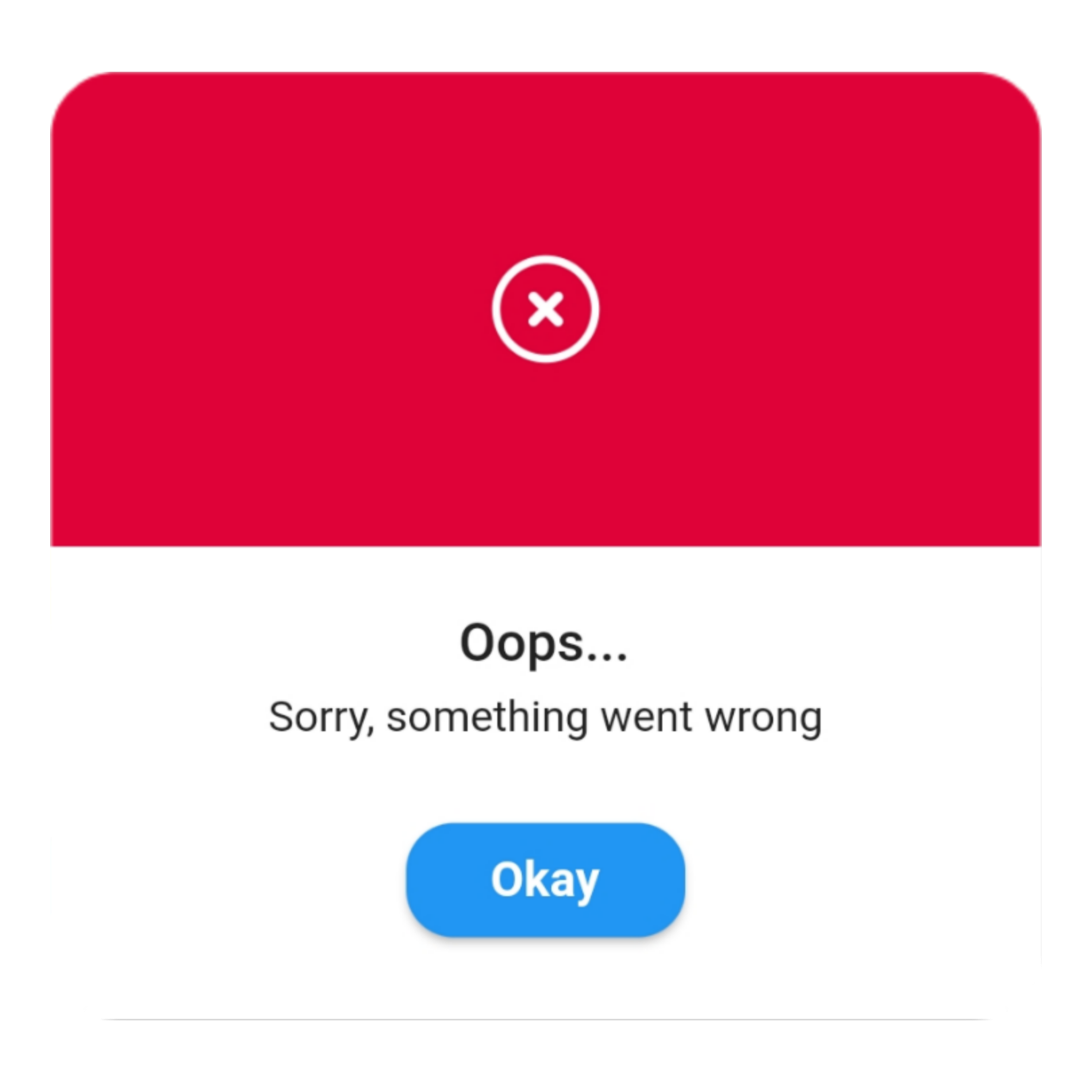
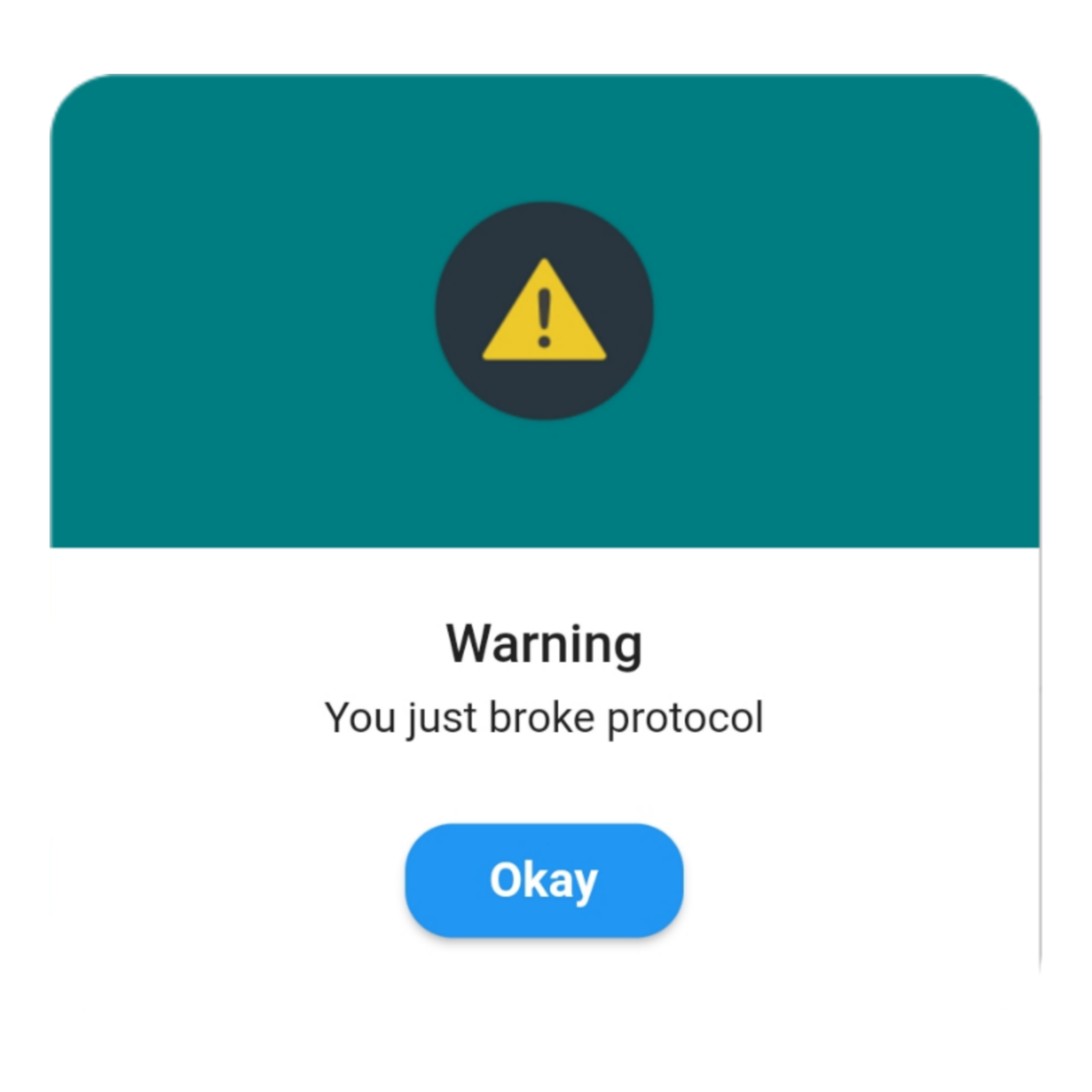
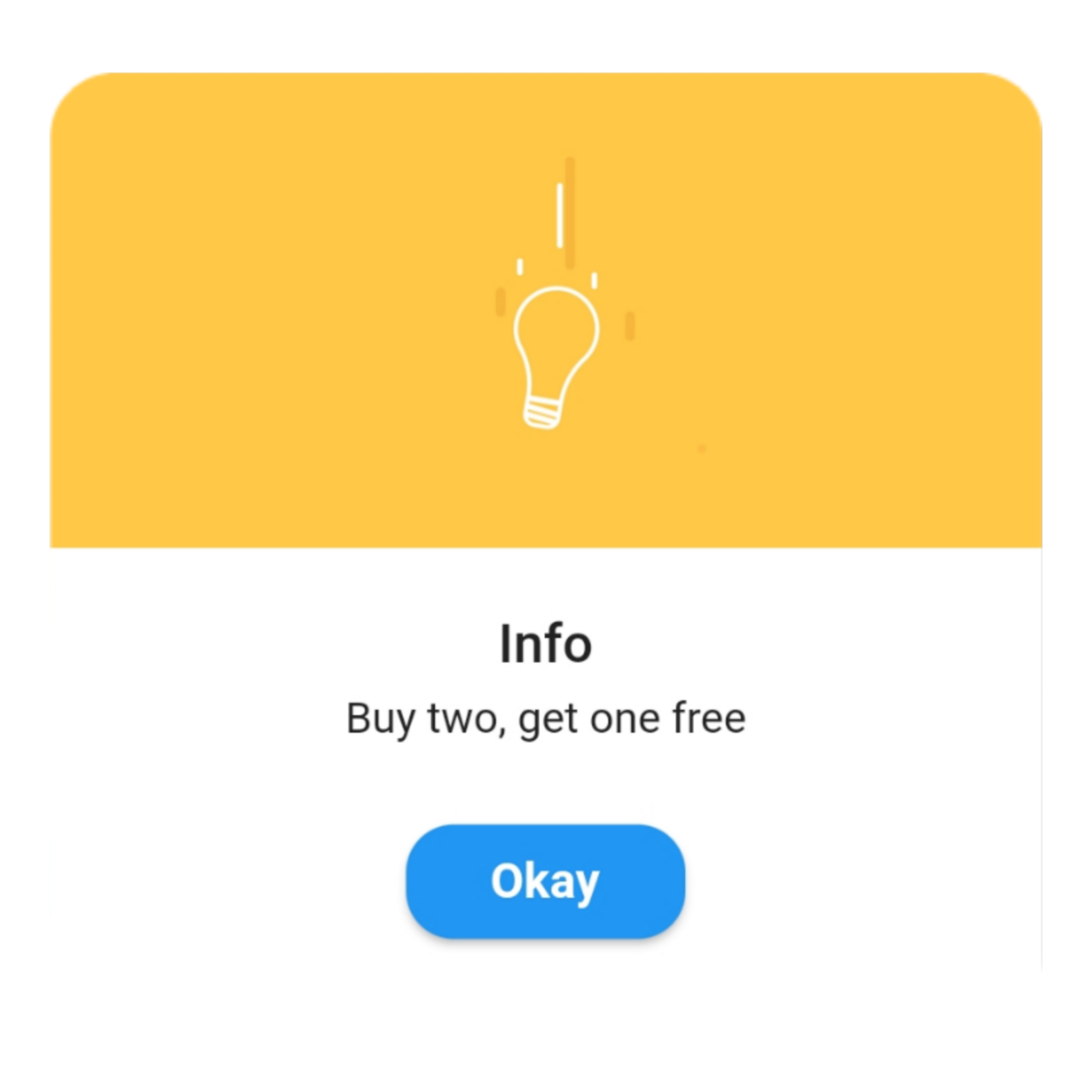
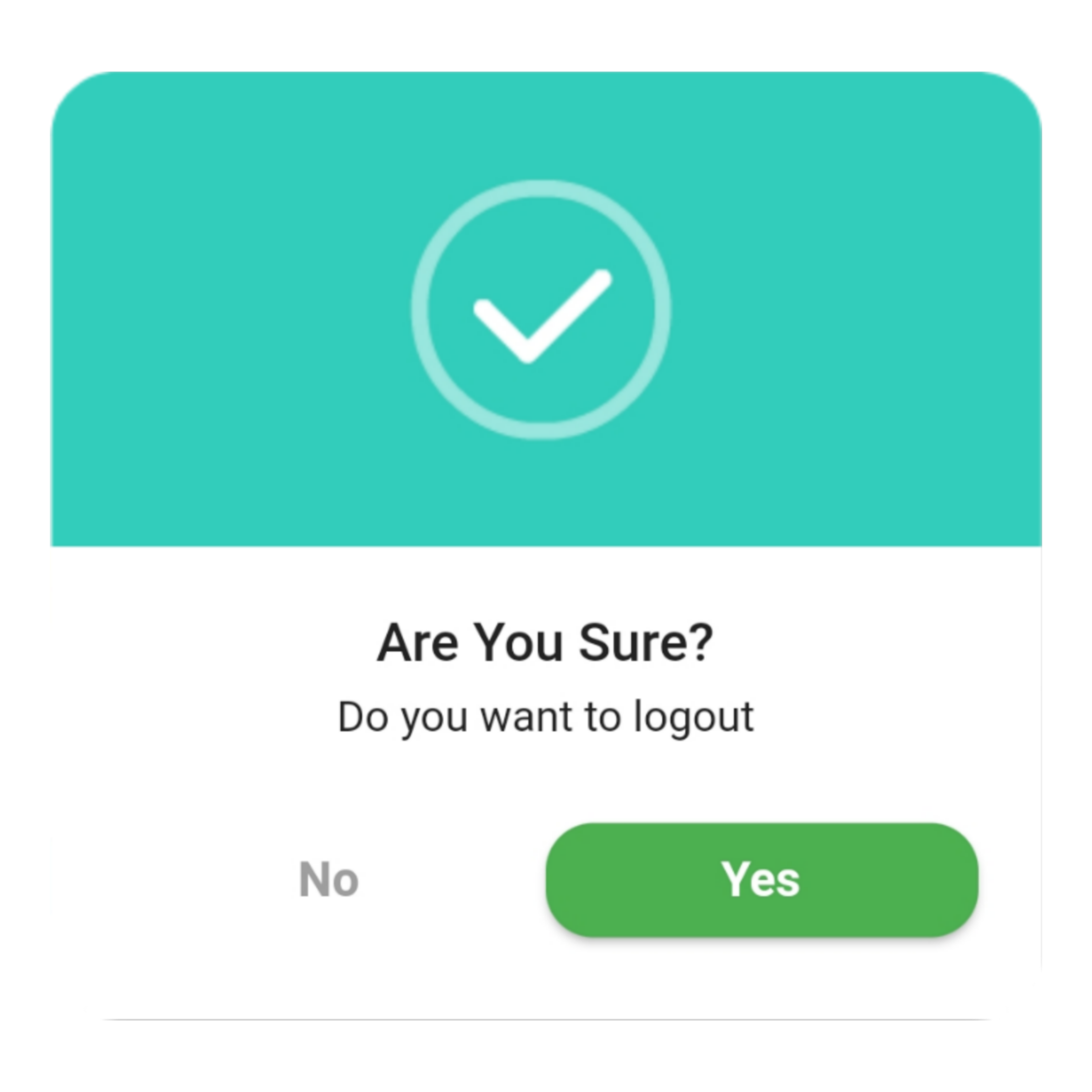
Make use of the predefined alerts are very beautiful and can also be customized very easily. In QuickAlert there are 6 different types of alerts, they are Success, Error, Warning, Info, Confirm & Loading.
Predefined Title & Actions
In QuickAlert all the 6 different types of alerts have predefined title & actions matching the alert type.
Super Customizable
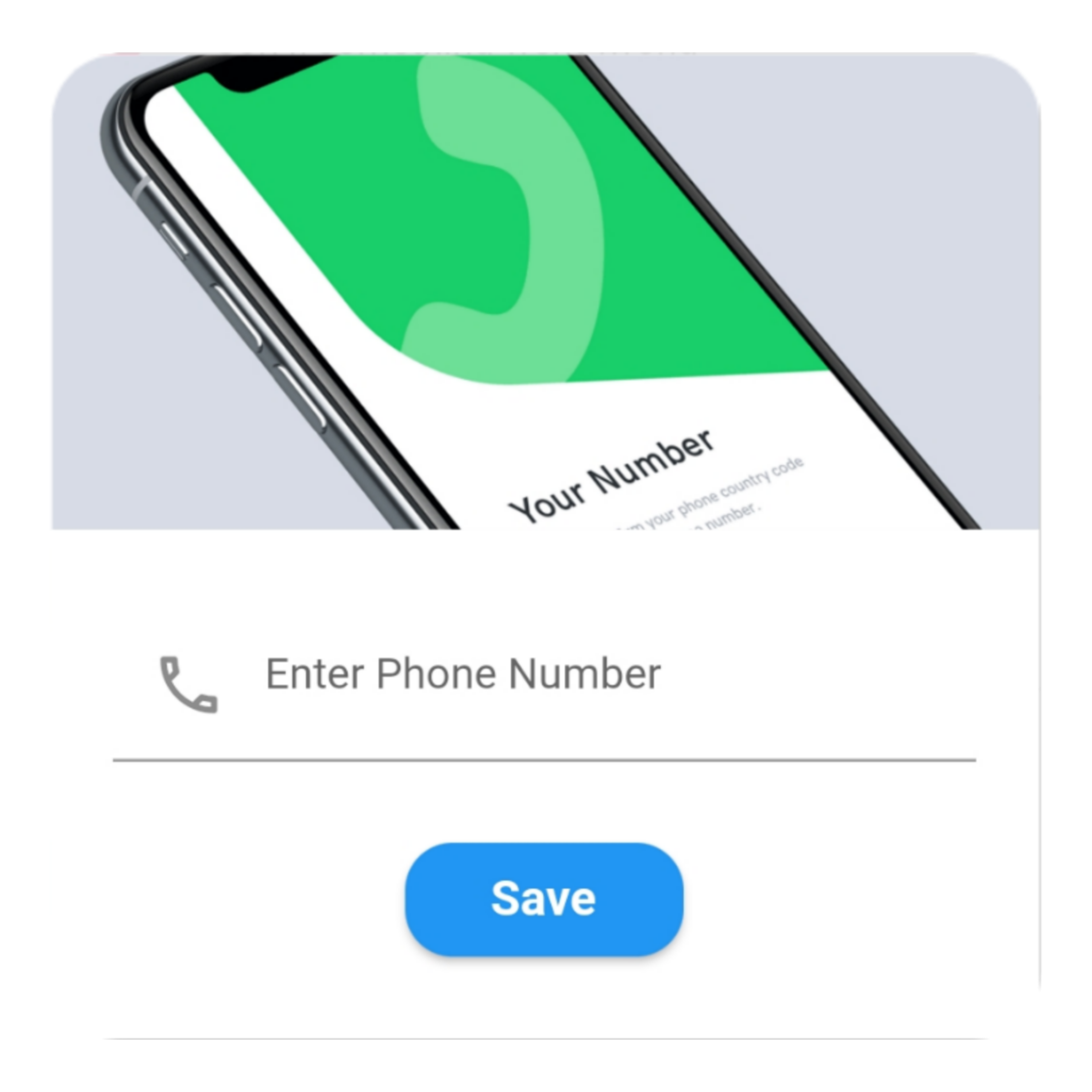
Build your custom alert with power of QuickAlert using the flutter widgets.
Change Animation
Set your favorite animation by choosing from scale, rotate, slideInDown, slideInUp, slideInLeft, slideInRight.
Set Auto close
Auto close the alert by setting auto close duration.
Set Overlay Tap to Dismiss
Control the alert's Barrier Dismissible Property by setting barrierDismissible to true or false.
And Many More...
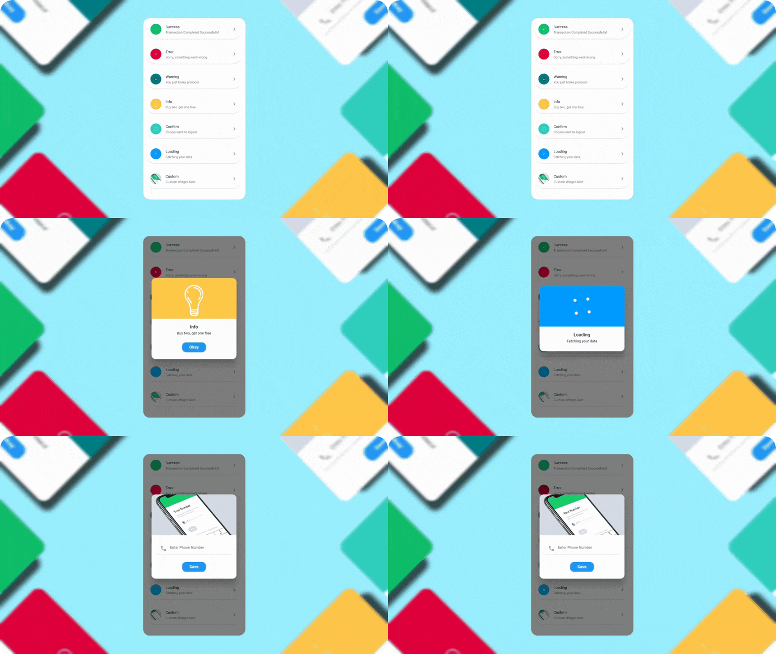
QuickAlert Demo
Getting Started 🔥
Start by adding the library as a dependency to your project.
dependencies:quickalert:<latestversion>
Run the command get the dependency
$ flutter pub get
Import it in your dart code, you can use
import'package:quickalert/quickalert.dart';
To display alert use QuickAlert.show() and define the type of alert.
QuickAlert.show(
  context: context,
  type: QuickAlertType.success,
); // That's it to display an alert, use other properties to customize.
Examples ⚡
There is a detailed example project in the example folder. You can directly run and play on it. There are code snippets from example project below.