
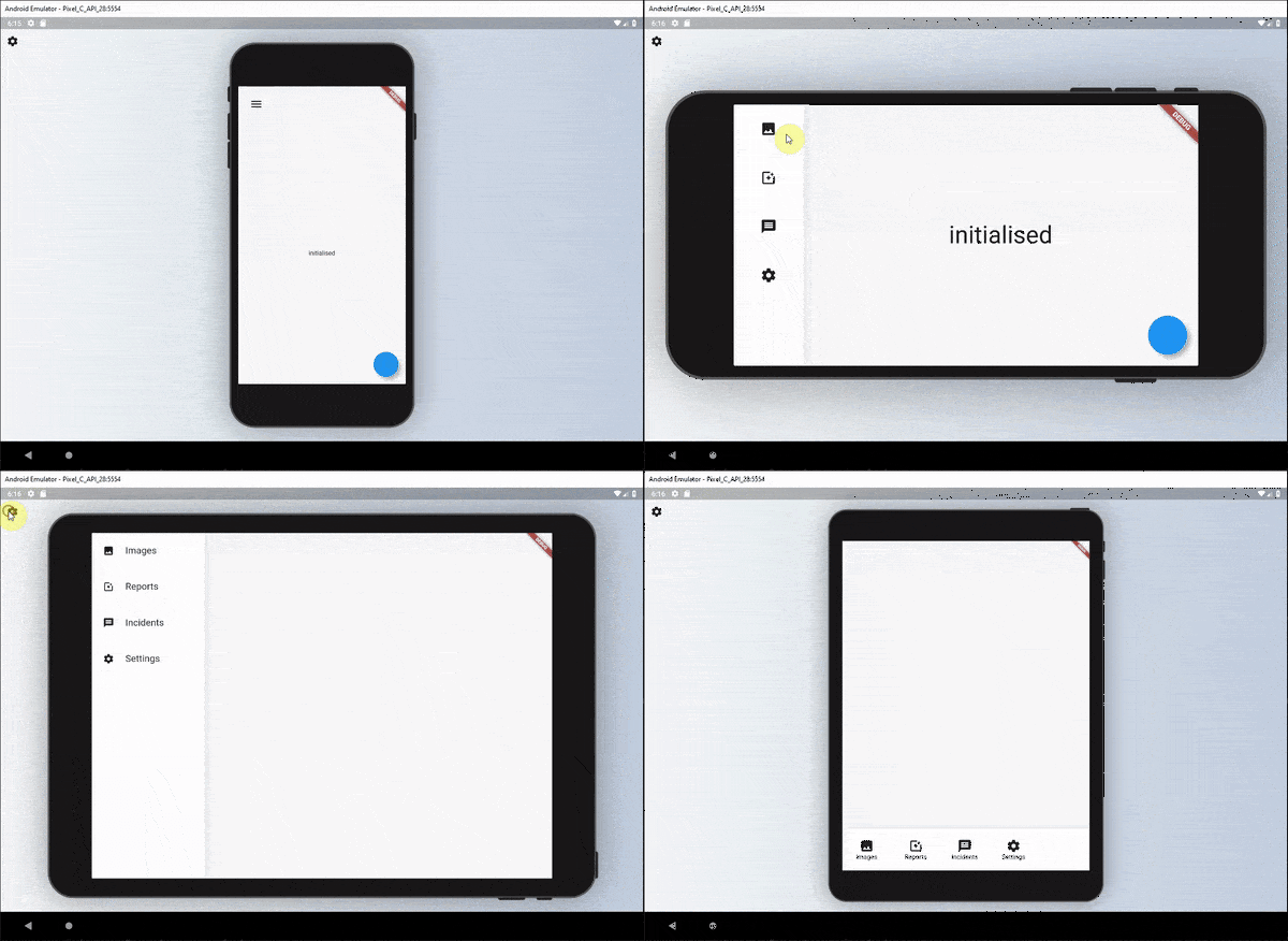
Overview
ResponsiveBuilder is a Flutter package that simplifies creating responsive user interfaces by providing widgets to easily adapt layouts based on screen size and device type. It enables developers to define different UI structures for various breakpoints, ensuring optimal display across Android, iOS, Web, macOS, Windows, and Linux. The package enhances readability and maintainability of responsive code with intuitive conditional rendering based on device characteristics like width, height, and orientation. It's ideal for building adaptive designs without complex logic or boilerplate code.
Use cases
- Building adaptive layouts for multiple screen sizes
- Creating responsive dashboards
- Designing cross-platform apps with consistent UI
- Implementing different UIs for mobile vs. desktop
- Optimizing content layout for tablets and large screens
Key features
- Breakpoint-based responsive design
- Support for all major platforms
- Clean, readable syntax for responsive logic
- Built-in device type detection
- Easy integration with existing Flutter projects
Suitable for
- Developers building cross-platform Flutter apps
- Teams prioritizing UI consistency across devices
- Projects requiring adaptive layouts for web and mobile
- Frontend developers focused on responsive design
- Apps targeting both mobile and desktop users
Considerations
- May require additional testing across device types
- Not suitable for highly dynamic layouts without custom logic
- Best used with clear breakpoint definitions
- Performance impact negligible but depends on complexity
- Requires understanding of responsive design principles