Search packages, repositories and app categories

rflutter_alert cover
Package detailsv2.0.7

rflutter_alert

RFlutter Alert is super customizable and easy-to-use alert / popup dialogs for Flutter. You may create reusable alert styles or add buttons as much as you want with ease.

AndroidiOSWebmacOSWindowsLinux
30-day downloads
14.1K
Likes
1.1K
Pub points
150

Install package

flutter pub add rflutter_alert

Package Overview

Package selection guidance compiled from public package information, community data, and project usage.

RFlutter Alert is a customizable and user-friendly package for creating alert and popup dialogs in Flutter applications. It enables developers to easily build reusable alert styles with unlimited buttons, supporting various customization options like animations, colors, and content layouts. Ideal for displaying notifications, confirmations, or interactive prompts across multiple platforms. The package integrates seamlessly with Flutter's widget system and is maintained by ratel.com.tr.

Use cases

  • Displaying confirmation dialogs
  • Showing custom notifications
  • Creating reusable alert templates
  • Handling user input via popups
  • Implementing onboarding tips
  • Managing form validation alerts

Key features

  • Highly customizable appearance
  • Support for multiple buttons
  • Reusable alert styles
  • Built-in animations
  • Cross-platform compatibility
  • Easy integration with Flutter

Suitable for

  • Beginner Flutter developers
  • Apps needing frequent alerts
  • Interactive UI components
  • Multi-platform apps
  • Custom dialog design
  • Quick prototyping

Considerations

  • May require additional styling for complex layouts
  • Limited built-in themes compared to full UI libraries
  • Potential performance impact with many nested alerts
  • Not ideal for heavy modal workflows
  • Requires manual handling of button callbacks
  • Best suited for simple to moderately complex dialogs

Original README

Original README snapshot from the linked source repository. Visit the repository for the latest content.

RFlutter Alert

RFlutter Alert is super customizable and easy-to-use alert/popup dialogs for Flutter. You may create reusable alert styles or add buttons as much as you want with ease.

Version

Features

  • Single line basic alert
  • Adding buttons dynamically (as much as you want)
  • Predefined beautiful alert styles (success, error, warning, info)
  • Reusable alert styles
  • Super customizable
    • Change animation (fromTop, fromBottom, fromRight, fromLeft, grow, shrink) & Custom Animation
    • Set animation duration
    • Show/hide close button
    • Set overlay tap to dismiss
    • Assign Title and desc styles
    • Change dialog border style

Getting started

You must add the library as a dependency to your project.

dependencies:
 rflutter_alert: ^2.0.7

You can also reference the git repo directly if you want:

dependencies:
 rflutter_alert:
   git: git://github.com/RatelHub/rflutter_alert.git

You should then run flutter packages get

Example Project

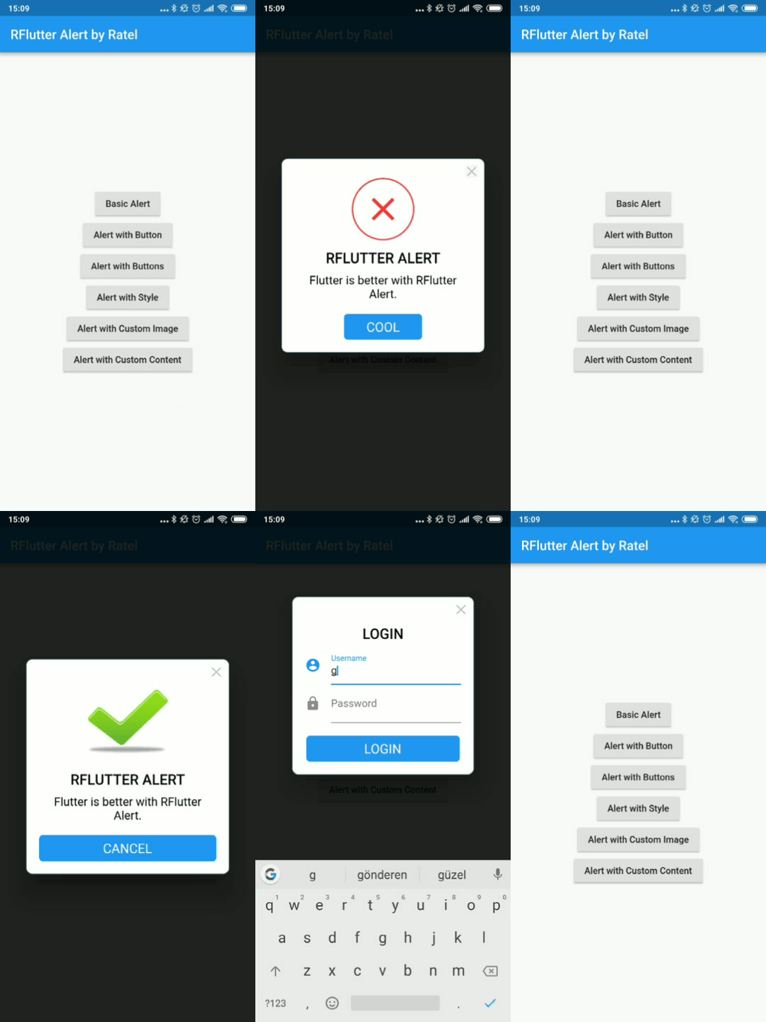
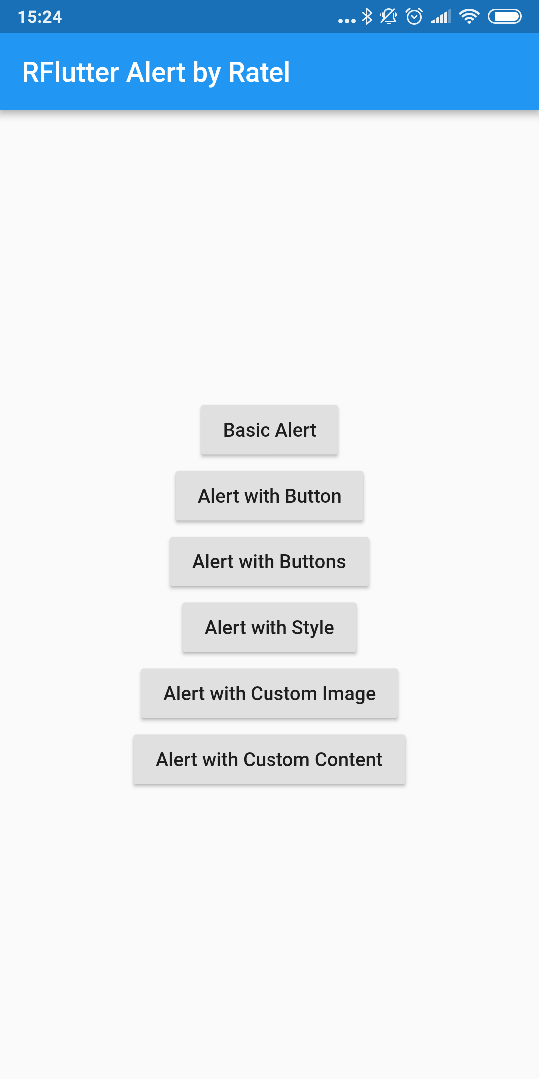
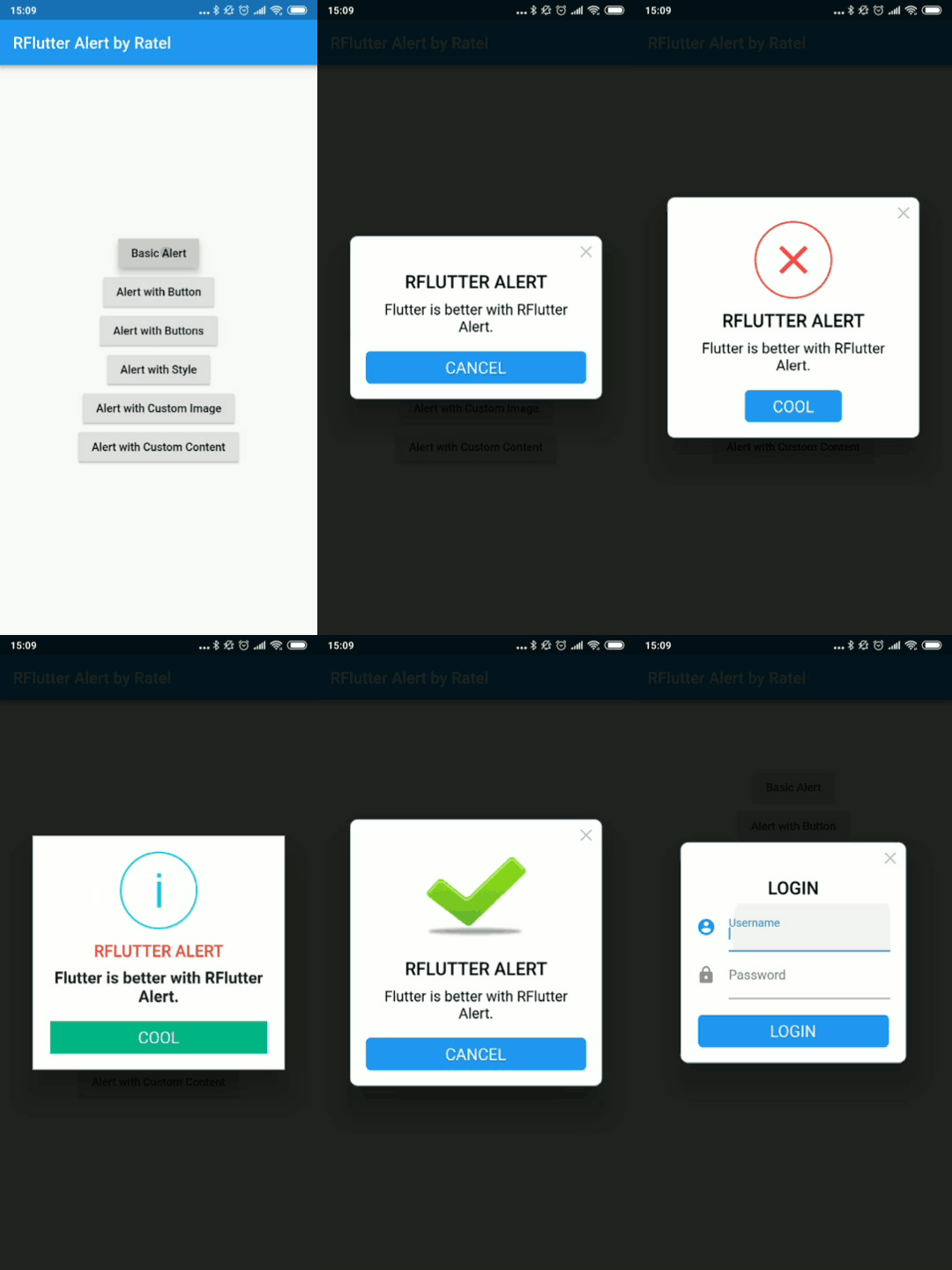
There is a detailed example project in the example folder. You can directly run and play on it. There are code snippets from example project below.

Basic Alert

Alert(context: context, title: "RFLUTTER", desc: "Flutter is awesome.").show();

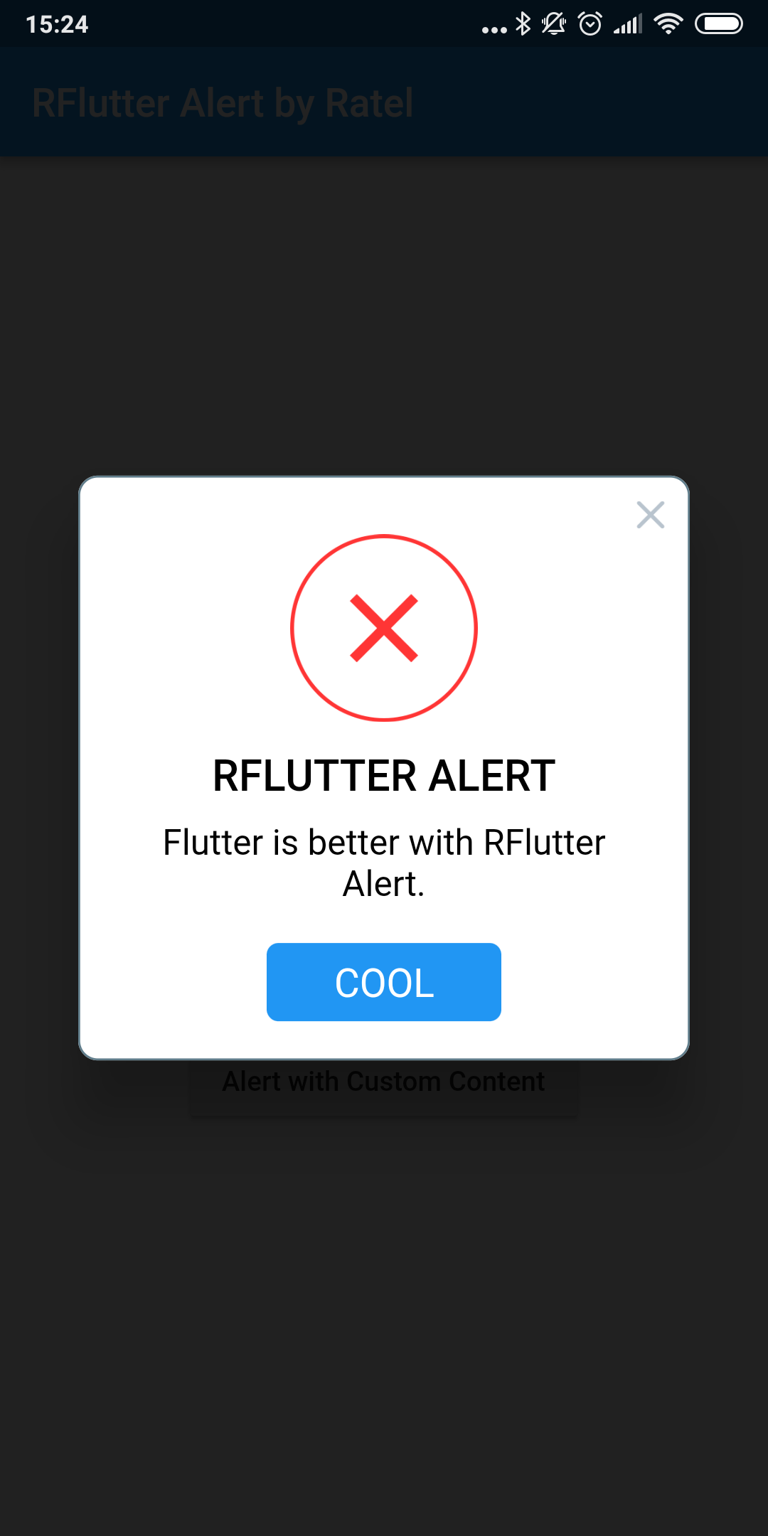
Alert with Button

    Alert(
      context: context,
      type: AlertType.error,
      title: "RFLUTTER ALERT",
      desc: "Flutter is more awesome with RFlutter Alert.",
      buttons: [
        DialogButton(
          child: Text(
            "COOL",
            style: TextStyle(color: Colors.white, fontSize: 20),
          ),
          onPressed: () => Navigator.pop(context),
          width: 120,
        )
      ],
    ).show();

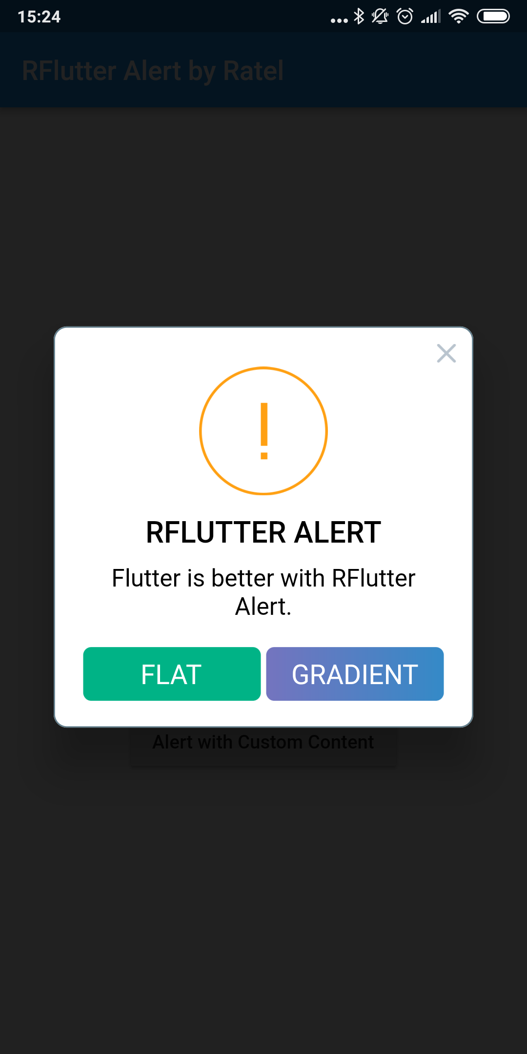
Alert with Buttons

    Alert(
      context: context,
      type: AlertType.warning,
      title: "RFLUTTER ALERT",
      desc: "Flutter is more awesome with RFlutter Alert.",
      buttons: [
        DialogButton(
          child: Text(
            "FLAT",
            style: TextStyle(color: Colors.white, fontSize: 20),
          ),
          onPressed: () => Navigator.pop(context),
          color: Color.fromRGBO(0, 179, 134, 1.0),
        ),
        DialogButton(
          child: Text(
            "GRADIENT",
            style: TextStyle(color: Colors.white, fontSize: 20),
          ),
          onPressed: () => Navigator.pop(context),
          gradient: LinearGradient(colors: [
            Color.fromRGBO(116, 116, 191, 1.0),
            Color.fromRGBO(52, 138, 199, 1.0)
          ]),
        )
      ],
    ).show();

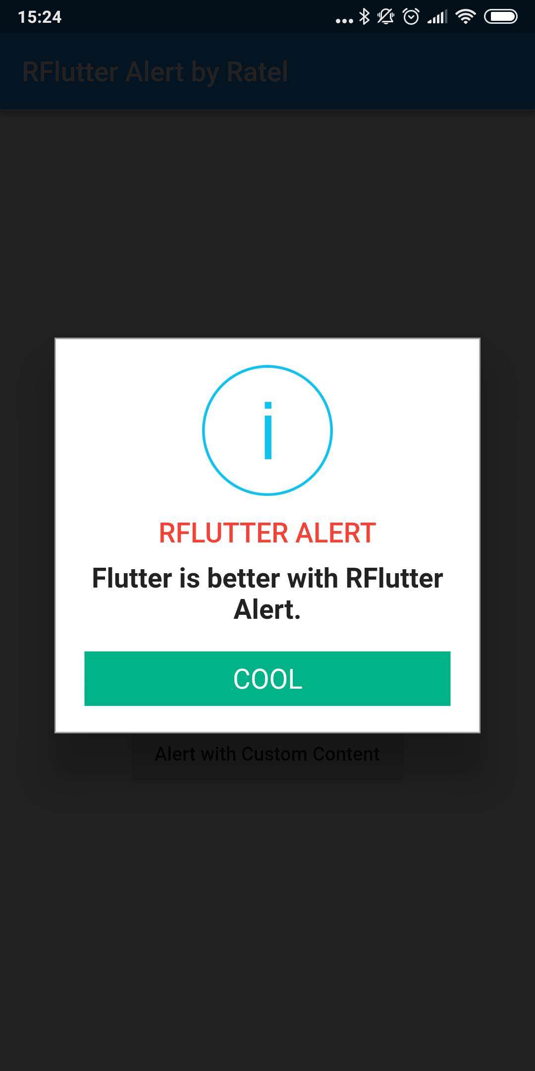
Alert with Style

AlertStyle

Use the AlertStyle class to customize.

    var alertStyle = AlertStyle(
      animationType: AnimationType.fromTop,
      isCloseButton: false,
      isOverlayTapDismiss: false,
      descStyle: TextStyle(fontWeight: FontWeight.bold),
      descTextAlign: TextAlign.start,
      animationDuration: Duration(milliseconds: 400),
      alertBorder: RoundedRectangleBorder(
        borderRadius: BorderRadius.circular(0.0),
        side: BorderSide(
          color: Colors.grey,
        ),
      ),
      titleStyle: TextStyle(
        color: Colors.red,
      ),
      alertAlignment: Alignment.topCenter,
    );

And assign your AlertStyle object to Alert's style field.

    Alert(
      context: context,
      style: alertStyle,
      type: AlertType.info,
      title: "RFLUTTER ALERT",
      desc: "Flutter is more awesome with RFlutter Alert.",
      buttons: [
        DialogButton(
          child: Text(
            "COOL",
            style: TextStyle(color: Colors.white, fontSize: 20),
          ),
          onPressed: () => Navigator.pop(context),
          color: Color.fromRGBO(0, 179, 134, 1.0),
          radius: BorderRadius.circular(0.0),
        ),
      ],
    ).show();

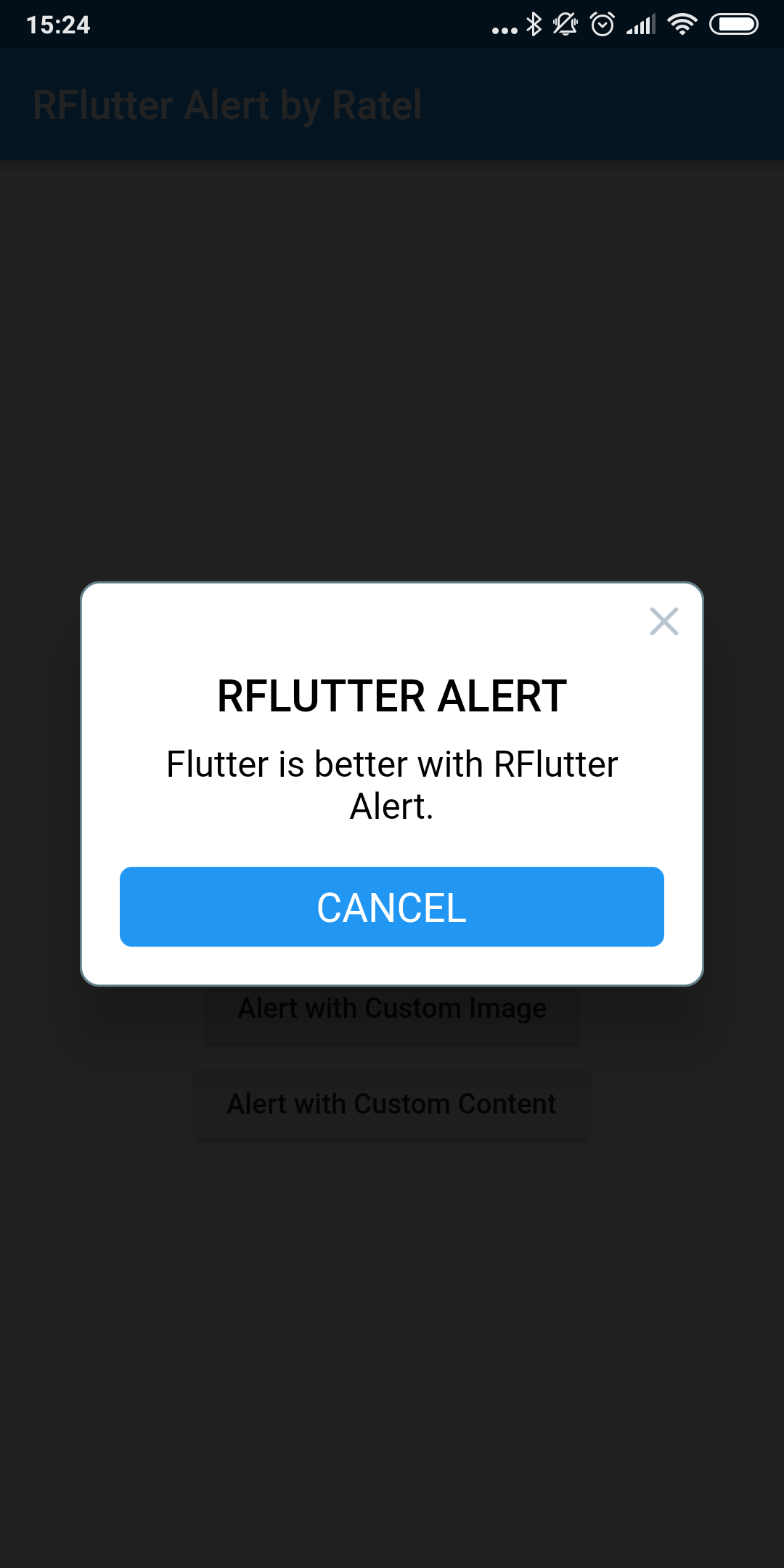
Alert with Custom Image

    Alert(
      context: context,
      title: "RFLUTTER ALERT",
      desc: "Flutter is better with RFlutter Alert.",
      image: Image.asset("assets/success.png"),
    ).show();

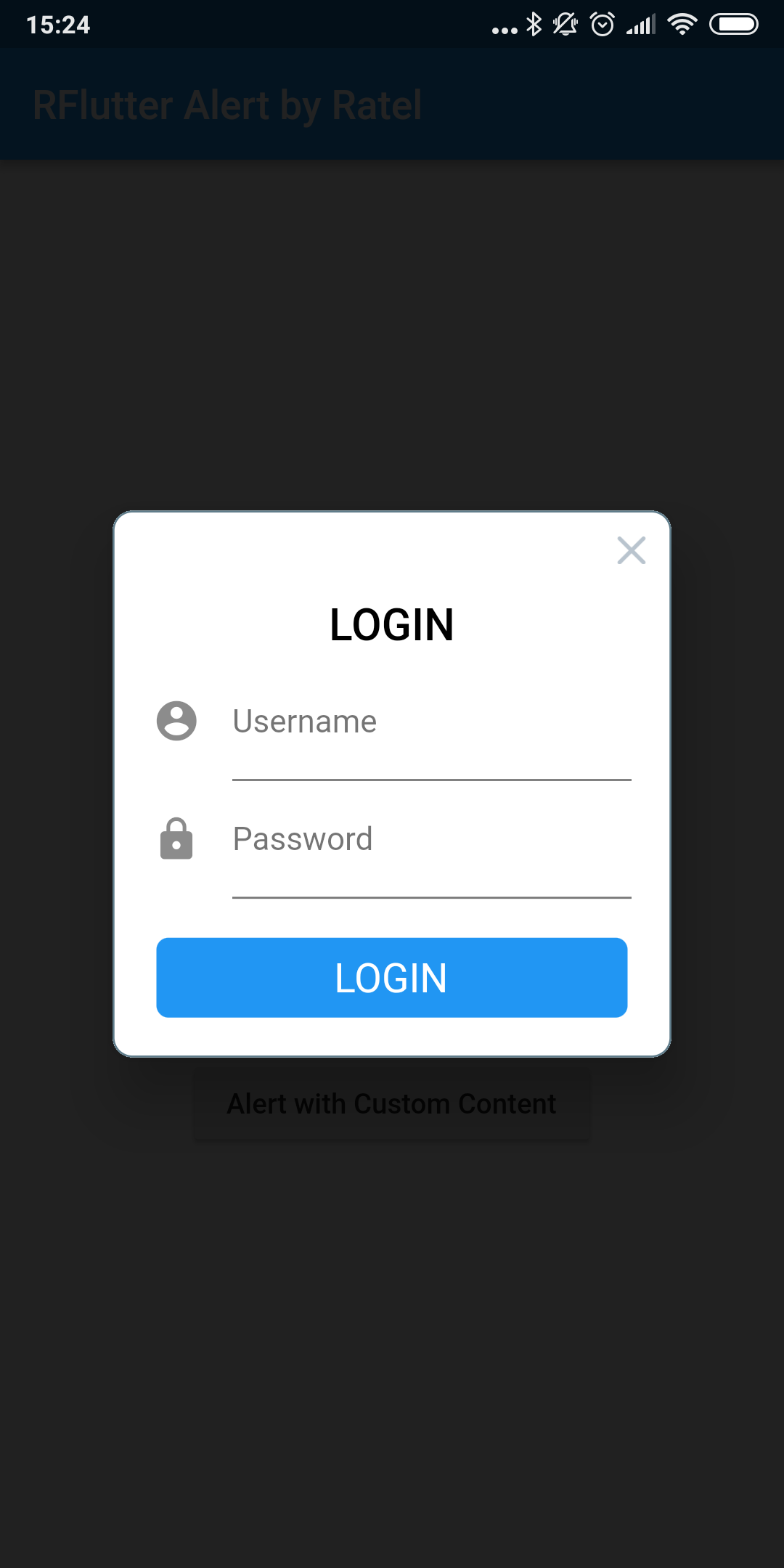
Alert with Custom Content

    Alert(
        context: context,
        title: "LOGIN",
        content: Column(
          children: <Widget>[
            TextField(
              decoration: InputDecoration(
                icon: Icon(Icons.account_circle),
                labelText: 'Username',
              ),
            ),
            TextField(
              obscureText: true,
              decoration: InputDecoration(
                icon: Icon(Icons.lock),
                labelText: 'Password',
              ),
            ),
          ],
        ),
        buttons: [
          DialogButton(
            onPressed: () => Navigator.pop(context),
            child: Text(
              "LOGIN",
              style: TextStyle(color: Colors.white, fontSize: 20),
            ),
          )
        ]).show();

Contributions

  • If you found a bug, open an issue.
  • If you have a feature request, open an issue.
  • If you want to contribute, submit a pull request.

Version compatability

See CHANGELOG for all breaking (and non-breaking) changes.


Made with ❤ by Ratel

Categories

Source repository

Projects using this package