
Overview
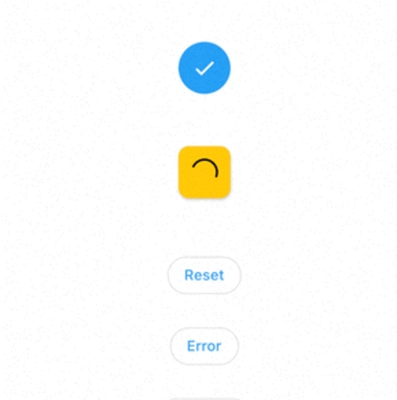
A Flutter package that provides an animated loading button widget with smooth transitions and customizable styling. It enhances user experience by visually indicating loading states during actions like form submissions or API calls. The button supports both circular and rounded rectangular shapes, with options to customize colors, size, and animation speed. Built for simplicity and performance, it integrates seamlessly into any Flutter app across multiple platforms.
Use cases
- Form submission with loading state
- API call triggers
- User authentication flows
- Interactive UI elements
- Progress indication in mobile apps
Key features
- Animated loading transition
- Customizable button shape
- Configurable colors and sizes
- Cross-platform support
- Simple integration with onPressed
- Smooth animation effects
Suitable for
- Developers building interactive forms
- Apps requiring visual feedback during async operations
- UI-focused Flutter projects
- Beginner to intermediate Flutter developers
- Projects targeting Android, iOS, Web, macOS, Windows, and Linux
Considerations
- Requires minimal setup for basic usage
- Limited customization beyond core properties
- No built-in error handling
- Best suited for simple loading scenarios
- Not ideal for complex state management