Search packages, repositories and app categories

wheel_chooser cover
Package detailsv1.1.2

wheel_chooser

WheelChooser is a widget allowing user to choose numbers/strings/widgets by scrolling spinners with wheel look.

AndroidiOSWebmacOSWindowsLinux
30-day downloads
12.7K
Likes
89
Pub points
130

Install package

flutter pub add wheel_chooser

Package Overview

Package selection guidance compiled from public package information, community data, and project usage.

WheelChooser is a Flutter widget that provides a visually appealing, wheel-based interface for selecting values such as numbers, strings, or custom widgets. Inspired by physical spinners, it allows users to scroll through options with smooth animations, ideal for forms, settings, or interactive inputs. The package supports multiple platforms including Android, iOS, Web, macOS, Windows, and Linux, ensuring consistent behavior across devices. It's lightweight and easy to integrate, making it suitable for applications requiring intuitive data selection.

Use cases

  • Form inputs with discrete choices
  • Time or date pickers
  • Custom numeric selectors
  • Settings with option wheels
  • Interactive educational apps

Key features

  • Smooth scrolling animation
  • Supports custom widgets
  • Cross-platform compatibility
  • Configurable item count
  • Easy integration with existing UI
  • Responsive design

Suitable for

  • Developers building form interfaces
  • Apps needing visual data selection
  • Educational or gaming applications
  • Multi-platform Flutter projects
  • UI designers seeking engaging input methods

Considerations

  • May require performance tuning for large datasets
  • Limited built-in validation
  • Not optimized for very high-frequency updates
  • Requires careful styling for accessibility
  • Best suited for small to medium-sized option lists

Original README

Original README snapshot from the linked source repository. Visit the repository for the latest content.

wheel_chooser

pub package

WheelChooser is a widget allowing user to choose numbers/strings/widgets by scrolling spinners with wheel look.

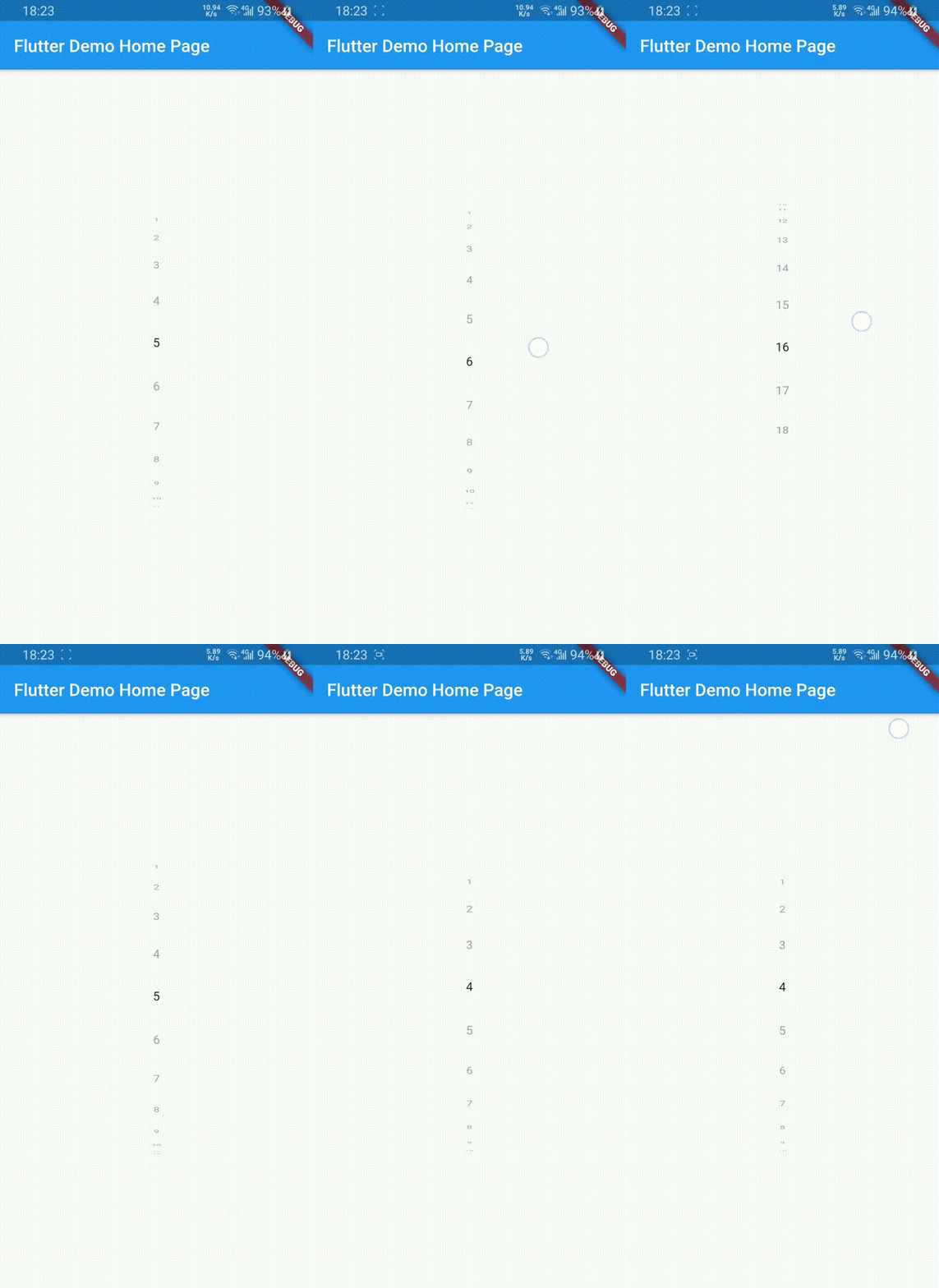
vertical

Getting Started

Install
dependencies:
  wheel_chooser: ^1.1.2
Creating WheelChooser Widget

use it to show Strings

WheelChooser(
    onValueChanged: (s) => print(s),
    datas: ["a", "b", "c"],
  );

use it to show Integers

WheelChooser.integer(
    onValueChanged: (i) => print(i),
    maxValue: 10,
    minValue: 1,
    step: 2,
  );

use it to show display titles and return a value associated with the selected value


List<WheelChoice> aChoices = [
  WheelChoice(value: DateTime(2000,1,1,9,0), title: '9AM'),
  WheelChoice(value: DateTime(2000,1,1,9,30), title: '9:30AM'),
  WheelChoice(value: DateTime(2000,1,1,10,0), title: '10AM'),
  WheelChoice(value: DateTime(2000,1,1,10,30), title: '10:30AM'),
];

WheelChooser.choices(
    choices = aChoices,
    onChoiceChanged: (value) {
      // returns DateTime of selected title
      print('selected time is ${value.hour} hours and ${value.minutes} minutes')
    }
  );

use it to show CustomWidgets

 WheelChooser.custom(
    onValueChanged: (a) => print(a),
    children: <Widget>[
      Text("data1"),
      Text("data2"),
      Text("data3"),
    ],
  );
Usage examples

vertical

WheelChooser.integer(
        onValueChanged: (s) => print(s.toString()),
        maxValue: 18,
        minValue: 1,
        initValue: 5,
        unSelectTextStyle: TextStyle(color: Colors.grey),
      )

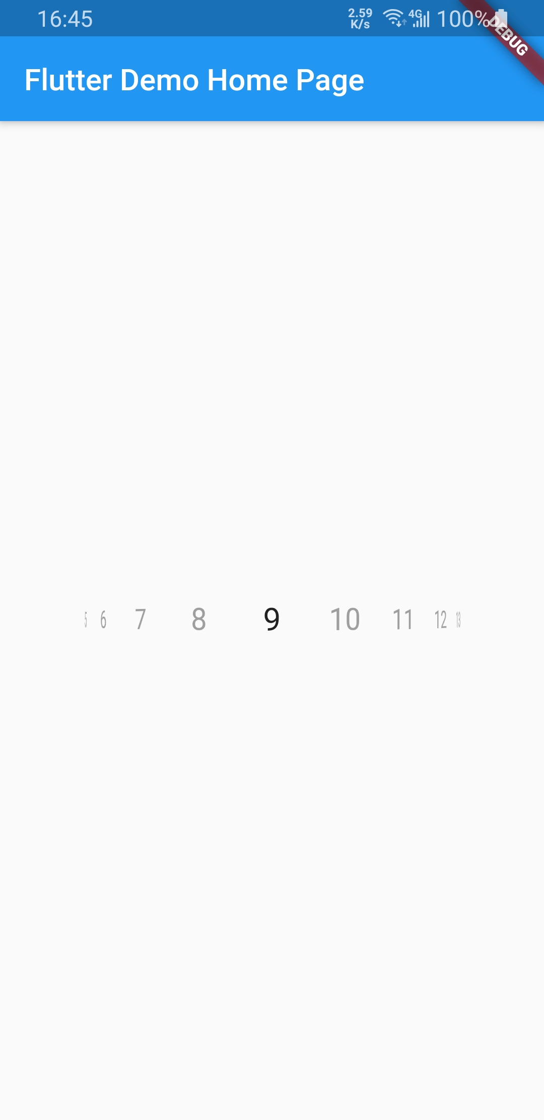
vertical

WheelChooser.integer(
        onValueChanged: (s) => print(s.toString()),
        maxValue: 20,
        minValue: 1,
        initValue: 9,
        horizontal: true,
        unSelectTextStyle: TextStyle(color: Colors.grey),
      )

From v0.1.1 support Infinite. From v1.0.0 support null safe.

Categories

Source repository

Projects using this package