Package selection guidance compiled from public package information, community data, and project usage.
Animated Text Kit is a Flutter package that provides a collection of visually appealing and customizable text animations. It enables developers to easily add dynamic text effects such as typing, fading, and scrolling to their apps. Ideal for splash screens, welcome messages, or engaging UI elements, it supports multiple platforms including Android, iOS, Web, macOS, Windows, and Linux. The package is lightweight and integrates seamlessly with Flutter’s widget system, offering smooth animations with minimal setup.
Use cases
Splash screens
Welcome messages
Interactive UI elements
Loading indicators
Dynamic headlines
Onboarding sequences
Key features
Pre-built text animations
Customizable speed and delay
Support for multiple platforms
Easy integration with Flutter
Smooth transitions
Text styling options
Suitable for
App onboarding flows
Engaging user interfaces
Simple animations in apps
Educational or presentation apps
Creative digital displays
Lightweight animation needs
Considerations
Limited to text-only animations
May impact performance with many instances
Not suitable for complex animations
Requires careful tuning for optimal UX
Best for short-duration effects
Depends on Flutter's rendering performance
Original README
Original README snapshot from the linked source repository. Visit the repository for the latest content.
Animated Text Kit
A flutter package which contains a collection of some cool and awesome text animations. Recommended package for text animations in Codemagic's Ebook, "Flutter libraries we love". Try out our live example app.
pause – the time of the pause between animation texts
displayFullTextOnTap – tapping the animation will rush it to completion
isRepeatingAnimation – controls whether the animation repeats
repeatForever – controls whether the animation repeats forever
totalRepeatCount – number of times the animation should repeat (when repeatForever is false)
controller - It allows for control over the animation by providing methods to play, pause and reset the text animations programmatically
There are also custom callbacks:
onTap – This is called when a user taps the animated text
onNext(int index, bool isLast) – This is called before the next text animation, after the previous one's pause
onNextBeforePause(int index, bool isLast) – This is called before the next text animation, before the previous one's pause
onFinished - This is called at the end, when the parameter isRepeatingAnimation is set to false
Note: You might come up with an issue that the text does not get updated with setState as shown here. The solution to this, is a key that changes based on the text. For reference, watch this video.
New with Version 3
Version 3 refactored the code so that common animation controls were moved to
AnimatedTextKit and all animations, except for TextLiquidFill, extend from
AnimatedText. This saved hundreds of lines of duplicate code, increased
consistency across animations, and makes it easier to create new animations.
It also makes the animations more flexible because multiple animations may now
be easily combined. For example:
Using the legacy FadeAnimatedTextKit is equivalent to using AnimatedTextKit with FadeAnimatedText.
An advantage of AnimatedTextKit is that the animatedTexts may be any subclass of AnimatedText, while using FadeAnimatedTextKit essentially restricts you to using just FadeAnimatedText.
Legacy AnimatedTextKit classes
Have you noticed that animation classes come in pairs?
For example, there is FadeAnimatedText and FadeAnimatedTextKit.
The significant refactoring with Version 3 split the original FadeAnimatedTextKit into FadeAnimatedText and a re-usable AnimatedTextKit, then FadeAnimatedTextKit was adjusted for backwards compatibility.
When introducing a new AnimationText subclass, you may wonder if you also need to also introduce an additional Kit class. The answer is NO. :tada:
Going forward, we are championing the adoption of the Version 3 approach, and have deprecated the legacy Kit classes.
This will make creating new animations easier.
We know it makes some legacy code more verbose, but the flexibility and simplicity is a conscious trade-off.
returnSizedBox(
width: 250.0,
child: DefaultTextStyle(
style: constTextStyle(
fontSize: 30.0,
fontFamily: 'Bobbers',
),
child: AnimatedTextKit(
animatedTexts: [
TyperAnimatedText('It is not enough to do your best,'),
TyperAnimatedText('you must know what to do,'),
TyperAnimatedText('and then do your best'),
TyperAnimatedText('- W.Edwards Deming'),
],
onTap: () {
print("Tap Event");
},
),
),
);
Typewriter
returnSizedBox(
width: 250.0,
child: DefaultTextStyle(
style: constTextStyle(
fontSize: 30.0,
fontFamily: 'Agne',
),
child: AnimatedTextKit(
animatedTexts: [
TypewriterAnimatedText('Discipline is the best tool'),
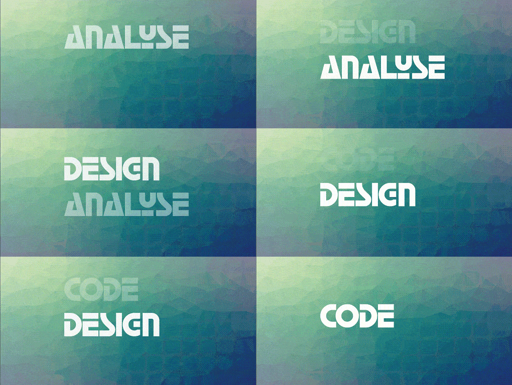
TypewriterAnimatedText('Design first, then code'),
TypewriterAnimatedText('Do not patch bugs out, rewrite them'),
TypewriterAnimatedText('Do not test bugs out, design them out'),
],
onTap: () {
print("Tap Event");
},
),
),
);
You can easily create your own animations by creating new classes that extend
AnimatedText, just like most animations in this package. You will need to
implement:
Class constructor – Initializes animation parameters.
initAnimation – Initializes Animation instances and binds them to the given AnimationController.
animatedBuilder – Builder method to return a Widget based on Animation values.
completeText – Returns the Widget to display once the animation is complete. (The default implementation returns a styled Text widget.)
Then use AnimatedTextKit to display the custom animated text class like:
If you encounter any problems feel free to open an issue. If you feel the library is missing a feature, please raise a ticket on GitHub and I'll look into it. Pull request are also welcome.